The Year in Pattern - Letting a Few Good Prints Quietly Anchor Your Projects
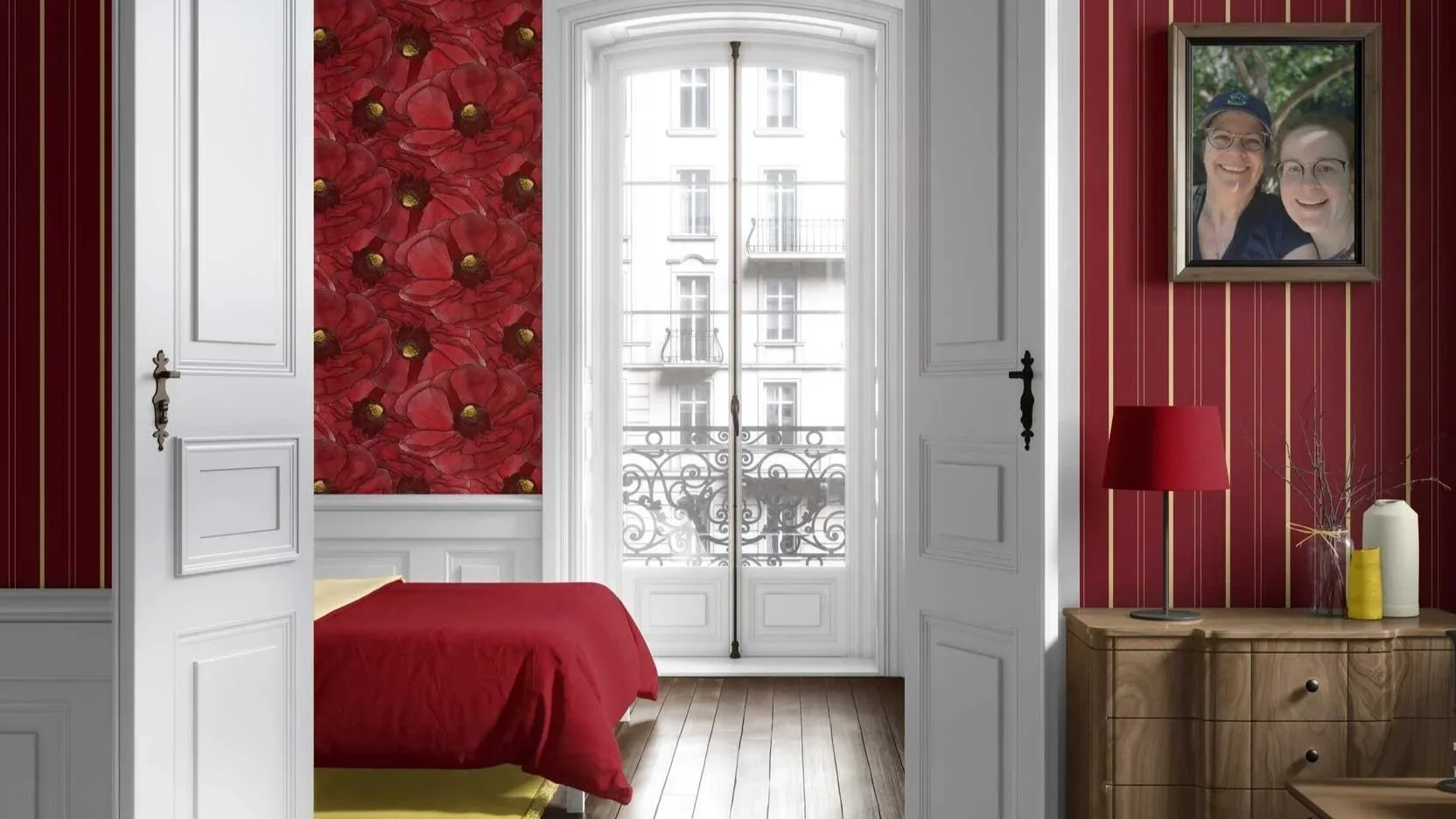
There’s a quiet relief that comes when you realize you don’t need a completely new pattern for every single project. A handful of well-chosen, hard-working prints can quietly anchor your rooms across an entire year—and still let each space feel unique to those using it. In this post, I’m talking to fellow decorators and designers about building a “year in pattern”: how to curate a small set of go-to wallpapers and fabrics, when to bring them in, and how to keep them feeling fresh from project to project.
Why “a few good prints” is a gift to you and your projects
As interiors professionals, it can be easy to feel like:
Every project needs a brand-new pattern story.
Repeating a favorite print is somehow “cheating” or not creative enough.
You should always have something completely different to show.
In practice, though:
Those using the space care more about how it feels to live and work there than whether the wallpaper is brand-new to the world.
A consistent, curated pattern vocabulary makes your work feel more coherent and recognizable over time.
Having a small library of trusted prints simplifies your process and reduces decision fatigue.
Think of it less like repeating yourself and more like: Developing a pattern “handwriting” that you can adapt to different architectures, palettes, and personalities.
A few good prints—chosen intentionally—become familiar tools you know you can rely on, not crutches.
What makes a pattern worth coming back to?
Not every print deserves a recurring role. Some are perfect one-offs; others are quiet anchors.
The patterns I find myself reaching for again and again tend to have:
1. A calm but interesting ground
Off-whites that feel like paper, plaster, or fabric—not bright printer white.
Neutrals that can swing warm or cool depending on what they’re near.
Grounds that accept a wide range of woods, metals, and stone without fighting them.
These are the patterns that sit nicely with real-world finishes.
2. Rhythm without shouting
Repeats that are recognizable but not bossy.
Patterns that begin with hand-drawn shapes—sometimes left soft and organic, other times translated into cleaner, more structured repeats—so they still feel human even when they’re more tailored.
Enough rhythm and detail to feel intentional and alive, but not so much that the wall turns into visual noise or distraction.
They hold the room together rather than demanding all the attention.
3. Palette flexibility
Palettes shaped by the original artwork—whether that means a few close hues or a fuller range of color, the goal is always a single, liveable story in the room.
Colors and tones that can be pulled into upholstery, art, or rugs without extreme custom matching.
The ability to play lead or supporting role depending on how you style around it.
You know a pattern is a “year in pattern” candidate when you can immediately imagine it in:
A calm bedroom.
A small office.
A powder room.
A tucked reading nook.
Different roles, same print.
Building your “capsule pattern library”
Think of this like a capsule wardrobe, but for wallpapers and fabrics.
A simple starting structure might be:
One to two soft geometrics
Grids, fans, arcs, or stripes with hand to them.
Good for entries, hallways, and behind shelving.
One to two organic / botanical designs
Leaves, florals, or abstracted nature motifs.
Perfect for bedrooms, offices, and powder rooms.
One nature-adjacent abstract
Something that feels like water, stone, or bark without being literal.
Works almost anywhere when you need subtle movement.
One “quiet hero” coordinating fabric
A textured solid or barely-there pattern for upholstery or drapery.
Connects rooms that don’t all want wallpaper.
Over a year, this small capsule can:
Show up in wildly different ways across multiple projects.
Give you a reliable base, so when timelines tighten you’re not starting from zero.
Help those who follow your work recognize your touch without seeing the exact same room twice.
How to keep repeated patterns feeling fresh from project to project
Repeating a pattern doesn’t mean repeating a room. A few levers keep things feeling new:
1. Change the surface
Use a pattern as wallpaper in one project and as fabric in another (if it’s available in both).
Wrap a full room in one job; in another, use the same print just on the back of a bookcase or inside a nook.
Let a pattern live large-scale on walls in one home and in smaller doses on pillows or a bench in another.
Same design, completely different roles.
2. Shift the supporting cast
Pair the pattern with warm woods and brass in one project, and cooler woods and blackened metals in another.
Change the rug texture—flatweave vs. plush, solid vs. subtle pattern.
Adjust how much solid vs. patterned fabric you bring in alongside it.
The pattern becomes a recognizable thread; the surrounding choices make each space specific.
3. Let architecture steer the scale
In taller rooms, you might keep the pattern at its standard scale and let it stretch up the walls, or go “grand” with a larger scale that helps ground the space.
In small jewel-box spaces, you might keep the pattern tighter or let it wrap more fully for impact.
In long hallways—the transitional spaces between rooms—you might use it as a steady rhythm that gently carries you from one area to the next.
When you let the architecture have a say, the pattern feels like it’s responding to the building, not being imposed on it.
Designing a year in pattern around real workflows
If you’re an interior decorator or designer, your year is rarely neat. You’re likely juggling:
Projects that start and stop at different times.
Long lead items.
Install days that cluster.
A small, well-considered pattern library supports that reality:
You can grab a trusted wallpaper when a project suddenly gets the green light.
You know which prints will play well with common flooring, cabinet, and existing furnishing scenarios.
You have a mental shorthand: “If the room needs calm but presence, this one; if it needs a bit more spark, that one.”
Practical ways to work this into your year:
Keep large-format samples or memo books of your “capsule patterns” ready to pull for every new project.
Photograph them in a few installed spaces so you can show those using the space how they behave in real rooms.
Note where they’ve already been used—region, room type, application—so you can keep things feeling special and avoid repetition in close circles if that matters to you.
Talking about repeat use with those using the space
Sometimes designers worry: “What if someone discovers I used this wallpaper in another home?”
From the perspective of those using the space:
They care far more about feeling seen, supported, and well-served than having a pattern that exists nowhere else on earth.
A pattern used in two different homes or businesses will almost never look the same once it’s surrounded by different furniture, art, and routines.
Knowing that something is a “favorite” or a “go-to” for you can actually build trust: it signals that the choice is grounded in experience, not guesswork.
You might say: “This is one of my tried-and-true wallpapers. I come back to it because it behaves beautifully in different lights and works with many materials. We’ll make it completely yours with how we layer the rest of the room.”
Or: “This pattern is part of my core library for spaces that need calm but still want personality. I’d love to show you how it might look in your architecture and palette.”
It’s less about exclusivity and more about using tools you know will serve the space well.
A gentle way to review your own year in pattern
At the end (or even mid-point) of a year, it can be helpful to do a quick pattern audit:
Ask yourself:
Which patterns did I reach for more than once? Why?
Where did a print exceed my expectations—scale, color, or how it behaved in the room?
Were there any “one and done” patterns that were perfect for that project, but not something I’d repeat?
Is there a gap in my capsule—maybe a calm geometric, or a nature-inspired print in a different energy level?
You can also:
Keep a small digital folder or physical binder with photos of your capsule patterns in real rooms and real light.
Note the emotional job each one did: grounded, airy, cozy, focused, playful.
Let that inform which patterns you carry forward as anchors into the next year.
This turns “random usage” into an intentional pattern language.
How I think about my own year in pattern
From my side of the studio, designing patterns and decorating, I treat each year as a chance to:
Notice which designs quietly support the widest range of spaces.
Add new colorways or scales where I see an opportunity to expand the collection.
Introduce a few new patterns that complement (rather than replace) the existing core.
And, while I love creating new collections and do so each year, my goal isn’t to reinvent everything every season, but to:
Keep deepening a body of work that decorators, designers, and those using the space can live with comfortably for a long time.
If you were to look at my year in pattern from outside, you’d see:
Certain motifs and line qualities that return.
Palettes that are cousins to each other, not strangers.
New work that feels like part of the same family rather than a completely different universe.
That’s the feeling I want for you and your projects, too.
If you’re reading this as someone planning a new space—or reimagining an existing home or business—and you’d like help building a wallpaper and fabric story that balances texture, pattern, and practicality for those using the space, you’re welcome to reach out through my Contact Me page to learn more about my paid interior decorating services.
And if this kind of conversation is helpful, you can also:
Subscribe to Surface & Space to have new posts land in your inbox on Fridays.
Get access to a growing library of subscriber-only resources—gentle guides, checklists, and tools to help you think through pattern, color, and materials in your own time. I add to this collection regularly, so it becomes a little toolbox you can return to whenever you’re ready.
© 2025-2026 Gabrielle Hewson. All rights reserved. You’re welcome to share links to this article, but please don’t copy or republish the text or images without my written permission. For licensing, permissions, or any other use beyond linking, please contact me directly.