
What To Expect When You’re New to Wallpaper
Bold walls don’t just change how a room looks—they change how it’s valued. Deep color and confident wallpaper instantly signal “this space was designed on purpose,” which makes everything in front of those walls—upholstery, fabrics, art—read as more custom and more expensive. In this post, I’m unpacking why bold walls increase perceived value, and how to use them strategically to elevate your upholstery and fabric choices.
Why perceived value isn’t just about the furniture
You can place the same sofa, chairs, and rug in two different envelopes—a plain white room and a room with bold, considered walls—and they will not be experienced the same way.
In most people’s minds, perceived value comes from three things:
Evidence of intention – it looks like someone made thoughtful decisions.
Sense of completion – the room reads as “done,” not halfway there.
Emotional impact – it makes you feel something: cozy, chic, moody, joyful.
Bold walls—whether that’s deep paint or patterned wallpaper—check all three boxes in an instant. They show up in photos, in first impressions, and in how visitors talk about the space. And crucially, they make your upholstery and fabrics look more important, more custom, and more worth investing in.
The psychology behind bold walls and “this must be expensive”
When people walk into a room with bold walls, a few quiet assumptions kick in:
“Someone hired a designer.” — Most mass-market, lowest-effort spaces default to safe, light neutrals. Bold walls signal risk-taking and taste—hallmarks of professional involvement.
“If they committed to this, the rest must be high quality too.” — people assume the sofa, fabric, and art must be special.
“This room is unique.” — If they haven’t seen the exact same wall color or pattern in ten other homes, it feels more bespoke—and people tend to associate “one-of-a-kind” with “higher value.”
In other words, the walls quietly raise the perceived level of everything in the room, especially textiles and upholstered pieces.
How bold walls make upholstery and fabric look more luxurious
This is where the category connection really shines: bold walls are one of the best tools you have to elevate the textiles you love.
1. Contrast makes fabrics “pop”
A neutral sofa in front of a white wall is… fine. The same sofa in front of a deep teal, smoky plum, or patterned wall suddenly looks intentional and more expensive. Why?
The silhouette reads more clearly.
The fabric’s texture stands out.
Piping, seams, and tailoring are easier to see.
People don’t always know why it looks better—they just feel that it does.
2. Bold walls frame hero fabrics
If you’ve specified a beautiful patterned chair, bench, or ottoman, a richer wall behind it works like a gallery backdrop:
The pattern feels curated, not floating.
Small-scale prints read as “couture” rather than busy.
Statement fabrics look like art, not afterthoughts.
3. Color continuity suggests custom work
When the wall color or wallpaper palette repeats in cushions, window treatments, or a reupholstered piece, it gives the impression of a custom, designed scheme—even if the actual pieces are a mix of new and existing furniture.
Guests unconsciously read that harmony as “this must have been planned…and probably cost more.”
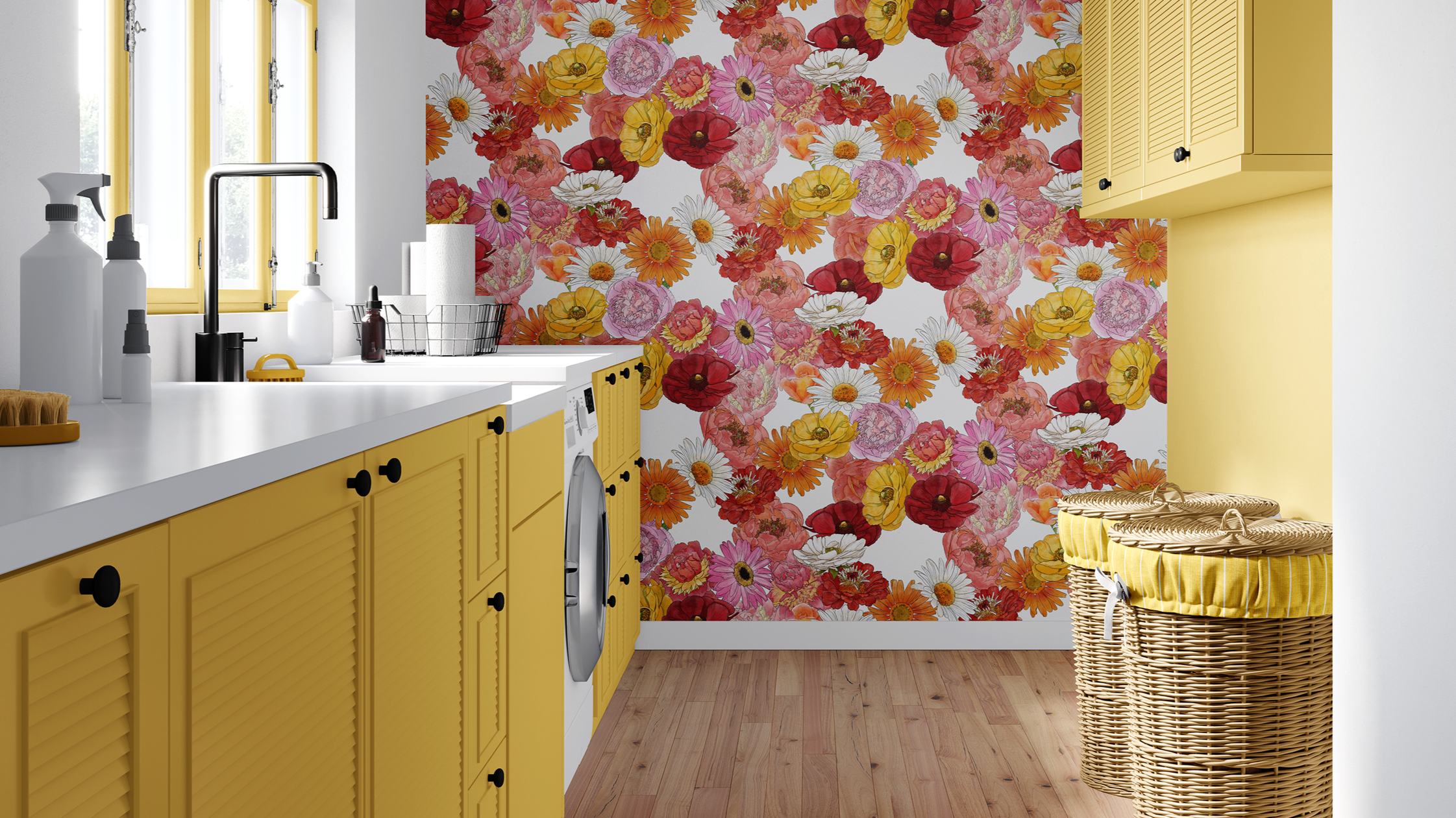
Bold doesn’t have to mean bright (defining “bold walls”)
A “bold wall” isn’t necessarily neon or high-contrast. Bold can mean:
Deep, complex neutrals — Charcoal, mushroom, inky navy, tobacco, and olive are bold because they envelop, not because they shout.
Patterned wallpaper in a calm palette — A soft botanical, stripe, or geometric in layered tones can be visually bold simply because it’s not a blank surface.
Color-wrapped rooms — Walls, trim, and even ceilings in one immersed color feel bold compared to a standard wall/white trim split—even if the color itself is gentle.
The goal is to move away from “default” and into “deliberate.” That alone increases perceived value.
Where bold walls have the most impact on value perception
Some rooms are especially sensitive to wall treatment when it comes to how people judge their value.
Living rooms and sitting rooms
These spaces often anchor the visitor’s sense of “my home.”
Deep color or wallpaper instantly moves them out of “apartment basic” and into “this feels designed.”
Sofas, armchairs, and rugs read more expensive against a bold backdrop.
Dining rooms
A richly painted or papered dining room—with chairs in thoughtful fabrics—feels like a place for occasions, even if the furniture itself is simple.
Guests often talk about “that dining room with the [insert color/pattern] walls,” which reinforces the sense of specialness.
Bedrooms
A bold wall or wallpaper wrapping the bed wall makes the headboard and bedding feel upgraded.
Even modest headboards and quilts can feel boutique-level when framed by strong color or pattern.
Small jewel-box spaces
Powder rooms, breakfast nooks, and snug reading corners are prime candidates.
The bolder the walls, the more every small fabric moment (a café curtain, cushion, or upholstered stool) feels intentionally chosen.
Pairing bold walls with upholstery & fabric: practical guidelines
Bold walls work best when the fabrics in front of them are handled with care. A few guidelines:
Keep big upholstery grounded
Choose sofa and major chair fabrics that have texture and depth, but not busy patterns.
Think linen blends, velvets, or textured weaves in solids or very subtle patterns.
Let the walls carry more of the “wow,” while upholstery carries comfort and quality.
Use fabrics to echo, not copy, the wall
Pull 1–2 colors from the wall (or wallpaper) into cushions, a bench, or dining chairs.
Shift the value slightly—lighter or darker—so the layers feel related but not flat.
Mix scales: if the wall is patterned, use smaller-scale or simpler motifs in fabrics, and vice versa.
Give at least one fabric a starring role
Choose a single patterned textile to play up against the bold wall:
A pair of chairs in a special print.
A window seat cushion in a coordinating pattern.
A bed bench or ottoman in a bolder fabric.
Because the walls are already signaling high design, that one textile suddenly reads as “custom.”
When someone is cautious about bold walls
Not everyone arrives ready for deep teal or patterned wallpaper. A few ways I like to ease them in:
Start with one room or one wall — “Let’s try this in your dining room / powder room / behind the sofa and see how it feels.”
Use language around value, not just aesthetics — “This will make the whole room—including your existing sofa and chairs—feel more elevated and finished.”
Show pairing boards with fabrics — Present wall color/wallpaper with the upholstery and textiles, so they see a cohesive story rather than an isolated color swatch.
Offer a range of boldness — Show the same scheme in three versions: softer, medium, and more dramatic. Let them choose their comfort level, all of which move beyond “default white.”
When they understand bold walls as an upgrade to the whole room, not just a risky color play, their resistance usually softens.
If you’re reading this as someone planning a new space—or reimagining an existing home or business—and you’d like help building a fabric and wallpaper story that balances texture, pattern, and practicality for those using the space, you’re welcome to reach out through my Contact Me page to learn more about my paid interior decorating services.
And if this kind of conversation is helpful, you can also:
Subscribe to Surface & Space to have new posts land in your inbox on Fridays.
Get access to a growing library of subscriber-only resources—gentle guides, checklists, and tools to help you think through pattern, color, and materials in your own time. I add to this collection regularly, so it becomes a little toolbox you can return to whenever you’re ready.