
Design Stories in Color: How Palette Choices Shape Emotion, Mood, and Meaning in a Space
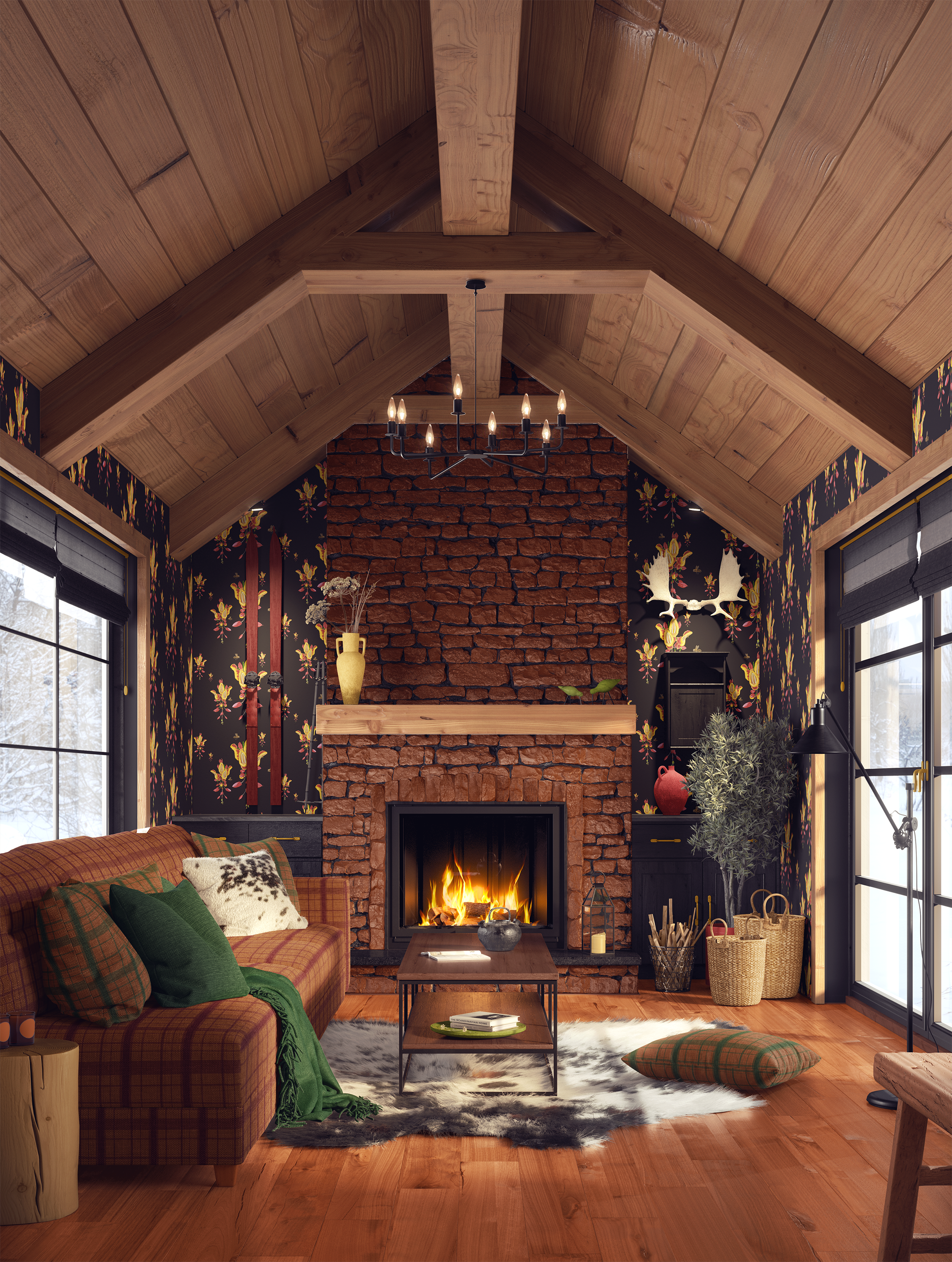
Collection: Exotic Florals: Indian Brick & Butter Vine wallpaper in a cozy mountain cabin setting, paired with coordinating plaid upholstery and pillows. Brick red, butter yellow, and vine green, drawn from the lush, colorful flowering vine indigenous to India, together create a warm, story-rich living room that feels both grounded and alive.
How a Color Story Shapes the Way a Room Feels
In the living room above, I built a warm, layered color story around one of the wallpaper colorways in my Exotic Florals: Indian Brick & Butter Vine collection. The brick red, soft butter yellow, and deep green tones repeat across the walls, the plaid sofa upholstery, and the plaid throw pillows. Because each element is drawn from the same palette — and designed as part of the same collection — the room feels layered and expressive without ever tipping into chaos. This is the power of a color story: every surface is doing its own job, but together they tell one cohesive narrative. The coordinating plaids were created as intentional complements to the wallpaper, so designers can confidently mix pattern and texture while staying anchored to a single, harmonious palette.
From Color Concept to Lived-In Space
When most people think about color, they think about favorites: “I love green.” “I never wear yellow.” “I’m a blue person.”
As a designer, I think about color differently.
Color isn’t just “pretty” — it’s a storyteller, a mood-setter, and a quiet director of how a space feels and functions.
The colors you live with every day don’t just decorate your rooms; they shape how you move, how you rest, how you focus, and how you remember. Thoughtful palette choices can shift a space from “nicely decorated” to deeply personal and alive.
This is where design stories in color begin.
What Is a Color Story? (And Why Designers Think in Palettes)
A color story is the narrative that a group of colors tells together.
It’s not just “blue and white” or “pink and green.” It’s:
• What kind of blue? Inky? Dusty? Sky?
• How saturated is the pink? Whisper-soft or unapologetically bold?
• How do these colors show up — on walls, textiles, patterns, and small accents?
Designers think in palettes instead of single colors because it’s the relationship between hues that creates mood:
• Harmony feels calm and cohesive
• Contrast adds energy and drama
• Temperature shifts (warm vs. cool) can pull a space inward and cozy, or open it up and refresh it
When I design wallpaper, fabric, or an interior, I’m always asking: What story do these colors tell together? How do I want someone to feel in this space, and what palette will support that?
Guiding Energy & Flow: How Color Moves You Through a Space
Color is one of the quietest ways to guide energy and flow in a home.
Think of moving from room to room as moving through chapters of a book. Each chapter has its own mood, but they still belong to the same story.
As a designer, I use color to:
Create transitions — Repeating a color (even in a different intensity) from one room to the next helps the eye travel smoothly. A deep green wallpaper in the dining room might echo as a softer sage in the adjacent hallway.
Define zones — In open-concept spaces, color can gently “draw a line” where walls don’t. A warm, grounding palette for a seating area versus a lighter, cleaner palette for a workspace.
Set the pace — Softer, low-contrast palettes tend to slow you down: perfect for bedrooms, reading nooks, or restful corners. Higher contrast and bolder saturation add energy: ideal for creative studios, dining rooms where conversation matters, or playful kids’ spaces.
A simple exercise:
Stand in a central spot in your home and look at every visible room. Ask yourself: Is there a common thread of color? Does the energy jump too dramatically from one room to the next?
Often, introducing one “bridge” color — through pattern, rugs, or textiles — can smooth out the entire experience of your home.
Color as Memory and Place-Making
Color is deeply tied to memory and identity. It can evoke a place you love, a season of life, or a feeling you want more of.
When I build a palette — especially for a custom wallpaper, fabric, or room — I often ask:
Where do you feel most at home? (A coastal town, a forest, a desert, a city café?)
What colors live in that memory? (Sun-faded terracotta, moody navy, sunlit olive, soft foggy gray?)
What stories and symbols feel like “you”? (Botanicals, geometrics, vintage prints, quiet solids?)
This is where pattern becomes powerful. Motifs and repeats act like visual echoes of places and memories:
A botanical print in earthy greens and russets might recall childhood gardens or favorite hikes.
A geometric pattern in stone, clay, and charcoal might ground a space in the feeling of an old European city or a modern gallery.
A soft, hand-drawn floral in a limited palette can feel like a favorite vintage fabric passed down in a family.
Color plus pattern becomes place-making: you’re not just decorating a room — you’re creating a sense of “this is who lives here, and this is what matters to them.”
Introducing Bold Palettes with Intention
Many people are drawn to bold color but hesitate: “What if it’s too much?” “What if I get tired of it?”
Bold color doesn’t have to feel loud. It just has to feel intentional.
Here’s how I approach bold palettes as a designer:
Start with an anchor — Choose one rich, confident color that holds the space: a deep teal, a cinnamon red, an inky blue, a golden ochre. Let that be the star.
Support it with grounding neutrals — Pair your bold color with neutrals that have personality — warm greige*, creamy white, soft mushroom, smoky charcoal — rather than stark white alone.
Use pattern as a bridge — A wallpaper or fabric pattern that contains your bold color and one or two supporting hues instantly ties the room together.
For example:
• Bold teal on the wall• A pattern with teal, clay, and cream on cushions or drapery
• Clay or cream in solid accessories nearby
Scale matters
• Large-scale bold color (like a full wall of saturated wallpaper) works well in spaces where you want a strong mood: dining rooms, entryways, powder rooms, reading nooks.
• Smaller-scale doses (pillows, art, accent chairs, patterned shades) are ideal if you’re experimenting and don’t want to commit to an entire wall.Add breathing room — Let bold areas be surrounded by quieter surfaces. If everything is loud, nothing stands out. The eye needs places to rest.
*Greige is a term that encapsulates a lack of noticeable color or color variation beyond grey and beiges; a color palette comprised of a blend of grey and beige.
The key is that bold color feels chosen, not random. It should connect to a story: a place you love, a feeling you want more of, or a personality you want the room to express.
Curating Meaningful Color Stories That Feel Deeply Personal
Curating a color story is less about rules and more about translation: taking feelings, memories, and intentions and turning them into a palette.
Here’s a simple framework you can use:
1. Name the feeling first — Choose 3–5 words you want the space to embody, for example:
• Grounded, warm, gathered
• Playful, bright, optimistic
• Calm, airy, restorative
• Moody, intimate, enveloping
2. Choose a “hero” inspiration — This might be:
• A piece of art
• A vintage textile
• A photo from a favorite trip
• A wallpaper or fabric you keep coming back to
3. Pull 3–5 core colors from that hero — Include:
• 1–2 grounding neutrals
• 1 medium-tone support color
• 1 accent or “spark” color
4. Assign each color a job — Decide where each color lives:
• Walls
• Larger furniture pieces
• Textiles (pillows, drapery, upholstery)
• Patterned elements (wallpaper, fabric, rugs)
• Small accents (lamps, frames, accessories)
5. Give your color story a name — This might sound whimsical, but it’s powerful. Names like:
• “Rainy Garden Morning”
• “Sun-Drenched Studio”
• “Twilight Library”
• “Desert at Golden Hour”
These act as creative guardrails. When you name your color story, you’re less likely to get distracted by random trends and more likely to stay true to the mood you’re actually trying to create.
How I Build Color Stories with Wallpaper, Fabric, and Pattern
Because I work across wallpaper, fabric, and interior decorating, I’m constantly thinking about how color will live on different surfaces and textures.
When I design for clients — or for a collection — I typically:
Start with a core palette inspired by a story, place, or feeling
Translate that palette into patterned pieces (like wallpaper and fabrics) that can anchor a room
Create opportunities to layer: small-scale patterns, larger-scale motifs, and solids pulled from the same palette
Wallpaper often becomes the scene-setting backdrop — the chapter heading of the room. Fabric carries the story into daily life: on seats, cushions, window treatments, and even small details like upholstered stools or table linens.
The result isn’t just a “coordinated look,” but a space where:
The colors feel intentional
The patterns feel personal
The room tells a story you recognize as your own
That, to me, is the magic of design stories in color.
Bringing It All Together
Color is one of the most powerful design tools you have — not because it’s trendy, but because it’s primal, emotional, and deeply tied to how we experience the spaces we inhabit.
When you treat palette choices as storytelling rather than “what’s popular this year,” your interiors naturally become:
More cohesive
More meaningful
More reflective of your life, your memories, and your personality
Whether it’s a single room or an entire home, your color story can guide how you move, gather, rest, and create.
Want Help Defining Your Color Story?
If you’re ready to move beyond “I just like this color” into a curated, meaningful palette for your home or project, this is exactly the kind of work I love to do.
I help clients:
Translate feelings and memories into intentional color stories
Choose wallpaper and fabric that support those stories
Create interiors that feel deeply personal, alive, and thoughtfully designed
You can:
Explore my wallpaper and fabric collections
Inquire about design consultations or trade collaborations
Your space already has a story.
Color is how we bring it to life.
Subscribe to Surface & Space for new articles in your inbox and instant access to two free printable substrate guides (wallpaper & fabric), plus a bonus PDF on Conscious Creators of Gentle Textiles.
© 2025 Gabrielle Hewson. All rights reserved. You’re welcome to share links to this article, but please don’t copy or republish the text or images without my written permission. For licensing, permissions, or any other use beyond linking, please contact me directly.