
Why Colorful Spaces Make People Happier (Science + Practice)
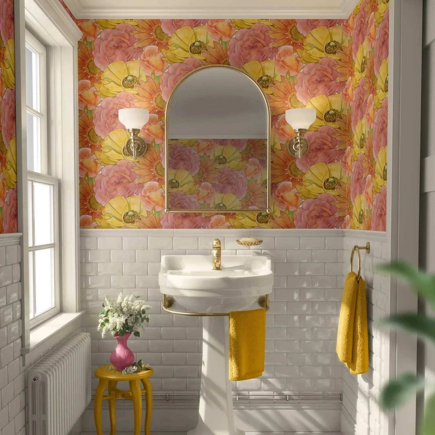
Watercolor florals, warm brass, and a few simple accents turn this petite bathroom into a daily mood-lift — a colorful, lived-in example of how intentional wallpaper can make even small spaces feel joyful and alive. — Collection: Watercolor Florals; Pattern: 02 (Flower Foursome); GH Studio Reference #16822100
The Quiet Power of Living With Color
Many people light up when they see a colorful room, then immediately say: “I love it… but I could never live with that much color.”
Somewhere along the way, we absorbed the idea that neutrals are “safe” and calming and color is risky, loud, or something you’ll regret later.
But when we look at both research and real homes, a different story emerges:
Our environments have a measurable impact on mood and wellbeing.
Color — used thoughtfully — can support focus, creativity, comfort, and joy.
“Colorful” doesn’t have to mean chaotic. It can be intentional, layered, and deeply personal.
In this post, I’m looking at what the science suggests, how it shows up in real interiors, and how you can bring more happiness-supporting color into your own or your clients’ spaces without feeling overwhelmed.
The Science: How Color & Environment Affect Mood
We don’t live in a vacuum; we live in environments, and those environments quietly influence how we feel.
Fields like environmental psychology and biophilic design have consistently found that:
People respond emotionally to color, light, and pattern.
Spaces that feel engaging, warm, and personally meaningful tend to support positive mood.
Environments that are overly stark, monotonous, or impersonal can leave us feeling drained, unfocused, or “flat.”
Color plays several roles here:
1. Color stimulates and focuses attention
Color is a type of visual stimulation. Certain hues and contrasts can:
Help us feel more awake and engaged
Support creative thinking and problem-solving
Make important areas in a room feel more inviting or noticeable
This doesn’t mean every surface should be bright — it means small, well-chosen doses of color can give your brain something pleasant to “hook onto” throughout the day. In my work with interiors clients and trade partners, this often looks like one patterned wall, a few intentional textiles, or a single strong color note that quietly anchors the room.
2. Color connects to memory and emotion
We all carry personal associations with color:
A sunlit yellow that reminds you of a favorite kitchen
A deep blue that feels like the ocean or a twilight sky
A leafy green that recalls a forest walk or a childhood backyard
When those memories are positive, bringing those colors into your space can be emotionally grounding and uplifting. Your rooms begin to mirror the places where you feel most yourself.
3. Color works with light and nature
Color doesn’t exist alone; it interacts with:
Natural light
Artificial lighting
Materials (wood, stone, metal, textiles)
Views to the outdoors
Warm colors can enhance evening light and create a cozy, gathered feeling. Cooler colors can soften bright, hot daylight and offer a sense of calm. Colors inspired by nature — greens, sky blues, earth tones, florals, botanicals — often feel especially supportive because they echo environments our nervous systems tend to recognize as safe and nurturing.
The science isn’t saying: “Paint everything bright and you’ll be happy.”
It’s saying: your surroundings matter — and color is one of the simplest tools you can use to support how you feel.
Why All-Neutral Isn’t Always the Calming Answer
Neutrals can be beautiful. They can absolutely be calm, elegant, and timeless.
But “neutral = calm” isn’t the whole story.
Too much sameness — in color, texture, or light — can actually feel:
Fatiguing (your eye has nothing to rest on, only to drift past)
Impersonal or unfinished
Emotionally “blank,” especially if the colors don’t reflect you
If you’ve ever felt strangely low or uninspired in a perfectly styled but monochromatic room, you’ve experienced this. The space might be beautiful from a distance, but it doesn’t always feel engaging to live in.
Colorful spaces, on the other hand, can:
Signal warmth and welcome (“This home has people and stories in it.”)
Offer visual “moments of delight” throughout the day
Reflect your actual personality, not just the latest mood board
The goal isn’t to abandon neutrals — it’s to let color and neutrals work together so your rooms feel both grounded and vividly alive.
What “Colorful” Actually Means (Spoiler: Not Just Bright Walls)
When I talk about “colorful spaces,” I don’t necessarily mean every wall is saturated and every object is bold.
In practice, a colorful space can look like:
A calm room of soft neutrals with a joyful patterned wallpaper in a niche or behind shelves
A moody space with deep, inky walls and a few vibrant, botanical cushions or art pieces
A mostly light, airy palette with one or two confident colors pulled through wallpaper, fabric, and accessories
Colorful can mean:
Layered rather than loud
Curated rather than chaotic
Emotionally true rather than trendy
The common thread in spaces that make people feel good isn’t “maximum color.”
It’s intentional color — chosen because it supports the way they want to live, feel, and gather.
The Practice: How to Use Color to Support Happiness in Everyday Life
Let’s bring this down from theory into what you can actually do in a home or project — whether that’s your own space or a client’s. In the bathroom above, the watercolor floral wallpaper does most of the emotional heavy lifting, while the brass fixtures, warm golden wood stool, pink vase, gold towels & area rug, and fresh flowers quietly support the story. It isn’t a large room or a major “showpiece” space — it’s a simple, functional guest bathroom. And yet, because the color and accents are intentional, it becomes a small, everyday mood-lift. That’s the power of color in practice: you don’t have to overhaul your entire home to feel the difference; sometimes one thoughtfully colorful room is enough to change how you move through your day.
Here are some approachable ways to let color support your wellbeing:
1. Start with one “happy corner”
Instead of thinking, “I have to redo the whole room,” choose one small area:
A reading chair
A breakfast nook
A desk corner
A powder bath
Ask yourself: What colors make me smile when I see them? Then:
Add a colorful patterned wallpaper behind that area
Introduce a bold or patterned cushion or throw
Hang a piece of art that pulls those colors together
It’s easier to be brave with color on a smaller “stage” — and you get to experience the mood shift immediately.
2. Use your own joy cues, not generic rules
Instead of starting with a trend, start with what actually lights you up:
A scarf you love and wear constantly
A photo from a favorite trip
A garden, forest, or coastline you can’t stop photographing
A textile or wallpaper sample you keep coming back to
These are clues to the colors your nervous system already responds well to. Build your palette from there — those colors are far more likely to continue making you happy over time than anything dictated by a “color of the year.”
3. Let pattern do the heavy lifting
Patterned wallpaper and fabric are wonderful tools because they:
Combine several colors into one harmonious story
Add interest without having to scatter random accessories everywhere
Help bridge multiple hues in a room so nothing feels out of place
A floral or geometric wallpaper that includes your favorite dusty pink, deep green, and warm neutral can instantly make the space feel intentional and layered, even if everything else is quite simple. In many projects, a single well-chosen wallpaper or fabric quietly carries the color story, which lets the rest of the space stay simpler and more edited.
4. Make friends with “low-risk” color
If you’re still warming up to the idea of bolder color, start with elements that are:
Easy to swap out
Lower commitment than repainting or redoing major furniture
Think about:
Pillows and throws
Lampshades
Art prints
Accent chairs or ottomans
A single wall of wallpaper or a wallpapered niche
You’ll get the emotional benefit of more color without feeling like you’ve changed everything at once.
5. Pay attention to light
The same color can feel totally different in:
North-facing vs. south-facing rooms
Morning vs. evening
LED vs. warm incandescent bulbs
Before you commit:
Look at wallpaper and fabric samples at different times of day
Notice how the color feels under your actual lighting, not just on a screen
Ask yourself: Do I feel more relaxed, more energized, or more “myself” in this light with these colors?
Light plus color is where the real magic — and the real “happiness factor” — lives.
For the Color-Shy: Bringing in Color Without Regret
If you’ve lived in neutral spaces for a long time, the idea of adding color can feel like a personality shift. It doesn’t have to be.
Here are gentle, practical steps:
Create a mini mood board.
Collect 5–10 images of rooms, textiles, or nature scenes you honestly love. Look for the colors that repeat.
Order generous samples.
Larger wallpaper and fabric samples (like the 1’ x 2’ wallpaper samples I offer) let you see more of the pattern and color shifts — far more helpful than a tiny swatch.
Test in your real space.
Tape samples to the wall or drape them over furniture. Leave them up for a few days. Live with them.
Notice your reactions.
Do you smile when you walk past? Do you keep pausing to look? That’s useful data.
Start with one decision.
Maybe it’s a patterned wallpaper in a powder room, or upholstery for a single chair. Let that choice teach you what you want more of — or less of — next.
Color confidence isn’t about being fearless.
It’s about getting curious and taking small, thoughtful steps.
How I Design Colorful Spaces for Real People
My own work sits at the intersection of:
Wallpaper and fabric design
Interior decorating
Color psychology and lived experience
When I design a colorful space — or a pattern destined for walls and textiles — I’m always thinking about the human being who will live with it every day.
That usually looks like:
Asking how you want to feel in the space (calm, energized, cozy, inspired).
Looking at the colors and patterns you’re repeatedly drawn to — sometimes in your wardrobe, sometimes in your travel photos.
Building a palette that feels emotionally true for you, then translating it into wallpaper, fabrics, and layered textures that support that story.
Making sure there’s a balance of color, pattern, and quiet — so the room feels alive, not overwhelming.
The goal isn’t to make a magazine-perfect room.
The goal is to create a space where you naturally breathe a little deeper, smile a little more, and feel more like yourself.
When I collaborate with interiors professionals, my role is usually to support the overall concept by refining the pattern and color story in wallpaper and fabrics, so the space feels cohesive, lived-in, and emotionally true to the client.
Bringing It All Together
Colorful spaces don’t “fix” life. But they do shape how we experience our days:
A warm, patterned breakfast nook can make mornings feel a little more hopeful.
A leafy, color-rich reading corner can become a refuge you genuinely look forward to.
A joyful wallpaper in a hallway or powder room can turn a purely functional area into a tiny moment of delight.
The science tells us our environments influence mood.
Practice shows us that intentional, personal color can make daily life feel richer, warmer, and more joyful.
You don’t have to become “a color person” overnight. You just have to start listening to what makes you feel alive — and give those colors a place to live with you.
Ready to Explore a More Colorful Home?
If you’re craving more color but not sure where to begin — or you’re a designer guiding a client into more color — this is where I can help.
I typically work with homeowners, interior designers, and trade partners to:
Identify the colors and patterns that genuinely support their wellbeing
Design wallpaper and fabric pairings that feel joyful, grounded, and livable
Translate “I want to feel happier in my home” into a real, tangible color-and-pattern plan
You can:
Explore my wallpaper collections and fabric collections; samples can be purchased at the bottom of each collection page.
Inquire about design consultations or trade collaborations if you’d like support on a specific project or client brief.
And, if you’re not already working with an interior decorator or specialist, here are ways we might work together.
Subscribe to Surface & Space for new articles in your inbox and instant access to two free printable substrate guides (wallpaper & fabric), plus a bonus PDF on Conscious Creators of Gentle Textiles.
© 2025 Gabrielle Hewson. All rights reserved. You’re welcome to share links to this article, but please don’t copy or republish the text or images without my written permission. For licensing, permissions, or any other use beyond linking, please contact me directly.