
The Jewel Box Room: Colorful Wallpaper & Fabric Combinations
A jewel box room isn’t about size; it’s about impact. When color, wallpaper, and fabric work together in a small or contained space, the result can feel like opening a favorite piece of jewelry: surprising, personal, and quietly luxurious. In this post, I’m sharing how to think about colorful wallpaper and fabric combinations in jewel box rooms—so those using the space feel wrapped in a story, not overwhelmed by pattern.
What makes a room feel like a “jewel box”: small footprint, big personality
A jewel box room is less about square footage and more about concentration—of color, pattern, and intention. Think:
Powder rooms, pantries, and butler’s kitchens.
Breakfast nooks, reading corners, and window seats.
Petite offices, mudrooms, or little vestibules between larger spaces.
In these spaces, surfaces are closer together, and the eye takes everything in at once. That closeness is exactly what allows color and pattern to feel rich and immersive instead of loud.
A room starts to feel like a jewel box when:
The walls (and sometimes the ceiling) are wrapped in a cohesive color or pattern.
Fabrics echo or complement the story on the walls.
Hardware, lighting, and small details feel considered, not random.
It’s the difference between “we added some wallpaper” and “this little room feels like its own beautiful world.”
Why jewel box rooms are perfect for color and pattern
Smaller or more contained spaces are surprisingly forgiving for bold choices. A few reasons:
They’re often transition or “pause” spaces. — Powder rooms, pantries, and narrow kitchens are places those using the space move through or step into briefly, so a strong color or pattern feels like a delightful moment rather than a constant shout.
They’re easy to define as their own chapter. — A jewel box room can nod to the rest of the home’s palette while still feeling distinct—like a secret tucked inside.
They hold pattern well. — Doors, windows, cabinetry, and built-ins break up wall surfaces. Wallpaper and fabric can weave around these elements, creating rhythm and interest without needing vast, blank expanses.
Because the scale is smaller, each decision carries more weight. That’s where pairing wallpaper and fabric thoughtfully matters most.
Starting with the story, not the swatches
Before choosing a pattern, I like to ask:
What is this room’s “job” emotionally? — Should it feel energizing? Moody? Whimsical? Quietly glamorous?
When is it used most? — Morning light at breakfast, evening candlelight at dinner parties, daytime work, nighttime wind-down?
What’s happening just outside this room? — Does it open off a calm, neutral hallway? A busy family room? A more formal dining space?
Once I have a sense of the role this room plays, the wallpaper and fabrics become tools to tell that story:
A pantry that feels like a cheerful secret garden.
A powder room that feels like a welcome respite; a magical world of its own.
A breakfast nook that feels like stepping into soft morning light, even on grey days.
Choosing wallpaper for a jewel box room
Wallpaper is often the main character in a jewel box room, so it helps to think about: scale, color, and complexity.
Scale
Small-to-medium scale patterns often sit best in tight spaces—florals, botanicals, geometrics, or stripes that don’t overwhelm close up.
Very large motifs can work, but usually benefit from simpler furnishings and plenty of breathing room.
Color
Saturated color can feel enveloping and cozy, especially when carried onto the ceiling or trim.
Softer color can still feel like a jewel box if the pattern has enough detail and the fabrics add depth.
If nearby rooms are quiet and neutral, the jewel box can be a place to lean a little braver with color—a deep teal pantry, a blush-and-berry powder room, a leafy green nook.
Complexity
If the pattern is intricate and busy, keep some of the other elements calmer.
If the wallpaper is more graphic or simple, fabrics can layer in additional texture and detail.
The key is balance: one element leads, the others harmonize.
Pairing fabrics with colorful wallpaper
Once the wallpaper direction is set, fabrics can either echo, soften, or counterbalance it.
1. Echoing the wallpaper
Here, fabrics pick up colors and motifs directly from the wallpaper:
A banquette cushion in a tone pulled from the background or leaves.
Café curtains that repeat one of the accent colors in a smaller pattern or soft stripe.
Seat cushions that reference the wallpaper’s palette in a quieter way.
This approach creates a very cohesive, wrapped-in feeling—perfect for truly jewel-box moments.
2. Softening the intensity
If the wallpaper carries a lot of pattern or strong color, fabrics can act as a resting place:
Solids or nearly solids in textured weaves.
Small-scale patterns that read almost like texture from a distance.
Soft linens or cottons that invite touch and calm the eye.
This lets the wallpaper stay special while keeping the room comfortable for those using the space every day.
3. Counterbalancing with structure
Sometimes, a structured fabric (like a stripe or quiet plaid) helps define edges and add order to a more organic wallpaper:
A striped cushion on a window seat against a loose floral or botanical.
Tailored chair cushions in a subtle plaid in a room with a more lyrical print.
The interplay between “organic” and “structured” often adds a quiet sophistication.
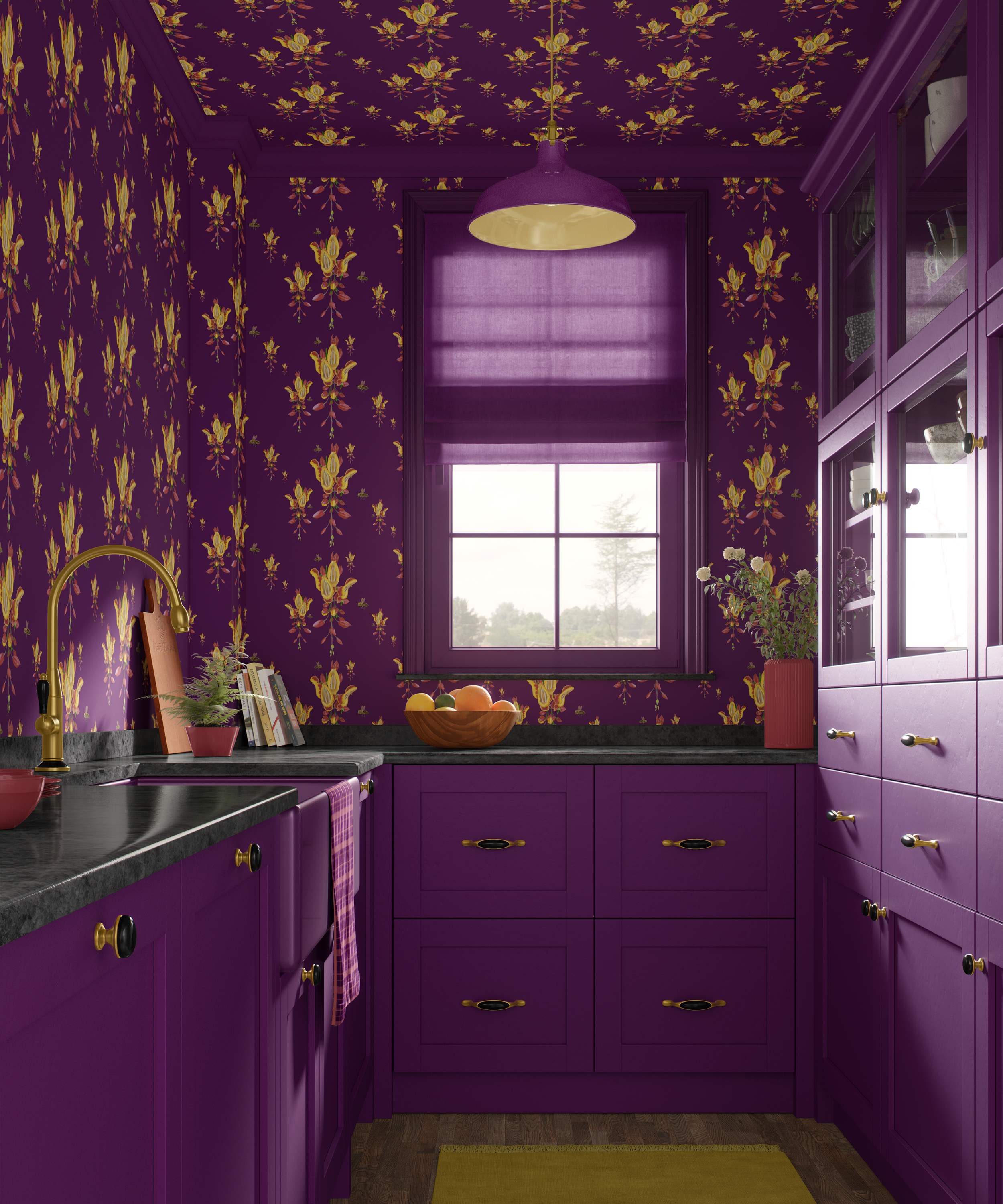
A French kitchen as a jewel box example
The narrow French kitchen above is wrapped in peaceful but boldly-colorful wallpaper on all exposed walls as well as the ceiling. Glass-front cabinets, when opened, reveal curated everyday pieces.
Fabrics enter in small but important ways:
A subtly-textured fabric Roman shade carries the rich plum background of the wallpaper.
Cabinetry, window framing, and molding at the ceiling carry through the rich plum as well.
Display/every-day-use plates, bowls, flower pots, and vases gently pull from the pink variants in the wallpaper.
A custom ceiling light in rich plum and gold gently lights the space with warmth.
A tea towel in rich plum and soft pink plaid from the collection add a more structured print that ties in nicely into the jewel-toned space.
The wallpaper carries the story; the fabrics and accessories make the space feel usable, warm, and inviting.
Practical considerations: durability and cleanability
Even in a jewel box room, practicalities matter:
Kitchens and breakfast nooks
Consider performance or highly durable fabrics for cushions and seat pads.
Choose wallpaper types that tolerate light cleaning, especially around high-touch zones.
Powder rooms
Humidity-resistant papers and paints can be helpful.
Fabrics might appear in hand towels, a small shade, or a skirted sink.
Pantries and utility spaces
Tougher fabrics on cushions or bench seats.
Wallpaper placed thoughtfully away from heavy splash or scuff zones (or paired with wainscoting).
Beauty and function don’t have to compete; they can inform each other.
Intentional, not chaotic
Jewel box rooms can be a wonderful way to introduce color and pattern without committing to larger spaces and provides:
a contained space to be a little braver;
the rest of the home with calm, while the jewel box serves as a special moment;
a wonderful reveal, respite, visual adventure, pop-of-wow that surprises and delights.
How to know if a jewel box room is right for those using the space
One doesn’t have to love bold pattern everywhere to enjoy a jewel box room. It may be a good fit if:
There’s curiosity about wallpaper but fear in starting in a large room.
There’s a small space home or business space that feels more “utility” than “designed.”
There’s desire for a space that provides a moment to feel particularly memorable—something guests and visitors comment on.
It’s perfectly fine to start small:
One patterned wall in a pantry or nook.
A powder room with patterned walls and a solid ceiling.
A quiet, tone-on-tone pattern paired with colorful fabrics.
This can always be built upon in future phases as comfort with color and pattern grows.
If you have a small space that feels more forgotten than intentional—a pantry, powder room, narrow kitchen, or nook—it might be the perfect candidate for a jewel box treatment. Colorful wallpaper and fabric, chosen thoughtfully, can turn it into a favorite spot rather than a pass-through.
If you’re an interior designer, decorator, or an interiors professional and want a partner on wallpaper and fabric combinations for your own jewel box projects, I’d be delighted to collaborate. Contact me.
If you’re a homeowner or business owner who would like help imagining what a jewel box could look like in your space, and you’re not already working with an interior designer or decorator, feel free to contact me.
Check out my Wallpaper & Fabric collections.
Subscribe to Surface & Space for new articles in your inbox and instant access to two free printable substrate guides (wallpaper & fabric), plus a bonus PDF on Conscious Creators of Gentle Textiles.
© 2025-2026 Gabrielle Hewson. All rights reserved. You’re welcome to share links to this article, but please don’t copy or republish the text or images without my written permission. For licensing, permissions, or any other use beyond linking, please contact me directly.