
Color Drenching with Fabric & Wallpaper: A High-impact, Low-risk Strategy
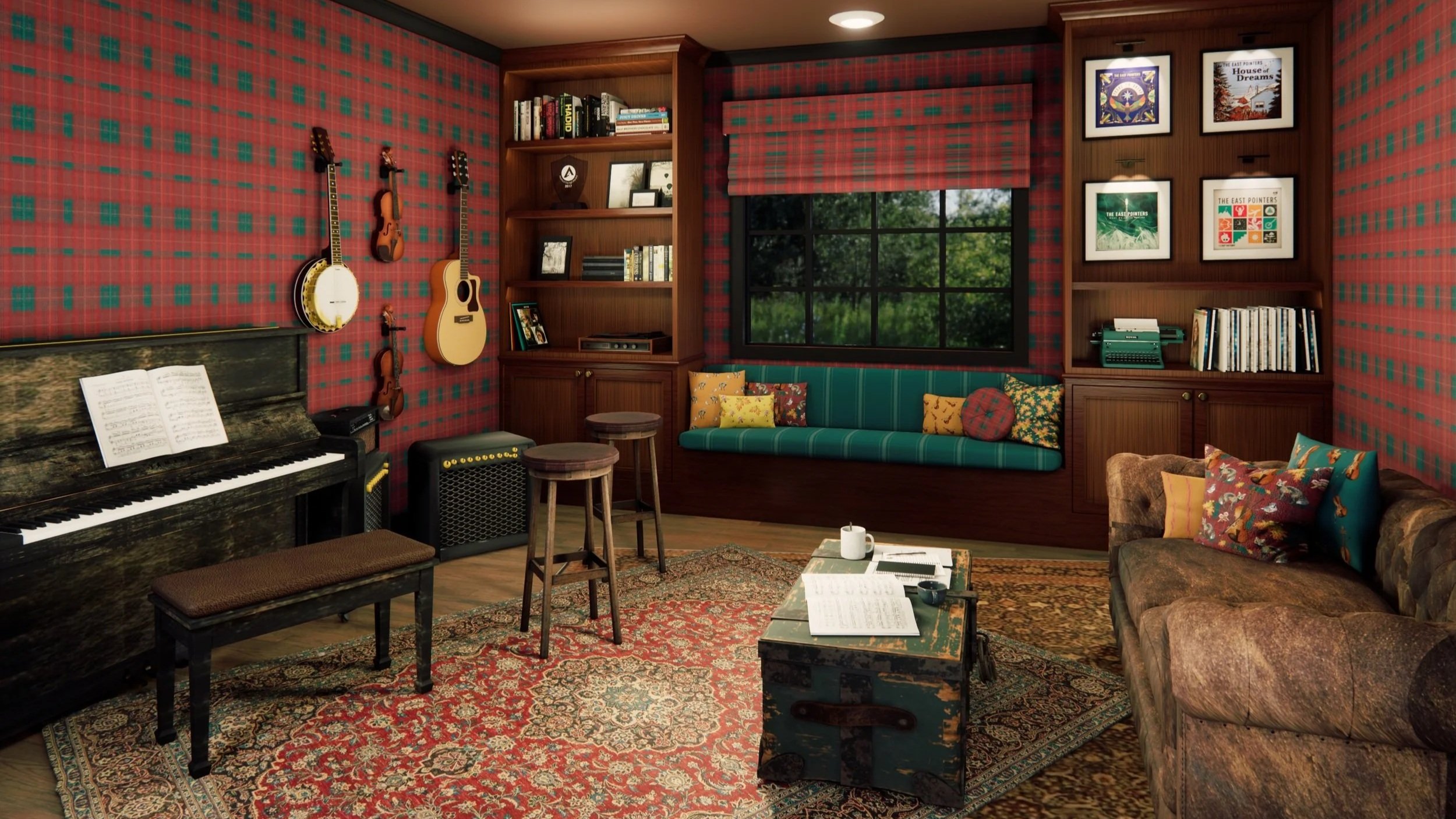
Color drenching doesn’t have to mean “everything is bright and scary.” When fabric and wallpaper are used together, fully immersed, tone-on-tone rooms feel sophisticated, edited, and even incredibly photogenic—without locking into something that will be regretted later. In this post, I’m sharing how to approach color-drenched schemes with textiles and wallcoverings so they stay high-impact, but surprisingly low-risk.
What color drenching really is (and what it isn’t)
There’s a misconception that color drenching always means saturated, high-contrast rooms where every surface is shouting. In reality, color drenching is simply: carrying one hue (or tight family of hues) across multiple surfaces—walls, upholstery, textiles, and sometimes trim—so the room feels like a complete color story.
Done well, it can look:
Tailored and quiet (think layered neutrals or soft blues).
Dramatic and cozy (deep greens, inky plums, smoky terracottas).
Fresh and optimistic (muted corals, sage, chalky ochres).
Using fabric and wallpaper as part of that “drench” lends texture, pattern, and material variation to keep room from feeling flat or overwhelming.
Why fabric + wallpaper are secret weapons in color-drenched rooms
Paint alone can only do so much. When textiles and wallcoverings are woven into a single color story, the design becomes more nuanced—and more forgiving.
Wallpaper contributes:
Depth and gentle movement — A tonal pattern adds subtle rhythm so the color doesn’t read like a flat block.
Soft variation within the hue — Slightly lighter or darker tones within the repeat keep the walls from feeling heavy.
Clear focal points — One patterned wall or a fully wrapped room gives you a “hero” moment that anchors all the textiles.
Reupholstery and interior fabrics contribute:
Tactility — Linen, velvet, bouclé, and textured weaves in the same color family keep the room from feeling like a paint chip.
Soft contrast within the same hue — matte vs. sheen, smooth vs. nubby—that’s where the interest lives in a drenched room.
Longevity — Recovering key pieces in your core color means the room feels intentional, even if accessories change later.
Together, wallpaper + fabric enable us to go deeper on color while letting pattern and texture quietly soften the edges.
Why color drenching is actually low risk when planned well
Color feels risky when it’s random. A well-planned, tone-on-tone scheme is often easier to live with than a room full of competing colors that never quite relate.
Color drenching can be a safer bet because:
You’re editing the palette down, not adding more. A restrained, monochromatic or near-monochromatic scheme reads calm, even when the color is rich.
You can control where intensity lives. Maybe the walls are mid-depth, while the upholstery is a touch lighter and the patterned textiles gently bridge the gap.
It photographs and ages well. Drenched rooms tend to feel timeless when the hue is chosen with care, especially in quieter, more complex colors (think smoke, clay, moss, ink).
You’re building around existing architecture and pieces. Reupholstery allows you to bring older furniture into the new color story instead of fighting it.
In short, “color drenching” is about committing to a deliberate, edited vision.
Color-drenching; an orchestrated flow
Here’s one way I’ve employed to structure the process so it feels clear and repeatable.
Starting with a lead hue
Starting with one color family and naming it clearly:
“Dusty blue”
“Olive green”
“Warm clay”
“Soft charcoal”
I might start with slightly grayed, softened tones that have range.
Deciding where the “strongest” version lives
Picking one of these as the anchor/main stage might look like:
Walls (paint or wallpaper) – strongest hue here, softer on upholstery.
Upholstery – hero sofa or chair in the richest tone, lighter walls.
Textiles – multiple layered fabrics holding the color, with walls supporting quietly.
One anchor is usually enough.
Layering in fabric textures within that hue
Using at least three texture types in similar tones such as a:
woven or linen-like base cloth (sofa or large chair).
velvet or chenille in the same hue, slightly deeper or lighter (pillows, ottoman).
small-scale patterned fabric that mixes your main color with a neighbor tone (bench, accent chair, or roman shade).
…keeps the color story dynamic and tactile, instead of feeling like a solid block.
Letting wallpaper be the visual “bridge”
Wallpaper can:
introduce the hue in a softer, patterned way on walls, while fabrics carry the solid, or
be the boldest expression of the color, with textiles echoing a quieter version.
Choosing a pattern that:
Feels aligned with the room’s mood (calm, lively, cocooning).
Includes main color plus 1–2 supporting tones (neutrals or neighbors on the color wheel).
Has a scale that suits the space—mid-scale for most rooms, larger scale for big walls or simpler furniture, smaller-scale if the pattern is intended to read like texture.
Carefully placing “outsider” colors
A color-drenched room doesn’t mean another hue can never be used. It just means outsiders are strategic:
A slim line of contrast in piping or trim.
A warm wood tone or metal finish.
Small accessories that can be changed seasonally (pillows, throws, books, flowers, art).
When accents are kept small and repeated a couple of times in the space, they feel intentional, not random.
Where color drenching with fabric + wallpaper works especially well
Some spaces are practically built for this approach.
Bedrooms
Wallpaper behind or around the bed sets the mood.
Headboard, bench, and cushions in related tones and textures create a cocooning feel.
Small sitting rooms and snug living rooms
Wrapping walls in pattern or color, then repeating the hue on upholstery, makes the space feel deliberate and cozy.
Dining rooms
A strong wall color or patterned wallpaper, paired with upholstered dining chairs in a related hue, feels instantly “finished” and evening-ready.
Home offices and studios
One color family across walls, a key upholstered piece, and soft furnishings can create a focused, statement feel without adding visual chaos.
Color drenching shines wherever you want the room to read as a cohesive “jewel box”—even if the footprint is modest.
Using reupholstery to step into color (without changing everything)
An entire room doesn’t need to be rebuilt to color drench this way. Reupholstery is one of the easiest tools for moving toward a color-drenched look gradually.
You can:
Reupholster one hero piece in your chosen color—sofa, pair of chairs, or a bench—and then echo the shade in wallpaper, cushions, or a window treatment.
Use patterned fabric that already carries the palette you want, then match or slightly adjust wall color to that pattern. This instantly makes the color story feel intentional.
Transform inherited or “almost right” pieces by bringing them into the new color world.
This is refinement rather than starting over—and it opens the door to using bolder, richer hues.
Reframing mindset: “high-impact, low-risk”
Color drenching is:
Narrowing down to one beautiful hue and exploring its softer and richer versions so everything feels connected.
Creating flexibility; where the palette looks just as good with different art or pillows seasonally or down the line.
Connection to emotion — an approach that is about how one wants to feel the space: wrapped, grounded, uplifted; color supports that.
A considered design decision.
If you’ve been tempted to try a richer, more immersive color story—but worried it might feel like “too much”—color drenching with fabric and wallpaper is a beautiful way to experiment. Whether you’re ready to reupholster a single hero piece, wrap a room in pattern, or map out a full-home palette, you can reach out to me to start the conversation.
Curious how my wallpapers and fabrics might translate into a color-drenched scheme in your own home or project? You can request samples directly from any collection page by clicking “Request A Sample” on my website, and we’ll build a layered, livable color story together.
Subscribe to Surface & Space for new articles in your inbox and instant access to two free printable substrate guides (wallpaper & fabric), plus a bonus PDF on Conscious Creators of Gentle Textiles.
© 2025-2026 Gabrielle Hewson. All rights reserved. You’re welcome to share links to this article, but please don’t copy or republish the text or images without my written permission. For licensing, permissions, or any other use beyond linking, please contact me directly.