
Designing for Emotional Impact: Pattern as a Storytelling Tool
Every pattern carries a feeling. Some whisper, some hum, some practically sing. When we treat wallpaper and fabric as storytelling tools—not just decorative layers—we can shape the emotional experience of a room as clearly as we shape its floor plan. In this post, I’m unpacking how designing with pattern intentionally creates spaces that don’t just look beautiful; they feel like the story that wants to be told.
Pattern as emotional language
Our bodies respond to rooms before our minds start making judgment calls. Pattern is one of the fastest ways to a desired tone.
Even without words, pattern can suggest:
Calm – open, flowing motifs with plenty of breathing room.
Energy – tighter repeats, higher contrast, and clearer geometry.
Nostalgia – traditional florals, checks, and small-scale repeats that echo memory.
Luxury – refined line work, depth of color, and thoughtful placement on key surfaces.
When pattern is treated as a language, engagement and perception shifts to “Does this feel like the story that wants to live here?” That’s where design becomes much more personal—and much more effective.
Consider the desired emotion before choosing the pattern
I like to start with one clear intention per space; framing a conversation with:
“This room wants to feel… restful, cocooning, and a little romantic.”
“This space want stop feel… bright, optimistic, and creative.”
“This studio wants to feel… grounded, intelligent, and quietly confident.”
Once the emotional “headline” is set, pattern becomes a way to support that, not compete with it. Then ask: “Does this pattern help that feeling—or fight it?” That one filter alone eliminates a lot of pretty-but-not-right choices.
Use pattern qualities to steer mood
Different qualities in a pattern speak different emotional dialects. To understand them is to be able to shape very specific feelings on purpose.
Line & shape
Curved, hand-drawn lines — Feel human, approachable, and soft. Great for bedrooms, reading nooks, and family rooms.
Straight, precise lines and geometrics — Read as structured, modern, and focused. Ideal for offices, studios, and spaces where clarity matters.
Organic, botanical shapes — Suggest growth, comfort, and connection to nature—especially powerful in rooms where you want people to exhale.
Scale & spacing
Large-scale motifs with air around them — Feel confident, serene, and contemporary. They slow the visual tempo.
Mid-scale repeats — Feel steady, reassuring, and balanced—excellent for everyday spaces.
Small-scale, closely spaced prints — Feel intimate and nostalgic, and in the right palette can feel tailored and “finished.”
Contrast & color story
Low-contrast, tonal patterns — Whisper. They create a mood without shouting, often perfect for restful or contemplative spaces.
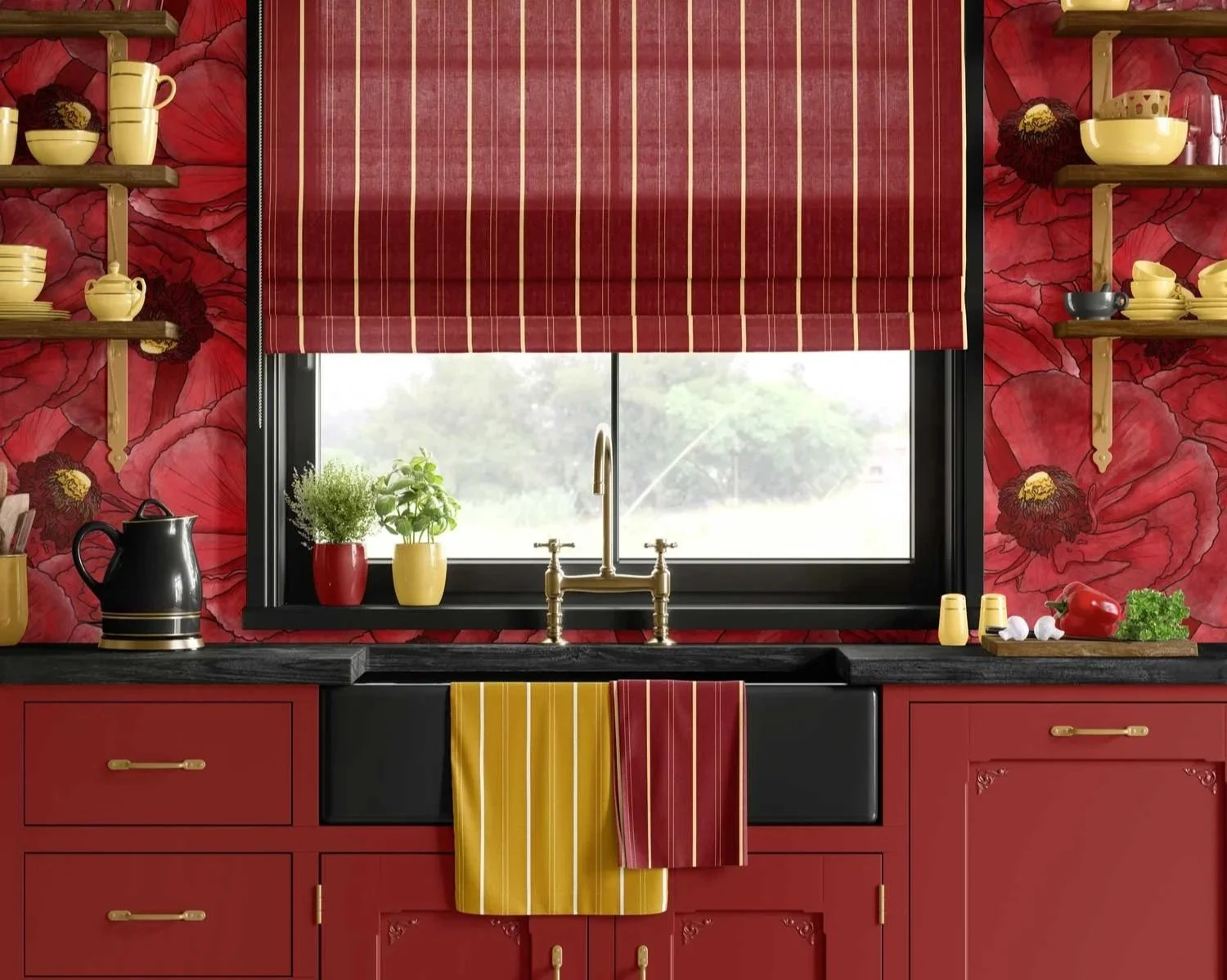
Medium contrast — Feels lively but livable—ideal for kitchens, dining areas, and family spaces.
High contrast — Demands attention and feels bold. Best used in short-burst rooms like powder baths, bars, or brand moments where you want a strong statement.
Combining line, scale, and contrast with intention, the composition of emotion rather than simply picking patterns.
Pattern attached to story, not just style
Every space has a story—whether it’s a family’s history or a business’s core message. Pattern can carry that story in a way that is felt every day.
For homes
Look for hooks like:
Places lived in or loved (coastal, urban, countryside, specific regions).
Activities valued (hosting, reading, cooking, creative work).
Personal symbols gravitated toward (certain flowers, stripes, motifs).
That can translate into pattern decisions:
A climbing botanical in a dining room for those who love gardening and gathering.
A tailored, rhythmic stripe in a hallway for those who love structure and order.
A softer, hand-drawn floral in a bedroom for someone craving comfort and gentleness.
For businesses
Choices anchored in:
Values (warm, precise, playful, classic).
The visitor’s journey (welcome, collaborate, celebrate).
Existing visual identity (logo shapes, colors, or origin story).
Pattern becomes the “subtitles” of that story—constantly running in the background, reinforcing what the space stands for.
Pattern placed where emotion peaks
Placement of pattern is just as important as pattern chosen. Consider the moments where emotions are naturally higher: arrival, gathering, resting, and working:
Arrival (entries, reception, corridors) — Use pattern to set the tone: welcoming, grounded, optimistic. A soft, rhythmic repeat can say “you’re home now” or “you’re in the right place.”
Gathering (dining rooms, breakfast nooks, living rooms) — Choose patterns that support connection—nothing so busy it overwhelms faces and conversation, but enough presence to make the room feel like an occasion.
Resting (bedrooms, reading corners, baths) — Let pattern slow the tempo: organic motifs, low contrast, and gentle movement that feels like a visual exhale.
Working (studios, offices, creative spaces) — Aim for patterns that support focus and flow—steady rhythm, clear geometry or restrained botanicals, and color stories that keep energy up without overstimulating.
When pattern is concentrated at these emotional “high points,” it punches far above its square footage.
Building a cast of supporting patterns
Storytelling isn’t just about the lead character; it’s about the supporting cast. In a successful pattern plan, there’s typically:
1 hero pattern — The main storyteller—often on a wall, ceiling, or major upholstered piece.
1–3 supporting patterns — Smaller scale or quieter pieces on cushions, benches, shades, or secondary walls. These reinforce the mood without competing.
Plenty of textured solids — Linen, velvet, bouclé, and matte paint act like pauses in the story—giving eyes and nervous systems a rest.
Emotionally, this reads as “layered but calm” rather than “busy”; providing a clear through-line experience, like chapters of the same book instead of a pile of separate magazines.
Connecting to the emotional story
Part of my role as an Interior Decorator is to help translate why certain patterns feel right or wrong to those who engage my services.
A few ways I might help guide that conversation:
Naming the feeling out loud — “This pattern will make the room feel more cocooning at night,” or “This stripe keeps the hallway feeling organized and purposeful.”
Telling a short story — “This is the pattern you’ll see behind your guests in every holiday photo.”
Using options that shift the emotion, not just the look by presenting two or three choices that tell slightly different stories: one calmer, one bolder, one more nostalgic and asking which version of the story feels most like them.
When we hear pattern described in emotional terms, we tend to make decisions more confidently—and feel more connected to the finished space.
If you’re ready for your rooms to do more than “look nice”—if you want them to tell a story and genuinely change how you feel in them—pattern is one of the most powerful tools we can use. Whether you’re a homeowner craving more emotional resonance at home, or a designer wanting to specify wallpapers and fabrics with more intent, you can reach out to me to start the conversation.
Curious which patterns might match the story you’re trying to tell? You can request samples directly from any collection page by clicking “Request A Sample” on my website, and we’ll explore the emotional language of pattern together. Visit my wallpaper and fabric collections.
Subscribe to Surface & Space for new articles in your inbox and instant access to two free printable substrate guides (wallpaper & fabric), plus a bonus PDF on Conscious Creators of Gentle Textiles.
© 2025-2026 Gabrielle Hewson. All rights reserved. You’re welcome to share links to this article, but please don’t copy or republish the text or images without my written permission. For licensing, permissions, or any other use beyond linking, please contact me directly.