
How Palette Choices Shape Emotion, Mood, and Meaning in a Space
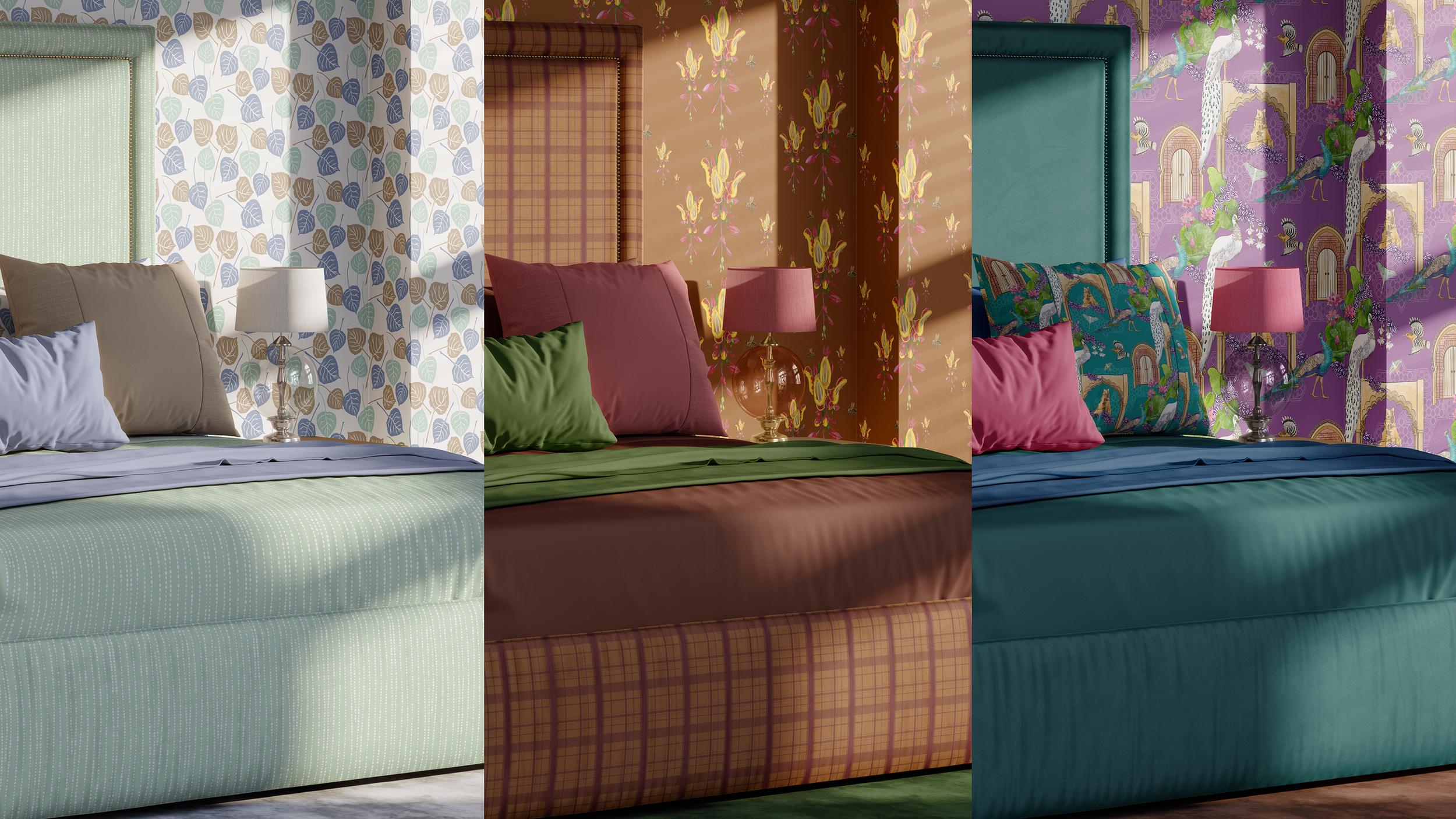
Color is never just a “finish.” The palette you choose quietly shapes how a space feels, how those using it move through their day, and even how they remember the room in hindsight. In this post, I’m using one bedroom corner styled three different ways—soft neutrals and gentle hues (bright, airy, breathes), warm earth tones and terracottas (cozy, warm, comforting), and deep jewel tones with simple but richly-colored accents (grounded, intimate, confident)—to explore how palette choices shape emotion, mood, and meaning in a space.
Color as a feeling, not just a swatch
If you’ve ever walked into a room and thought, “I don’t know why, but this feels right,” color was almost certainly part of that.
Not just the paint color, but:
how the wall color interacts with light
whether fabrics absorb or bounce that light
how deep or soft the overall palette feels
and how all of that lines up with what needs to happen in the room day to day
As an interior decorator and wallpaper/fabric pattern designer, I rarely think of color as “blue” or “green” in isolation. I think of it as:
a quiet exhale before bed,
a gentle nudge to wake up,
a cocoon at the end of a hard day,
or a subtle confidence boost.
One of my favorite ways to show this is by keeping almost everything the same—furniture, layout, even pattern—and changing the palette. That’s exactly what this post is built around.
One bedroom corner, three emotional directions
Imagine the same bedroom reading corner:
a comfortable chair
a small side table
a lamp
a bit of pattern (perhaps in wallpaper, a pillow, or the upholstery)
a framed piece of art
a soft rug anchoring the area
Then, imagine that corner styled three ways:
Soft, muted neutrals and gentle hues
Warm earth tones and terracottas
Deep jewel tones with simple but richly-colored accents
The shapes stay almost identical. It’s the palette that moves the story.
Palette 1: Soft, muted neutrals and gentle hues – the exhale
In the soft neutrals and gentle hues version, the room leans into calm.
You might see:
Soft, grayed versions of denim, sage, and taupe in a subtle wallpaper pattern.
Warm white or oatmeal tones in the chair and rug.
A whisper of one of those hues—perhaps a soft denim or sage—in a throw or cushion.
*ight, natural wood or soft oak at the table or frame.
How it feels:
light, breathable, and uncluttered
like early morning light, even in the evening
a place where the nervous system can drop a few notches
This palette is wonderful when:
the room is already small and you don’t want it to feel heavy
those using the space need true rest more than stimulation
you want pattern present, but not loud—a low-contrast, soft-edged design works beautifully here
In this version of the corner, wallpaper or fabric might carry a gentle, nature-inspired motif in softened tones. The pattern is there, but the low contrast keeps it from overpowering the stillness you’re trying to create.
Palette 2: Warm earth tones and terracottas – the grounded glow
Now, picture the same corner in a palette of warm earths and terracottas.
You might see:
a clay, sand, or terracotta wall—or a patterned wallpaper that pulls those tones in softly.
a chair in a warm neutral (mushroom, camel, or a deep cream).
a rug with earthy warmth: muted rusts, soft browns, maybe a hint of olive.
a throw or cushion that leans into cinnamon, brick, or baked-clay hues.
How it feels:
grounded and inviting
like late afternoon sunlight, even on a cloudy day
a place that invites lingering—reading, journaling, long conversations
This palette is especially lovely when:
those using the space crave warmth but don’t necessarily want bright color
you want the room to feel connected to earth and body—warmth in the floor, warmth in the walls
you’re working with existing wood tones, and want them to feel intentional rather than “stuck with”
Pattern in this palette can feel more tactile: think painterly brushstrokes, leaf forms, or soft geometrics that echo woven baskets or terracotta surfaces. It’s less about high contrast and more about depth.
Palette 3: Deep jewel tones and saturated accents – the cocoon
In the deep jewel tone version, the corner leans into drama and embrace.
You might see:
walls in an inky teal, midnight blue, or deep aubergine—painted or papered.
a chair in a saturated velvet or textured weave: bottle green, garnet, or a rich navy.
a rug that doesn’t fade into the background, but anchors the corner: perhaps a deep pattern or a tonal, plush solid.
Metallic or dark wood accents that catch small glints of light.
How it feels:
cocooning and cinematic
like the inside of a jewel box
a place for deep focus, late-night reading, or winding down
This palette works beautifully when:
the room gets soft evening light and you want to lean into that mood
those using the space love a sense of being held, rather than “opened up”
you’re comfortable with bolder color as long as it feels intentional and grown-up
Pattern here might be more pronounced: organic scallops, stylized florals, or graphic motifs that feel sophisticated rather than playful. The key is to balance saturation with enough “inkiness” or depth that it feels enveloping, not hectic.
Same furniture, different story
What’s important to notice in all three:
The bones of the space don’t change much.
The furniture pieces are nearly identical.
The basic layout stays constant.
The shift in mood comes from:
wall color or wallpaper palette
upholstery and pillow tones
the depth of the rug color
how much light the surfaces absorb vs. reflect
The meaning of the room changes too:
In the soft neutrals and blues, the corner says: “Rest. Exhale. Take a breath.”
In the earth tones, it says: “Come in. Sit. Stay a while.”
In the jewel tones, it says: “You’re held. You’re allowed to go inward here.”
None of these are “right” or “wrong.” They’re just different answers to the same core question: How do you want this room to feel for those using it?
Where pattern enters the color story
Because I live in the world of wallpaper and fabric, I rarely separate palette from pattern.
A few ways I think about pattern inside each palette:
Soft neutrals + hues
Low-contrast pattern: pale blue on warm white, or soft taupe on cream.
Nature-inspired motifs—leaves, branches, clouds—can feel like a visual deep breath.
Earth tones + terracottas
Organic shapes and slightly irregular repeats feel especially at home here.
Pattern might echo pottery, textiles, or landscapes—quietly referencing the hand of the maker.
Jewel tones + inky accents
Bolder, more graphic patterns can live here, especially if they stay within a limited palette.
Metallic touches or layered tones (for example, pattern on pattern in similar colors) can feel like a quiet luxury.
In all three, the pattern is not an afterthought. It is a way of reinforcing what the color palette is already whispering.
For interiors professionals
If you’re an interior designer or decorator, you do this kind of palette thinking every day—often instinctively. My hope is that these three versions of the same corner give you:
a simple way to show those using the space how different a room can feel without changing the furniture,
language to describe why a palette choice isn’t just “this color vs. that color,” but a story about how the room will hold them,
and a reminder that pattern and color together can be adjusted in layers, not all-or-nothing.
If you’d like a collaborator who designs wallpaper and fabric with these emotional palettes in mind—and who can step in specifically on pattern, color, and decorating layers while you hold the broader architecture and planning—I’d be glad to talk about project-based work. The best way to start that conversation is here: Contact Me.
For those imagining your own room in three palettes
If you’re reading this as someone planning a bedroom, sitting room, or little reading nook, one gentle experiment is to:
keep your furniture and layout the same,
and imagine the room in at least two or three palettes before committing.
Ask yourself:
Do I want this corner to wake me up, or help me wind down?
Does my life feel busy enough that I’d like the room to be simpler? Or do I crave richer color right now?
Which version feels like the truest support for my routines—not someone else’s idea of “good taste”?
If you’d like help translating that into specific wallpaper, fabric, and decorating choices, I offer paid consultations and interior decorating services where we can focus in on a single room or a small group of spaces. Because that requires real time and attention, I’m not able to provide detailed, project-specific advice over quick emails—but I’m always glad to work together in a more structured way. You can begin that conversation via my Contact Me page.
You’re also welcome to explore my wallpaper and fabric collections on my website and notice which palettes you’re drawn to. That alone can be a revealing first step.
Stay in the color conversation
If this kind of color-and-feeling discussion is helpful, you can:
Subscribe to Surface & Space to have new posts land in your inbox on Fridays.
Get access to a growing library of subscriber-only resources—to help you think through pattern, color, and materials in your own time. I add to this collection regularly, so it becomes a little toolbox you can return to whenever you’re ready.
Whether you’re another interiors professional or simply someone who loves the idea of rooms that feel as good as they look, you’re very welcome here.
© 2025-2026 Gabrielle Hewson. All rights reserved. You’re welcome to share links to this article, but please don’t copy or republish the text or images without my written permission. For licensing, permissions, or any other use beyond linking, please contact me directly.