
When Fabric and Wallpaper Share the Stage Around a Window
When a window sits on a patterned wall, it’s easy to treat fabric as an afterthought—something you choose quickly once the wallpaper is up. But when wallpaper and fabric are planned together, the window wall can become one of the most grounded, satisfying moments in a room. In this post, I’m sharing how I think about “who leads, who supports,” using a kitchen sink window wrapped in my Tumbling Aspen Leaves (BTOI-TAL-02 Peach + Sage + Gray + Taupe) pattern as a case study—and then translating those ideas to other kinds of window-and-wall pairings.
Why window walls are such powerful pattern moments
Windows naturally pull attention. They’re where light enters, where views live, and where a lot of everyday tasks quietly happen—washing dishes, making coffee, watching the street wake up.
When wallpaper and fabric both live around a window, they:
frame that natural focal point
affect how bright or cozy the space feels
change how busy or calm the room reads
So instead of asking, “Which pattern should I put here?” I like to start with:
What needs to happen functionally at this window?
What do those using the space need to feel here—energized, soothed, focused?
Should the wall feel like a soft backdrop, or a true feature?
Once those questions are answered, you can decide which element takes the lead.
Start by deciding which element leads
Think of the window wall as a small stage with two strong performers: wallpaper and fabric. If both try to be the star, the scene can feel loud. If one leads and the other supports, the mood is clear and comfortable.
When wallpaper leads
Wallpaper is the natural lead when:
the pattern is bold, large-scale, or multi-colored
it wraps more than one wall
it’s already doing the heavy lifting for the room’s personality
In that case, I like fabric at the window to:
echo a color or line from the wallpaper without copying it exactly
offer a simpler pattern (stripe, small check, barely-there texture) or a solid with subtle weave
provide the functional light control or privacy the room needs
When fabric leads
Fabric can be the lead when:
the wallpaper pattern is very quiet or tone-on-tone
the window treatment is substantial (full-length drapery, layered shades)
you want the eye to land on the softness of the textile first
Here, wallpaper might become the understated partner: the pattern might be a fine stripe, tiny dot, or a small, textured weave that feels almost solid from a distance that supports the fabric’s story.
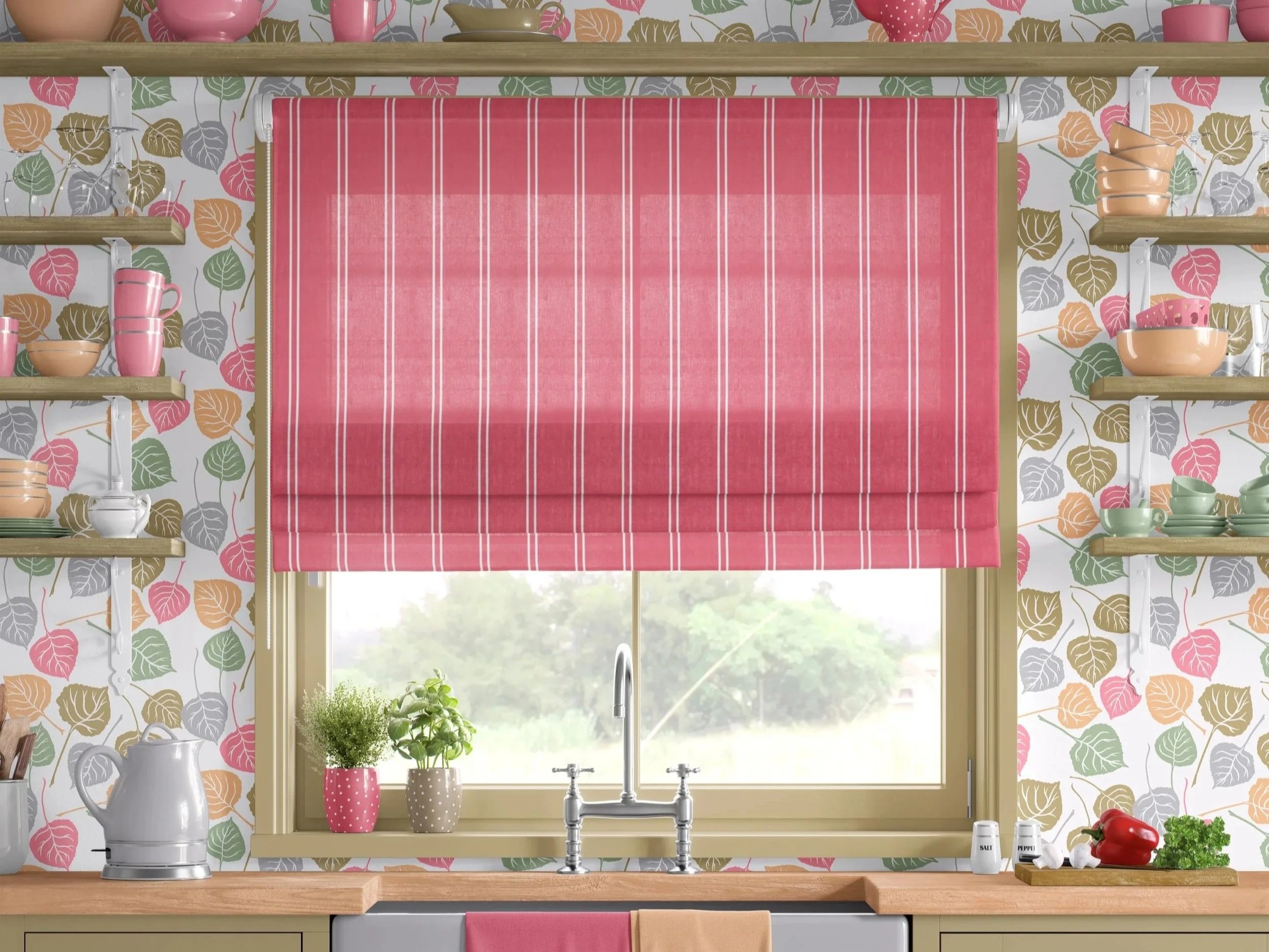
Case study – a kitchen sink window in Tumbling Aspen Leaves
In the Provence-style kitchen above, the pattern Tumbling Aspen Leaves (BTOI-TAL-02 Peach + Sage + Gray + Taupe) does a lot of the storytelling—but it’s the supporting decisions that keep the whole composition feeling calm rather than chaotic.
The paint color for the window frame, shelving, and cabinetry is lifted directly from one of the leaf tones in the wallpaper. Because that color repeats across multiple elements, the room reads as cohesive: the eye quietly understands that the trim, shelves, and cabinets all belong to the same family as the pattern behind them. Even with several leaf colors in play, a single repeated paint color lets the wall feel grounded instead of scattered.
The open shelves sit on simple white brackets, intentionally the same color as the wallpaper’s background. This lets the brackets visually disappear into the background so the shelves almost float; you read the leaves, the dishes, etc. as a rhythm of horizontals—not a busy grid of hardware cutting through the pattern.
At the window itself, the Roman shade becomes a soft focal point and a grounding element. Its blush background doesn’t need to perfectly match the pink in the leaves—instead, it can land a touch deeper in value, which keeps it from feeling sugary and gives the window real presence. That block of color gently calms the subtle movement of the wallpaper and anchors the hardest-working side of the room—the sink, counter, and view outside. The white stripes on the shade echo the wallpaper background, and everything feels related.
The result is that your attention naturally moves to the sink and window wall—the place where so much of the everyday activity happens—without the pattern ever shouting. The wallpaper sets the rhythm, and the shade, paint, and shelving quietly harmonize with it.
Translating the idea to other window-and-wall pairings
The same principles from that kitchen apply almost anywhere wallpaper and fabric meet at a window—even if the patterns, colors, or room type are entirely different.
Small spaces: let the window treatment steady the room
In powder rooms, mudrooms, and petite home offices, a lively wallpaper can make the space feel joyful—but it can also tip into visual noise if everything else shouts too. A simple Roman shade, woven shade, or café curtain can:
add a solid block of color to rest the eye
echo one of the wallpaper’s key hues
give the room a sense of structure amid the pattern
This is especially helpful when the wallpaper pattern has a lot of movement or contrast. Think of the shade as a calm pause in the middle of a good story.
Larger rooms: echo, don’t copy
In bigger rooms—living rooms, bedrooms, dining rooms—there’s usually more furniture, more textiles, and more viewpoints. Here, I like to create an easy conversation between wallpaper and window fabric by:
pulling a tone rather than an exact color match
echoing a curve from the wallpaper in the drapery rod, pleat style, or leading-edge trim
using scale thoughtfully: if the wallpaper pattern is medium to large, the fabric might be a fine stripe, micro-dot, or subtle herringbone
The goal is connection, not duplication. When everything matches too perfectly, the room can feel flat. When things relate without repeating, it feels layered and lived-in.
Practical tips for planning wallpaper + fabric together
If you’re sketching a project—or working alongside a designer or decorator—these steps can help:
Start with the feeling.
Ask: What should this window wall feel like? Fresh and bright, cocooned and moody, playful, or tailored?
Choose the lead.
Decide whether wallpaper or fabric is telling the main story here. That decision alone simplifies a lot of later choices.
Pull color with intention.
Use the wallpaper to choose trim and built-in colors, as in the Tumbling Aspen kitchen.
Let window fabric be a deeper or softer version of one of the wallpaper hues, rather than a perfect match.
Use texture to soften pattern.
If both wallpaper and fabric are patterned, keep at least one of them with a very tight, quiet motif or a strongly directional weave. This keeps the room from feeling jittery.
Think about the view from other rooms.
Windows framed in pattern are often visible from adjacent spaces. Make sure the colors and level of energy feel compatible with what they’re opening onto.
For interiors professionals
If you’re an interior designer or decorator, you’re already making nuanced decisions like this around windows all the time. My hope is that this gives you language you can use when:
explaining why a simpler shade or quieter pattern is actually the most elegant choice,
justifying a slightly deeper tone at the window to anchor a patterned wall,
or walking those using the space through the idea of “lead and support” so they understand why not every surface can be the main character.
If you’d like a pattern-focused collaborator who also thinks like a decorator, I offer paid consulting and project-based collaboration specifically around wallpaper, fabric, and finishing layers. The best way to explore that is through Contact Me, where we can talk about what your project needs and whether I’m a good fit to support you.
Visit my wallpaper and fabric collections, so you can explore patterns that are designed with these kinds of window-and-wall composition flexibility in mind.
For those imagining your own window walls
If you’re reading this as someone planning changes in your own kitchen, bedroom, or a small nook, you don’t have to figure everything out alone—but you also don’t need a whole-house overhaul to get thoughtful help.
I offer paid interior decorating services and focused consultations where we can:
look at your specific window-and-wall situation,
talk about how you want those using the space to feel there,
and choose wallpaper and fabric pairings that support that feeling in a practical, livable way.
Because this kind of guidance takes real time and care, I’m not able to provide detailed, project-specific advice over quick emails or messages. That thinking belongs inside a consultation or decorating engagement, where I can give your space the focused attention it deserves. If that sounds helpful, you’re warmly invited to start a conversation: Contact Me. And, in the meantime, explore my wallpaper and fabric collections. Browsing those can be a gentle way to notice what you’re drawn to before we ever talk about specifics.
Stay in the conversation
If you enjoy this kind of quiet, behind-the-scenes design conversation, you can:
Subscribe to Surface & Space to receive my new blog articles in your inbox each Friday, and
Get access to a growing library of subscriber-only resources—to help you think through pattern, color, and materials in your own time. I add to this collection regularly, so it becomes a little toolbox you can return to whenever you’re ready.
Whether you’re an interiors professional or someone simply curious about how wallpaper and fabric shape the feel of a room, you’re welcome to read, reflect, and reach out when you’re ready for more tailored, paid support.
© 2025-2026 Gabrielle Hewson. All rights reserved. You’re welcome to share links to this article, but please don’t copy or republish the text or images without my written permission. For licensing, permissions, or any other use beyond linking, please contact me directly.