
How to Balance Pattern Play in Maximalist and Minimalist Homes
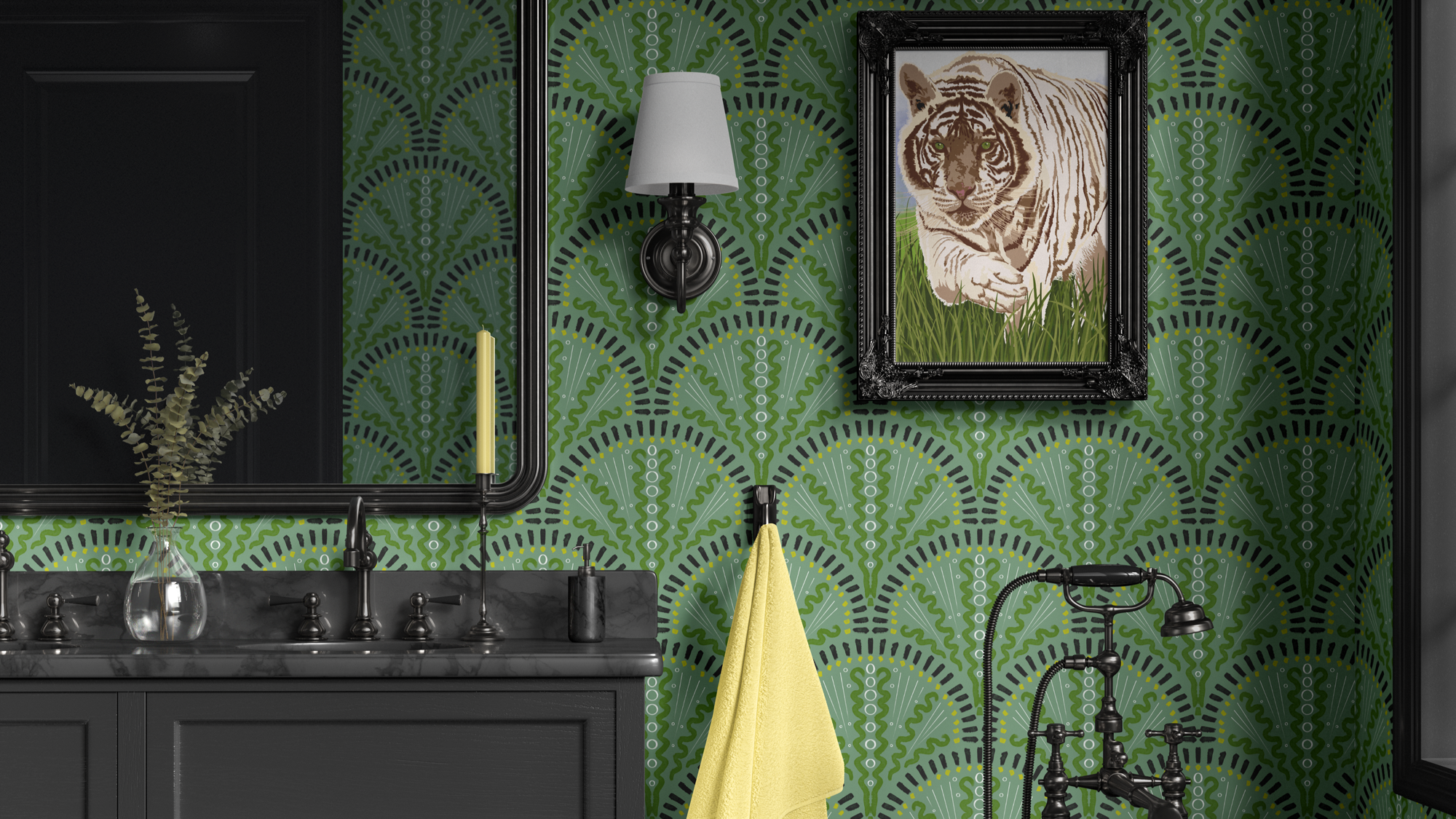
Feeling Africa wraps the walls in rich, organic pattern, while a classic white tub (below; hidden) and simple fixtures stay quiet. This is pattern balance in action—one confident print, paired with minimal, well-edited shapes. Pattern doesn’t belong to one style. It can feel at home in both maximalist and minimalist spaces—the difference is in how much, where, and how the eye gets to rest. In this post, I’m exploring how to balance pattern play in homes that lean maximalist, homes that lean minimalist, and all the nuanced spaces in between—so those using the space feel energized, not overwhelmed, and soothed, not bored.
Pattern as visual “volume”
Think of pattern as volume on a stereo:
Turned up, it can feel joyful, expressive, and full.
Turned down, it can feel calm, spacious, and focused.
Maximalist and minimalist spaces aren’t opposites so much as different volume settings:
A maximalist home tends to embrace more pattern, color, and collected objects.
A minimalist home tends to favor fewer pieces, cleaner lines, and more open space.
Both can use pattern beautifully when we think about:
How much visual information the brain is asked to process.
Where the eye gets to rest.
How the patterns support the room’s emotional job for those using the space.
Pattern in maximalist spaces: richness without chaos
Maximalism often gets mistaken for “everything everywhere all at once,” but the most compelling maximalist spaces are actually very considered. Pattern plays a big role, but it’s choreographed.
1. Choose a lead pattern (or two)
In maximalist rooms, it helps to have:
One hero pattern (often on wallpaper, a rug, or drapery).
One secondary pattern (like on a chair or bedding).
Everything else can echo or support those choices:
Pull colors from the hero pattern into solids and smaller prints.
Repeat certain shapes (curves, stripes, leaves) in quieter ways.
2. Vary scale on purpose
A common maximalist mistake is using too many patterns at the same scale. To keep richness without noise:
Use one large-scale pattern (like a bold floral or mural).
Add medium-scale patterns on pillows or smaller furniture.
Sprinkle small-scale patterns that read almost like texture.
The eye can then move between patterns without getting stuck.
3. Give the eye rest stops
Even in a maximalist home, those using the space need visual rest. Build in:
Solid or nearly solid upholstery pieces.
Quiet stretches of wall between patterned areas.
Simpler zones within a very layered room (a calm corner, a plain lampshade, a solid throw).
Maximalism that respects the nervous system feels generous, not demanding.
Pattern in minimalist spaces: subtlety, depth, and intention
Minimalist spaces often prioritize air, negative space, and clarity. Pattern can still live here—it just has to be used more like a whisper than a shout.
1. Treat pattern as texture first
In minimalist rooms, pattern often works best when it:
Is low-contrast and tonal.
Reads as natural texture (subtle stripes, tiny checks, small-scale botanicals).
Adds depth to solids rather than competing with them.
Think:
A faint pinstripe on a neutral duvet.
A small-scale, tone-on-tone patterned rug.
A delicately patterned throw in a limited palette.
2. Pick one patterned element per view
A simple guideline: In any given view, let there be one main patterned element and let everything else support it.
That might be:
A single patterned rug in an otherwise solid room.
A simple patterned Roman shade in a minimal kitchen.
A framed textile or patterned art piece on a quiet wall.
This keeps the minimalist language intact while adding visual interest.
3. Use pattern to soften edges
Minimalist interiors can sometimes feel a bit sharp or cold if everything is starkly solid. Pattern can:
Soften hard lines in a space with lots of glass, concrete, or metal.
Bring in organic shapes and references to nature.
Warm up a restrained color palette with subtle movement.
Even one small patterned piece can make a minimalist room feel more human and lived-in.
Bridging the two: “quiet maximalism” and “layered minimalism”
Many real homes don’t fit neatly into “maximalist” or “minimalist.” They live in the in-between:
Those using the space might love collections and breathing room.
Some rooms may be more layered, others more pared back.
Two helpful ideas:
Quiet maximalism
Plenty of pattern, but in controlled color palettes.
Repetition of similar motifs (botanicals, geometrics, stripes) across the room.
Texture and pattern layered together so it feels collected, not chaotic.
Layered minimalism
Simple forms and fewer objects.
One or two patterns used in low-contrast, tonal ways.
A focus on texture and subtle shifts rather than bold print everywhere.
Both invite pattern to participate while honoring the overall preference for more or less visual input.
How to decide how much pattern a room can hold
Instead of starting with “maximalist vs. minimalist,” it can help to ask:
What is this room’s job for those using the space? Rest, focus, gathering, play, transition?
How busy is the rest of the home or business? Does this room need to be the quiet one or the expressive one?
What is the nervous system capacity of the people who will be here most? Do they thrive in stimulation or feel better in calm visual environments?
A few pattern “dosage” guidelines:
High pattern dosage works better in:
Transition spaces (hallways, powder rooms, entryways).
Rooms for shorter bursts of time or high energy (playrooms, creative studios).
Medium pattern dosage often suits:
Living rooms, dining rooms, and multifunction spaces.
Rooms where you want both interest and comfort.
Low pattern dosage tends to shine in:
Bedrooms, meditation areas, some offices.
Places where overstimulation would work against the purpose of the room.
For interior professionals: guiding pattern-shy and pattern-bold personalities
If you’re an interior designer or decorator, you’re often balancing:
Someone who loves “more is more”.
Someone who insists they’re a “no pattern” person.
…sometimes in the same household or on the same project team.
A few ways to navigate that:
Present boards that show the same room at three levels of pattern—low, medium, and high—so they can see the spectrum.
Talk about how pattern supports function (focus, rest, energy) rather than good taste vs. bad taste.
Use phrases like:
“This gives us more breathing room.”
“This version feels more energized and layered; this one feels calmer and more spacious.”
When everyone can see and feel the difference, conversations about pattern become collaborative rather than defensive.
For those using the space: small experiments, big clarity
You don’t have to commit to a fully maximalist or minimalist pattern scheme overnight. A few low-risk ways to experiment:
Add or subtract pattern in one area at a time.
Try adding a patterned pillow and living with it for a week.
Swap a patterned rug for a solid or vice versa and notice how your body feels.
Test pattern in smaller, contained spaces first. Powder rooms, pantries, and reading nooks are great laboratories.
Play with pattern “clusters.” Keep one corner more layered and another more minimal, and see where you naturally gravitate.
Your preferences might be more nuanced than “I love maximalism” or “I’m a minimalist.” Most people live in a custom blend.
Whether your home or project leans maximalist, minimalist, or somewhere in between, pattern can support the story you’re trying to tell—if it’s used with intention. The key isn’t how much pattern you “should” have, but how those using the space feel while they’re in it.
If you’re reading this as someone planning a new space—or reimagining an existing home or business—and you’d like help building a fabric and wallpaper story that balances texture, pattern, and practicality for those using the space, you’re welcome to reach out through my Contact Me page to learn more about my paid interior decorating services.
And if this kind of conversation is helpful, you can also:
Subscribe to Surface & Space to have new posts land in your inbox on Fridays.
Get access to a growing library of subscriber-only resources—gentle guides, checklists, and tools to help you think through pattern, color, and materials in your own time. I add to this collection regularly, so it becomes a little toolbox you can return to whenever you’re ready.
© 2025-2026 Gabrielle Hewson. All rights reserved. You’re welcome to share links to this article, but please don’t copy or republish the text or images without my written permission. For licensing, permissions, or any other use beyond linking, please contact me directly.