
Introducing My Earth’s Sanctuary - Aqua Intima - Kame Collection Wallpapers

Earth’s Sanctuary – Aqua Intima – Kame (honoring the turtle) brings a slower, steadier kind of beauty into the room: turtles, floating water plants, turtle shell-inspired rhythm, and the quiet pull of freshwater life, interpreted in a way that feels soulful, grounding, and unexpectedly versatile.
The inspiration behind this next collection
After completing Nishiki, I knew I wasn’t finished with Aqua Intima. I still wanted to stay in that quiet world just beneath the water’s surface—to keep exploring freshwater life, slow movement, and the sense of calm that comes from pausing long enough to really look. That’s where Kame began. It grew naturally from the same over-arching Earth’s Sanctuary vision, but with a different emotional center: slower, steadier, more grounded.
Where Nishiki explored koi and the shimmer of movement through water, Kame turns toward turtles, floating water plants, and the intricate beauty of turtle shell pattern. If Nishiki is the gliding life of the pond, Kame is the deeper steadiness within it. It feels a little older, a little wiser, and a little more anchored. That was exactly the feeling I wanted to explore next.
The name Kame comes from the Japanese word for turtle, and this collection continues my fascination with the living calm of the Denver Botanic Gardens’ Japanese Gardens. I return again and again to the hush of that place—the bonsai, the gently tended landscape, the stillness around the water, the sense that nature is moving even when everything feels quiet. In difficult times, I find that kind of beauty incredibly restorative. Kame was born from that feeling and from my desire to bring more of it into the spaces where people live and work.
Meet the Kame family
The collection begins with Zenshin, the fullest expression of the story. The first two images above, and later in this article, show walls embracing this hero pattern. Here, turtles move through water and among floating plants, with ripples and layered motion giving the pattern a sense of life without making it feel busy. Kame Zenshin is immersive, dimensional, and emotionally rich. It carries the full pond story.
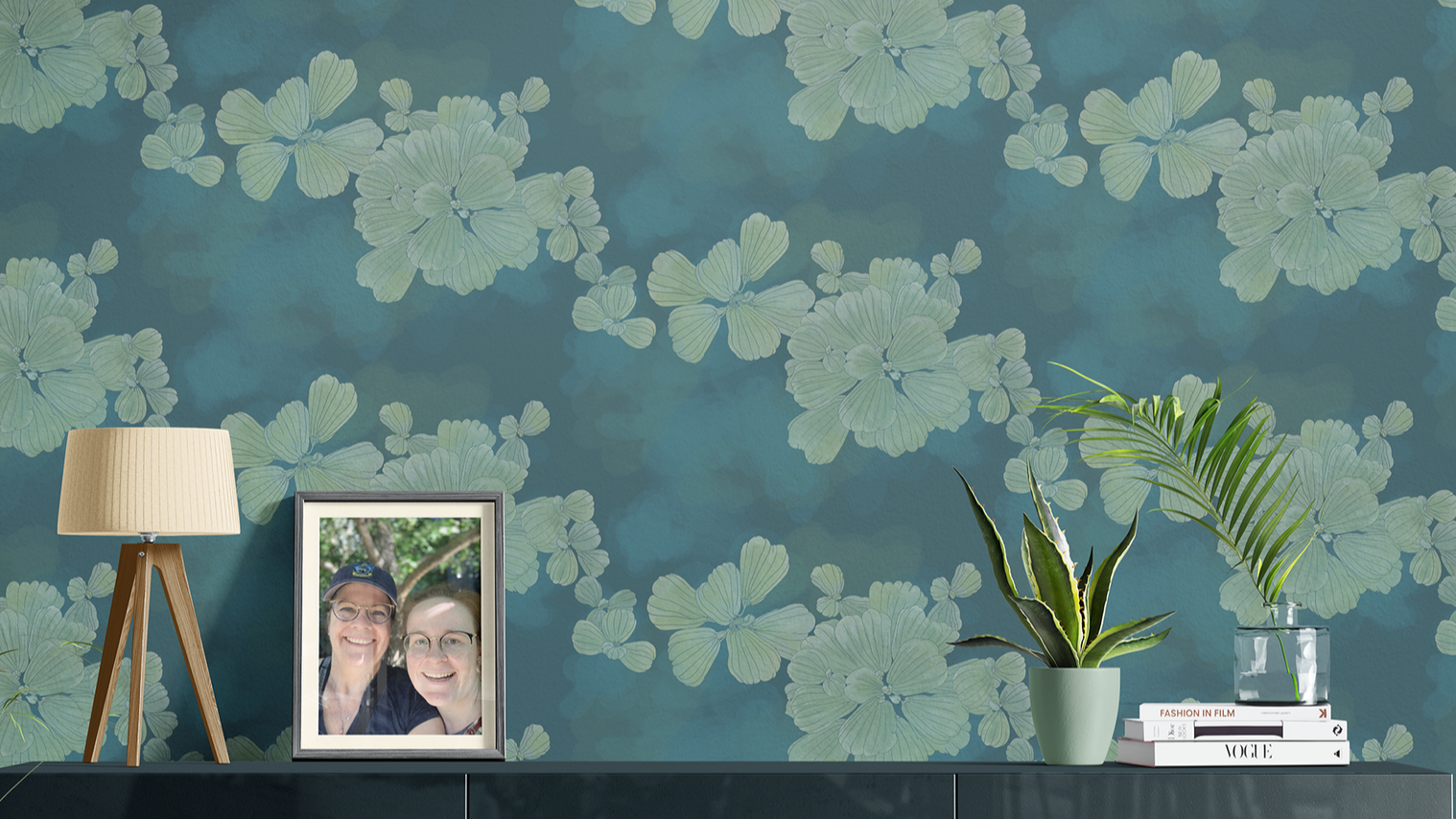
Aqua Intima – Kame – Ukikusa brings a lighter, more atmospheric expression of the collection to the wall, where floating water lettuce drifts across a softly layered ground—adding calm movement, quiet color, and an easy sense of freshness to the room.
Supporting it is Ukikusa, inspired by floating water lettuce. This pattern lightens the collection and gives it lift. It still belongs fully to the same world, but it reads more like atmosphere and texture than a full narrative. It’s wonderful for rooms that want the collection’s calm without asking for quite so much visual complexity.

Aqua Intima – Kame – Testa turns the quiet geometry of turtle shell pattern into a warm, artful wallcovering that feels especially at home in a bathroom—bringing structure, movement, and earthy color to the room without losing its sense of calm.
Then there is Testa, the turtle shell-inspired coordinate. This pattern extends the Kame story through the structure, rhythm, and beauty of turtle shell pattern, giving the collection a wonderful grounding note. It makes the whole family especially useful in design work because it allows you to move from the fuller narrative of Zenshin into quieter, supporting moments without losing the emotional thread.
That’s part of what makes Kame so compelling. It’s not a one-pattern idea. It’s a small ecosystem. It gives decorators, designers, homeowners, and business owners room to shape a full story, or simply touch the edges of one.
What makes Kame feel so at home in a variety of spaces
Part of Kame’s beauty is that it feels both calm and substantial. It settles naturally into the cleaner, quieter worlds of Japandi, Organic Modern, Wabi-Sabi, Zen, and Modern, where its softened aquatic movement and earth-and-water palette bring warmth without disturbing the stillness. It also has enough visual soul to support more layered interiors—spaces shaped by a collected, personal hand—such as Eclectic, Collected Global, and Transitional homes.
In more architectural, graphic, and period-aware settings like Mid-century Modern, Industrial, and Craftsman, Kame introduces a slower, more organic rhythm that softens stronger lines and harder materials. And because it comes so directly from water, turtle shell, plant life, and the living world, it also feels especially at home in interiors guided by place and lifestyle, including Biophilic, Modern Coastal, Mediterranean, California Casual, and Mountain Modern spaces.
What I love about Kame is that it doesn’t ask the room to become something entirely new. It simply deepens what may already be there: warmth, wood, calm, shadow, life. It has enough quiet drama to hold a wall beautifully, but enough softness to live with every day.
Wallpaper applications: where Kame can quietly transform a room
Earth’s Sanctuary – Aqua Intima – Kame is available in multiple wallpaper substrates, including non-pasted, grasscloth, PVC-free Type II unpasted, gold or silver metallic, vinyl, and peel-and-stick, with a recommended 12” or 24” vertical repeat for large-scale use. That flexibility allows the collection to move beautifully from softer residential interiors to more performance-oriented environments, depending on the room and how it lives.
A few places where I see Kame wallpaper especially shining: bedrooms, powders, full baths, library/den, Mid-century Modern or vintage-influenced interiors, wellness, hospitality or waiting room
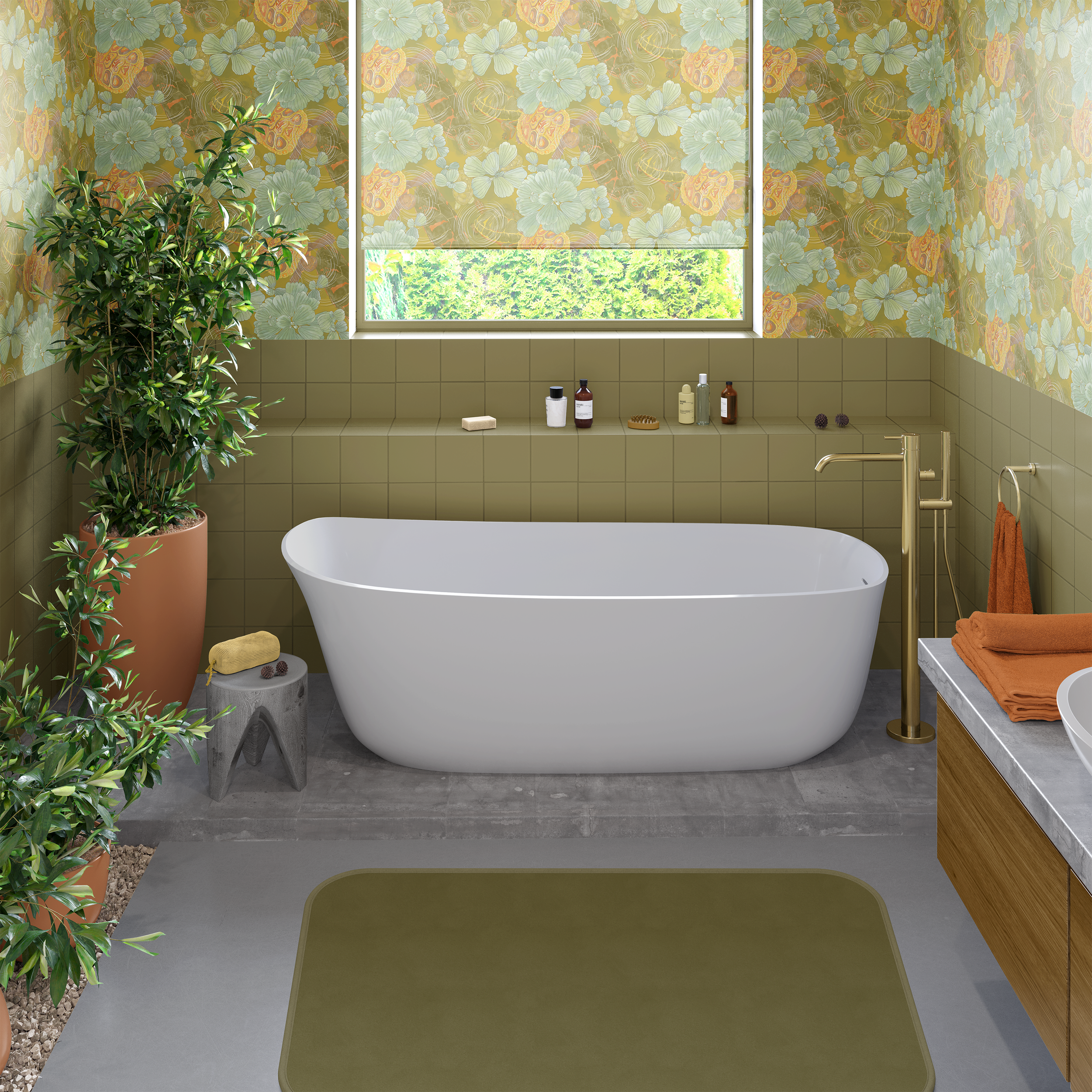
Kame feels especially natural in a bath: the turtles, floating plants, and softened ripples bring a restorative, water-connected calm that makes the room feel both grounded and quietly transportive.
One of the reasons I love Kame in a bathroom is that it doesn’t feel like a novelty application—it feels inherent to the room. The pattern’s connection to freshwater life, floating plant forms, and slow movement makes it especially resonant in spaces where water is already part of the daily ritual. In a bath or powder room, Kame can shift the atmosphere almost immediately, making the space feel more immersive, restorative, and emotionally connected to the natural world.
Kame also responds beautifully to different furniture styles, which is part of what makes it so useful. In the Mid-century-inspired room above, it settles in behind darker wood tones and simple silhouettes without losing any of its softness. The room still feels architectural and clean, but there’s more life in it—more warmth, more rhythm, more feeling.
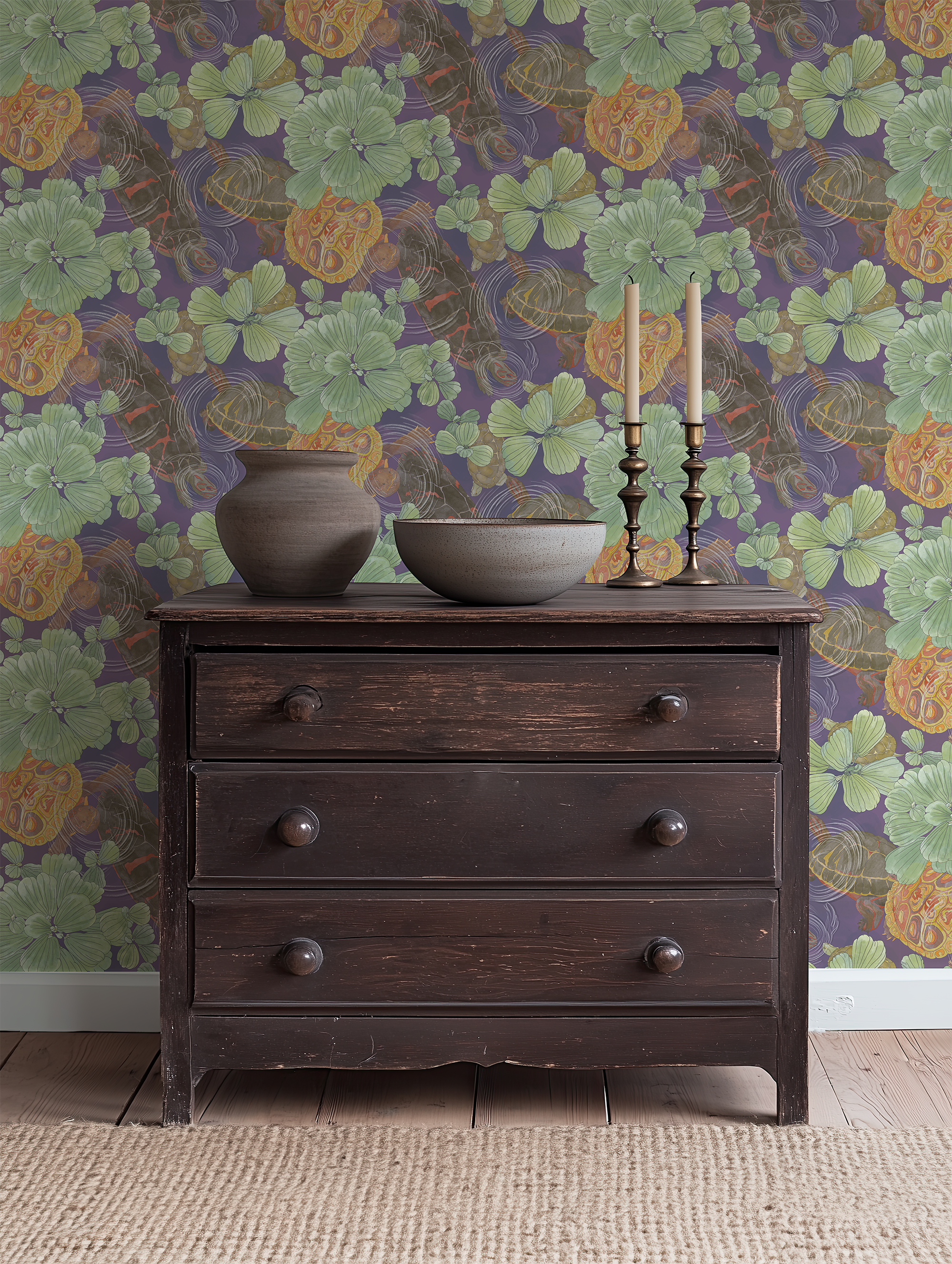
In a quieter, more intimate setting, Kame takes on a deeper, moodier presence—showing how beautifully the collection pairs with darker woods, simple objects, and a more contemplative palette.
Seen in a more intimate vignette, Kame reveals another side of itself. Against a vintage cabinet, a ceramic vessel, and candlelight, the pattern feels more contemplative and atmospheric. This is one of the things I find most compelling about the collection: it can feel open and design-forward in one room, and quietly cocooning in another, without losing its identity. The turtles, floating leaves, and turtle shell forms remain, but the mood shifts with the palette and the furnishings around them.
That range matters. It means Kame is not limited to one kind of homeowner, one kind of business, or one kind of architecture. It can move with the room.
A closer look at how Kame can change the mood of a space
One of the gifts of this collection is that it doesn’t just “go on the wall.” It actively influences how the room feels. In lighter, warmer colorways, Kame can feel almost sunlit—alive, earthy, and generous. In the moodier colorways, it becomes more introspective, more enveloping, and slightly mysterious in the best way.
That emotional range is one of the reasons I think Kame is especially strong for designers and decorators. It gives you a real tool for shaping atmosphere. You’re not just choosing a pretty repeat. You’re choosing whether the room feels brighter, deeper, quieter, more grounded, or more transportive.
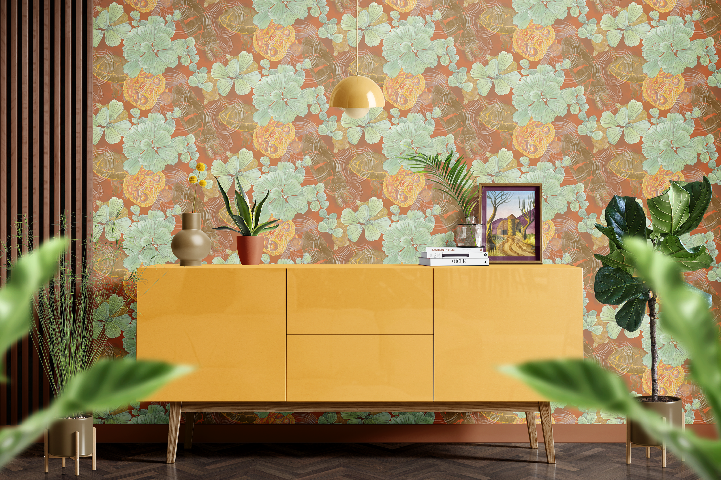
Kame also has a brighter, more playful side—proving that a nature-rooted, turtle-inspired pattern can feel fresh, lively, and completely at ease in a bolder, more color-forward interior.
I also love what happens when Kame is paired with stronger color and a more playful piece of furniture. Against a bright yellow credenza, the collection suddenly feels more energetic and contemporary, while still keeping its connection to nature. This is such a helpful reminder that “grounded” does not have to mean muted. Kame can absolutely hold its own in a bolder room. It can support color. It can support personality. It can support a client who wants something a little less expected.
That kind of flexibility is what makes a collection genuinely useful. It doesn’t collapse the minute you change the furniture. It keeps giving the room something to build from.
A few colorways I especially love for different moods
The collection currently shows a strong range of Kame colorways across the family. For Zenshin, those include Deep Forest, Deep Water Teal, Sea Green, Pond Edge Green, Dusk Sky, Violet Stream, Tree Bark Brown, Deep Saffron, and Stone Gray. Ukikusa mirrors that same core range, and Testa expands further with additional options including Algae Cools, Algae Warms, and Lily Haze.
What I love about that range is how naturally it divides into emotional moods:
Deep Forest / Tree Bark Brown / Deep Saffron — grounded, earthy, and quietly warming
Deep Water Teal / Sea Green / Pond Edge Green — restorative, lush, and gently alive
Dusk Sky / Violet Stream / Stone Gray — softer, moodier, more contemplative
Algae Cools / Algae Warms / Lily Haze — nuanced supporting shades that let the turtle shell story become more textural and atmospheric
So whether a project wants to feel sun-warmed and alive, shaded and restorative, or deeper and more cocooning, Kame already has a language for that.
Why this collection is so helpful for interiors professionals
For trade professionals, I think Kame is especially useful because it solves a slightly different but equally real problem than Nishiki. Sometimes a client wants pattern, but not motion-forward pattern. They want something natural, calming, and beautiful, but they also want it to feel grounding, mature, and deeply livable.
Kame answers that by offering:
A pattern story rooted in nature and freshwater life
Multiple supporting patterns within the same family
Enough colorways to work across warm woods, stone, plaster, simple upholstery, and layered natural materials
Substrates that support both residential and more demanding installations
Kame gives you room to shape a full narrative that feels serene and substantial, without having to reinvent the story from room to room.
If you’re seeing this for your own home or business
If you’re not a trade professional and you’re reading this thinking, I want this in my house, I completely understand. I love Kame for that same reason. It was made for people who want their spaces to feel like a deep breath—but maybe an even slower, steadier one.
And while it’s easy to imagine Kame in a bedroom or sitting room, I also love what it can do in a business setting. In a studio, wellness space, boutique hospitality environment, or other client-facing interior, it brings a sense of depth and calm that feels welcoming, intentional, and just a little transportive. It doesn’t try too hard. It simply makes the room feel more alive and more considered.
If you’re thinking about a:
bedroom or bath that feels more restorative
living room, reading nook, or dining corner that wants quiet depth
business, studio, or wellness space that wants softness, calm, and grounded sophistication
…this collection was made to be considered for exactly those kinds of places.
If you’d like to explore Kame for a project
If you’re an interior decorator or interior designer and want a pattern-rich, trade-friendly collection that can move across wallpaper and a broader room story with real grace, I’d love for you to consider Earth’s Sanctuary – Aqua Intima – Kame. Let’s connect.
If you’re a homeowner or business owner and you’d like help deciding where Kame belongs in your space, you can reach out through my Contact Me page to explore working together through interior decorating services.
And if this kind of conversation is helpful, you can also:
Subscribe to Surface & Space to have new posts land in your inbox on Fridays.
Explore my growing library of subscriber-only PDF guides designed to help you think through pattern, materials, and room decisions more calmly and clearl
© 2025-2026 Gabrielle Hewson. All rights reserved. You’re welcome to share links to this article, but please don’t copy or republish the text or images without my written permission. For licensing, permissions, or any other use beyond linking, please contact me directly.