
Why Bold Walls Increase Perceived Value For All
Bold walls aren’t just a “fun” choice—they quietly change how a space is valued. In this post, I’m unpacking why patterned and richly colored walls make rooms feel more intentional, more finished, and, very often, more high-end for both designers and those living with them day to day.
Why walls are such powerful value cues
When someone walks into a space, they may not consciously catalogue every detail, but they register the walls immediately:
Are they blank or thoughtfully finished?
Is there a sense of continuity from one room to the next?
Does the space feel like it was actively designed, or simply painted once and left alone?
Bold walls—whether through wallpaper, color, or both—send a quiet message: “Someone made deliberate choices here. This wasn’t an afterthought.”
Even those who can’t name a pattern or paint color will often describe these rooms as:
“finished”
“expensive”
“designed”
That perception is part psychology, part storytelling, and part simple math: walls are one of the largest visual surfaces in a room. When they’re thoughtfully treated, everything else feels upgraded.
What “bold ” actually means (and what it doesn’t)
Bold doesn’t have to mean:
neon colors
aggressive contrast
a pattern shouting from every surface
Most of the time, bold walls are simply:
Confident – the pattern or color isn’t apologizing for being there.
Intentional – there’s a clear relationship to the architecture, furniture, and light.
Anchoring – the walls give the room a backbone, so smaller elements don’t have to work as hard.
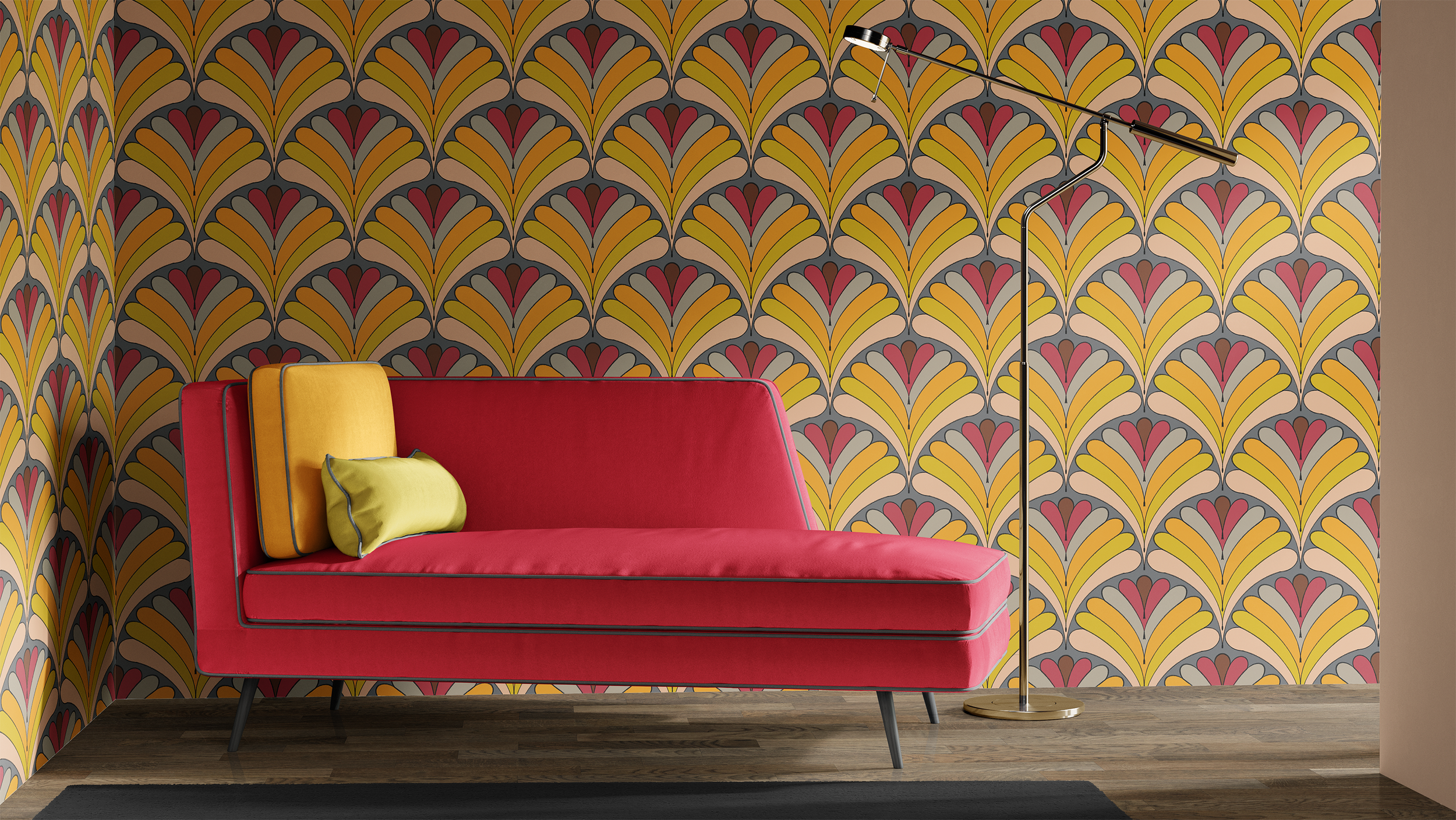
A deep, inky floral in a stairwell, a strong geometric in a powder room, or a saturated botanical behind a headboard can all be “bold” without feeling abrasive.
Why bold walls read as “higher value”
1. They suggest custom thinking, not default choices
Most people default to:
basic off-white paint
a single neutral color throughout
no clear relationship between walls and furnishings
When walls are wrapped in pattern or rich color that clearly ties into the room, it suggests:
time and thought went into the design
someone considered how those using the space move through it
there’s a point of view, not just a checklist
That’s one reason real estate listings and hospitality spaces so often highlight patterned or richly painted rooms—they photograph as intentional, not generic.
2. They make built-ins and furnishings look more considered
Bold walls can make existing elements feel upgraded:
A simple staircase looks more architectural when the wall alongside it is wrapped in pattern.
A modest console or bench reads as part of a composition rather than a lone piece against a blank field.
Even basic trim can feel elevated when it’s in conversation with the wall treatment.
You haven’t necessarily changed the bones of the room—you’ve changed how those bones read.
3. They help spaces feel composed, not pieced together
Rooms with bold walls often:
photograph more cohesively
feel “complete” even with fewer accessories
allow you to keep furnishings simpler without losing personality
That sense of composition—and the perception that someone took the time to create it—is a big part of why bold walls often feel more expensive than their actual cost.
For designers and decorators: how bold walls support your work
If you’re an interior decorator or interior designer, bold walls can quietly:
Raise the perceived level of the whole project without touching every single item.
Make your pattern language visible—your taste is easier to recognize when walls carry some of the story.
Help with budget balancing: a strong patterned wall can make a more affordable side table or chair feel intentional rather than like a compromise.
They also give you:
A focal point for photography and portfolio work.
A way to differentiate your projects from “safe” rooms that rely solely on art and pillows for personality.
You’re not being bold for its own sake—you’re using walls as one of the most effective tools you have.
For homeowners and business owners: where bold walls work hardest
You don’t have to start with the largest room in the house. Some of the best places to try bolder walls are:
Entries and hallways — These spaces are passed through often but not used all day. Pattern here can feel like a greeting rather than a commitment.
Stairwells — As in the image above, stairs are natural transitions. Wrapping the wall in wallpaper makes them feel like an experience instead of a necessary connector.
Powder rooms — Small scale, short visits, big impact. Bold pattern in a powder room often becomes a memorable detail guests talk about later.
Behind a bed or sofa — A single wall of pattern or saturated color behind a key piece of furniture can define the room without requiring every wall to participate.
These are spaces where a relatively small amount of wallpaper or paint can make a large difference in how the entire home feels.
How to balance bold walls so they feel intentional, not overwhelming
Bold walls work best when the rest of the room is in conversation with them, not shouting over them.
A few ways to keep that balance:
1. Let one surface lead
If the walls are patterned or deeply colored:
keep large upholstered pieces quieter in either solids or very subtle textures
allow smaller accents—pillows, art, a single chair—to echo colors or shapes from the wall without copying them exactly
You’re aiming for harmony, not matching.
2. Use texture as a counterpoint
Bold walls love:
nubby weaves on sofas and chairs
natural woods with visible grain
stone, ceramic, and woven pieces that bring in tactile softness
Texture can calm what might otherwise feel busy, and it gives the eye places to rest in between areas of pattern or strong color.
3. Mind the lighting
Bold walls behave differently depending on:
natural light levels
lamp placement
how reflective the pattern or paint finish is
In a darker space, bold walls can feel cozy, cocooning, and dramatic.
In a bright space, they can feel fresh and energetic.
Either way, a few thoughtfully placed lamps—wall sconces, a floor lamp, a table lamp—will help the pattern read as intentional rather than stark.
Gentle guardrails for those nervous about bold moves
If you’re curious but hesitant:
Start with a smaller zone: a powder room, a stair landing, or a short hallway.
Choose a pattern with a clear repeat and a limited palette rather than something hyper-busy.
Sample generously: order a larger wallpaper swatch or pin multiple paint samples up and live with them across a few days and light conditions.
Bold doesn’t have to mean impulsive. You can make a strong choice slowly and with care.
Bringing it all together
Bold walls:
tell those walking in that the space was thoughtfully designed
make existing architecture and furnishings feel more intentional
help projects—from family homes to commercial spaces—read as higher value
Whether that boldness comes from wallpaper, deep color, or both, the impact is rarely just visual. It’s emotional, too: spaces feel more memorable, more anchored, and more “worth keeping.”
To explore some examples of bold, colorful wallpaper designs that bring grounding and presence to a variety of spaces, visit my wallpaper collections. If you’re an interior decorator or interior designer and want a textile-focused pattern partner to support your bold-wall projects, I’d love to collaborate.
If you’re reading this as someone planning a new space—or reimagining an existing home or business—and you’d like help building a fabric and wallpaper story that balances texture, pattern, and practicality for those using the space, you’re welcome to reach out through my Contact Mepage to learn more about my paid interior decorating services.
And if this kind of conversation is helpful, you can also:
Subscribe to Surface & Space to have new posts land in your inbox on Fridays.
Get access to a growing library of subscriber-only resources—gentle guides, checklists, and tools to help you think through pattern, color, and materials in your own time. I add to this collection regularly, so it becomes a little toolbox you can return to whenever you’re ready.
© 2025-2026 Gabrielle Hewson. All rights reserved. You’re welcome to share links to this article, but please don’t copy or republish the text or images without my written permission. For licensing, permissions, or any other use beyond linking, please contact me directly.