Why Fabric Sampling Matters: Seeing Scale, Color, and Repeat in Real Light
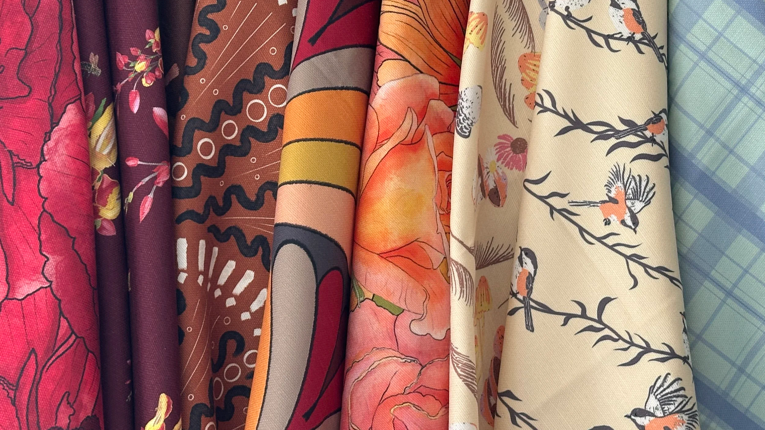
A fabric sample is not just there to confirm that you like a pattern. It’s there to show you how scale, color, texture, drape, and repeat actually behave in the real light and real conditions of the room.
Why fabric sampling is non-negotiable
Fabric is one of the most influential tools we have in interiors. It can soften architecture, bring comfort and depth to a room, support or shift the emotional tone, and tie together wallpaper, paint, millwork, flooring, and furnishings in a way that feels beautifully intentional.
But fabric is also deceptively easy to misjudge from a screen or even from a memo viewed in isolation. What looks soft can feel stiff. What looks quiet can suddenly dominate once repeated across a chair, Roman shade, or curtain panel. What looks like the perfect color on a table can turn far cooler, warmer, flatter, or busier once it enters the actual room.
Sampling is not there to slow you down. It is there to answer a few essential questions before you commit yardage and labor:
How does this fabric look in the room’s real light?
How does the scale and repeat feel on the actual piece or surface?
How does the color behave next to the finishes and materials already in the room?
How does the fabric feel to the touch and move in real life?
Step 1: Let the sample meet the room
When a fabric sample arrives, the first thing I want is to get it out of abstract decision-making mode and into the space where it may actually live.
If possible, place the sample:
On the chair, sofa, bench, or headboard you’re considering
Against the wall or trim it will live near
Near any flooring, millwork, wallpaper, or cabinetry it needs to coordinate with
At the window if it may become a curtain or Roman shade
Ask:
Does the fabric feel at home here, or does it suddenly feel off?
Does the pattern feel too large, too small, or pleasantly proportioned?
Does the texture feel supportive of the room, or is it fighting the architecture and finishes?
A fabric that feels wonderfully subtle on a memo can disappear on a large sofa. A pattern that feels charming on a swatch can become too active once repeated across dining chairs. A soft sateen that looks elegant folded on a table can behave very differently when hanging as a curtain. The sample will quietly tell you which way it wants to go.
Step 2: Check the fabric in different kinds of light
Color and texture do not stay fixed throughout the day. Fabric is especially responsive to light because weave, sheen, pile, and fiber content all affect how it reads.
Check the sample in:
Morning light — often cooler and clearer
Afternoon light — often warmer and stronger
Evening light — with lamps, sconces, pendants, and whatever bulb temperatures are actually in use
Pay attention to:
Whether the color reads lighter or darker than expected
Whether the undertone shifts warmer, cooler, greener, yellower, rosier, or grayer
Whether sheen or pile suddenly becomes much more noticeable
Whether the fabric feels richer, flatter, softer, or more synthetic under artificial light
This is especially important with velvets, sateens, linens, and any fabric with visible texture or luster. Those qualities can change dramatically between daylight and evening use.
Step 3: Check the repeat and rhythm, not just the motif
Fabric is pattern at object scale. The repeat matters just as much as the individual element.
Depending on the fabric and the sample size, you may be seeing:
A full vertical repeat
Only part of the repeat
A horizontal slice that does not tell the whole story
A scaled-down impression that feels very different once repeated across a full piece
If the repeat is large and your sample is small, you may only be seeing a hint of the full movement. In that case, I like to reference the repeat dimensions on the memo and imagine how that pattern will travel across the furniture, pillows, bedding, or window treatment.
You are looking for rhythm:
Does your eye move gently through the pattern, or get stuck on one element?
Are there any hot spots that might land repeatedly at eye level or in an awkward place?
Does the pattern feel steady and supportive, or jittery and restless?
A pattern can be beautiful and still not be right for the application. Sampling helps you separate “beautiful” from “beautiful here.”
Step 4: See how the color behaves with your real materials
Printed color on a swatch is one thing. Printed color next to your actual finishes is another.
Lay or hold the fabric sample next to:
Trim and paint colors
Wallpaper you are considering or already using
Flooring, whether wood, tile, or stone
Cabinetry finishes
Nearby upholstery or wood tones
Any companion fabric you may be layering in through pillows, bedding, or window treatments
Ask:
Does the color support or clash with the trim?
Does it sit well with the warmth or coolness of the wood tones?
Does it make the room feel more harmonious, or more scattered?
Could you imagine it as part of the visual atmosphere of the room for years?
I like to think of fabric as part of a room’s emotional climate. Sampling lets you check whether that climate is one you truly want to live and work in every day.
Step 5: Check the hand, body, and drape
This is one of the biggest reasons fabric sampling matters. A screen cannot tell you hand.
When you hold the sample, pay attention to:
Whether it feels soft, crisp, plush, dry, smooth, weighty, or springy
Whether it folds easily or resists folding
Whether it has body and structure or wants to collapse softly
Whether it feels comfortable against skin if it may be used on pillows, bedding, or seating
This matters because the same pattern printed on different fabric bases can behave completely differently. A linen-like fabric may feel relaxed and airy. A velvet may feel rich and enveloping. A sateen may feel soft, smooth, and quietly luxurious. A canvas may feel more structured and practical.
Sampling is where you stop choosing fabric as a picture and start choosing it as a material.
Step 6: Consider what the fabric is being asked to do
Fabric is never just fabric. It always has a job.
As you sample, ask:
Is this for upholstery, where durability and comfort matter?
Is this for a Roman shade or curtain, where body and drape matter?
Is this for bedding, where softness and ease near skin matter?
Is this for pillows or a throw blanket, where both look and touch matter?
Is this for a harder-working room, where ease of cleaning and longevity matter more than romance?
A fabric that is perfect for bedding may be completely wrong for a dining chair. A fabric that is wonderful for Roman shades may feel too stiff or plain on a pillow. A hard-wearing performance fabric may make perfect sense in a playroom, rec room, or exterior-adjacent setting, even if it would not be your first choice for softness. Sampling is where the fabric’s real role becomes clear.
Step 7: Think about those using the space
Fabric is always in contact with life.
Consider:
Is this a room for rest, gathering, work, play, or quiet retreat?
How sensitive are those using the space to texture, warmth, visual movement, or contrast?
Will this fabric still feel like the right choice after years of use, not just on install day?
As you look and touch the sample, you might ask:
Would I want this against my skin?
Would this feel comforting or distracting in this room?
Would this make the room feel more welcoming, more elevated, more practical, or more exhausting?
Fabric is where visual story and physical comfort meet. Sampling gives you a low-stakes way to test both.
Step 8: Give yourself enough fabric to really see it
Whenever possible, I recommend ordering more than a tiny sample—ideally a fat quarter, and sometimes even a yard or two, depending on the scale of the pattern and how you’re considering using it.
That gives you enough fabric to:
See more of the repeat
Understand how the pattern actually lives at a more realistic scale
Test how it looks folded, draped, or wrapped around a cushion
Compare it in more than one place in the room
See how it behaves next to companion materials
This matters because a small swatch may only show you a fragment of the story. If the pattern scale is generous or the intended use is larger—like a sofa, Roman shade, curtain panel, duvet, or bed—you may need more fabric in hand to really understand how it will read once it’s doing its actual job.
Sometimes a fabric looks lovely on a memo but changes entirely when you have enough of it to see movement, rhythm, and scale. That’s one of the reasons I like a fat quarter as a starting point whenever possible, and why I’ll sometimes want even more yardage if the application is substantial.
For decorators and designers: how to bring those hiring you into the sampling process
If you work with fabric regularly, you already know how transformative it can be. Sampling is a wonderful way to educate gently without overwhelming.
You might:
Bring a small, focused set of fabric options rather than a huge stack
Place them directly onto the furniture, bedding, or window location where they may be used
Compare them beside wallpaper, wood tones, and paint so those hiring you can see the story in context
Invite them to live with the samples for a few days and note what keeps drawing them in—or pushing them away
Framing it as: Let’s see how this behaves in your real light and with your real finishes before we ask it to live in the room helps everyone feel supported rather than pressured.
For homeowners and small business owners: a simple way to sample fabric
If you’re not a professional, you do not need to decode every technical term right away. Start here:
Order samples of any fabric you’re truly considering
Put them where they would actually live
Look at them at several times of day
Touch them
Compare them to your paint, wallpaper, trim, flooring, and furnishings
Ask yourself whether they feel calm, inviting, elevated, practical, or wrong
You might ask:
Do I exhale when I see this here, or do I feel uncertain?
Would I want this touching my skin every day?
Does this feel like it belongs in this room, or just on the sample table?
If you’re working with an interior decorator or designer, reactions like this feels too stiff,this feels too busy,this feels beautifully quiet, or this feels like a hug are incredibly useful.
Where this connects with wallpaper, performance, and planning
Fabric sampling does not stand alone. It is part of a larger conversation that includes:
Wallpaper sampling — making sure walls and textiles support one another in real light
Memo reading — understanding fiber content, width, repeat, durability, and intended use
Long-term thinking — choosing fabrics that feel right for you over time, not just in the excitement of the moment
In other posts and subscriber PDF guides, I go deeper into fabric memos, abrasion ratings, wallpaper memos, and substrate choices. But the sample is where the emotional truth of the decision begins.
If you’re an interior decorator or interior designer and want a textile-focused partner to support your pattern-rich projects, I’d love to collaborate.
If you’d like help building a wallpaper and fabric story that balances texture, pattern, and practicality for those using your spaces, you can Contact Me to engage my interior decorating services.
And, if this kind of discussion is helpful, you can:
Subscribe to Surface & Space to have new posts land in your inbox on Fridays.
Get access to a growing library of subscriber-only PDF guides—covering wallpapers, fabrics, performance substrates, and other quietly useful tools for interiors projects. I add to this collection regularly, so it becomes a little toolbox you can return to whenever you’re ready.
© 2025-2026 Gabrielle Hewson. All rights reserved. You’re welcome to share links to this article, but please don’t copy or republish the text or images without my written permission. For licensing, permissions, or any other use beyond linking, please contact me directly.