
Why Fabric Texture Matters More Than Color At First
When most people think about fabric, they think color first, but in real life, those using the space experience texture before they register color — how something feels against skin, how it drapes, how it catches the light, and how forgiving it is day to day. In this post, I’m sharing why fabric texture in interior decorating matters even more than color at the beginning of a design, and how starting with texture leads to rooms that feel better, wear better, and layer color more gracefully over time.
Why texture quietly leads the experience
Walk into a room and you might notice color first, but the moment you sit down, lean back, or brush past a piece of furniture, texture takes over.
Texture shapes:
How welcoming or formal a seat feels.
Whether a fabric seems “precious” or relaxed.
How much visual movement a surface has, even in a neutral palette.
A sofa that looks beautiful in photos but feels scratchy, slick, or fragile will never become a favorite spot—no matter how perfect the color is. Starting with texture asks:
“How do we want this to feel to those using the space every single day?”
Color can be layered and adjusted. Texture is woven into how the room is experienced.
Texture and lifestyle: matching fabric to real use
Before choosing color, it helps to understand who will be using the piece and how.
Some questions to ask:
Is this a curl-up-with-a-book sofa or a formal occasional piece?
Are there kids, pets, and snacks, or is this a quieter, adult space?
Do those using the space tend to be in jeans, suits, or loungewear?
Is this piece for long sits, quick perches, or mostly visual presence?
Different textures serve different lives:
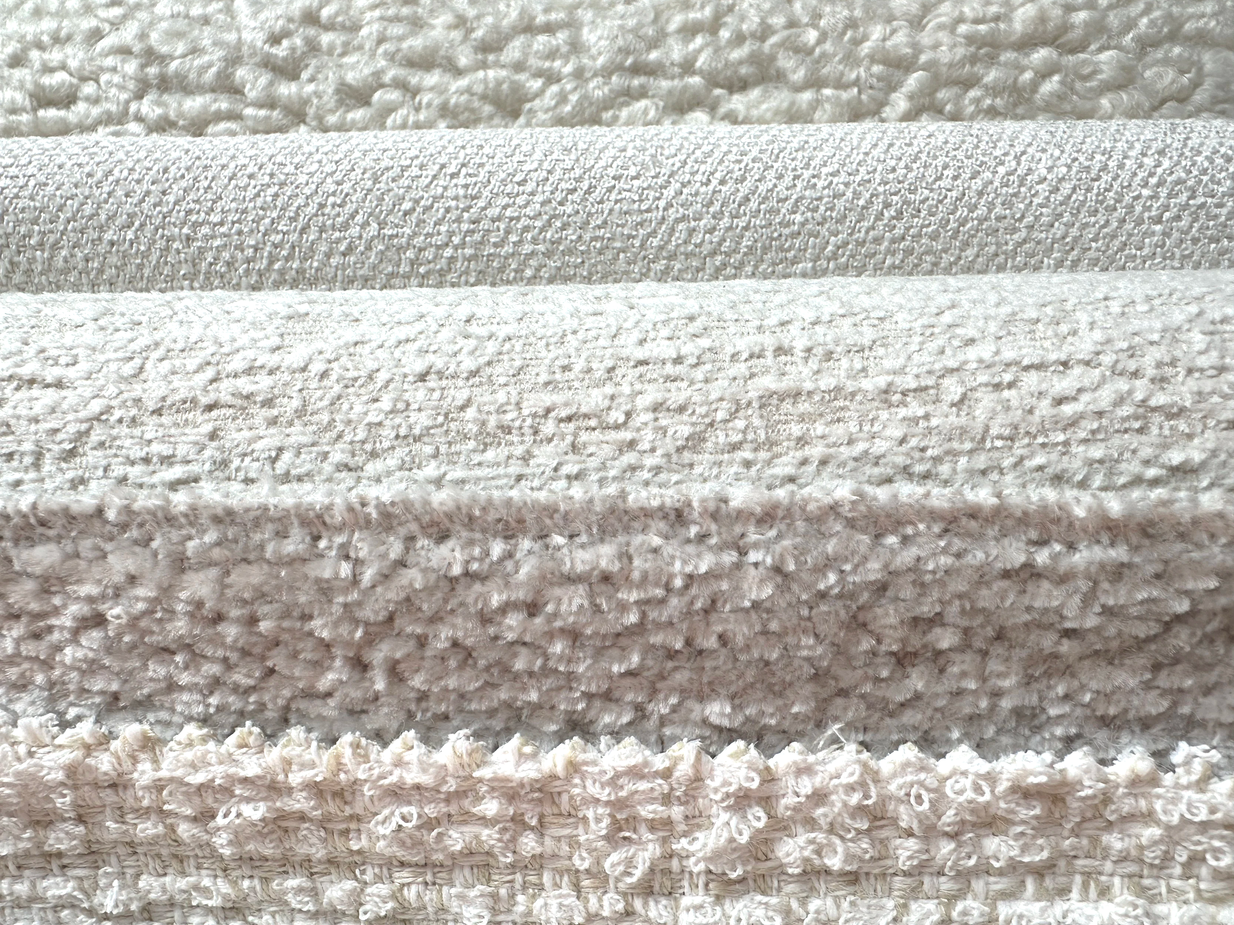
Nubby, textured weaves
Feel cozy, inviting, and forgiving.
Camouflage light wear and minor marks.
Great for family rooms and well-loved seating.
Smooth, tightly woven fabrics
Feel tailored and crisp.
Show creases and marks more easily.
Better for structured, more formal pieces or lower-traffic areas.
Soft, brushed fabrics and velvets
Feel luxurious and comforting.
Can show directional marks but reward touch.
Lovely for reading chairs, bedrooms, and anywhere you want a sense of indulgence.
Texture becomes a quiet contract: “Here’s how you’re allowed to live in this room.”
How texture influences mood (even in all-neutrals)
You can have two rooms in nearly identical neutral color palettes that feel completely different because of texture alone.
A room with smooth leather, slick cotton, and shiny metal might feel cool, minimal, and sleek.
A room with boucle, linen, wool, and matte wood might feel warm, grounded, and human.
Texture affects mood by:
Catching or softening light.
Adding depth in close-up views.
Suggesting how casual or formal the room is meant to be.
For those using the space, this translates into:
“I can flop down here in my everyday clothes.”
“I should sit a bit more carefully and mind my shoes.”
If the emotional brief for a room is “retreat,” “gather,” or “restore,” texture is often a faster path to that feeling than color alone.
Why starting with texture makes color decisions easier
When you choose texture first, color becomes easier and more flexible.
Here’s why:
Texture creates built-in depth. A textured weave in a single color can feel more layered than a flat fabric in three colors.
Texture can soften strong colors. A saturated hue in a slubby or brushed fabric often feels gentler than the same color in a very flat weave.
Texture gives solids interest. If those using the space are hesitant about pattern, textured fabrics keep a room from feeling flat or stark.
A practical approach:
1. Decide how the room should feel (cozy, tailored, airy, grounded).
2. Choose textures that embody that feeling.
3. Then choose colors within those textures that support the story of the space.
Instead of “blue or beige?”, the question becomes:
“Do we want a relaxed, linen-like beige or a smooth, tailored beige? A plush, enveloping blue or a crisp, structured blue?”
Texture and durability: what survives daily life
Texture isn’t just about feel; it’s also about how fabrics wear.
Rougher, open weaves can sometimes snag or show pulls in heavy-use areas, even if they look amazing.
Very smooth, flat fabrics can show every crumb, crease, and watermark.
Mid-texture, tightly woven fabrics often strike the best balance—soft to the touch but dense enough to resist everyday wear.
For seats and surfaces that those using the space interact with constantly, it’s worth asking:
Will this texture still look good after a year of daily use?
Does it hide minor marks or make them the main event?
Does it feel better over time, or does it ask to be maintained constantly?
In some cases, a slightly more textured performance fabric is a better choice than a smoother one—not because it’s trendier, but because it’s more forgiving of real life.
How texture, pattern, and color work together
Texture and pattern are cousins. Sometimes texture alone provides enough visual interest; other times, texture supports pattern so it doesn’t feel too busy.
A few helpful combinations:
Textured solids + patterned accents
Main pieces (sofa, large chairs) in textured solids.
Pattern on pillows, occasional chairs, or drapery.
Color builds on top of a tactile, calm foundation.
Subtle pattern + rich texture
A small-scale, tone-on-tone pattern on a textured base cloth.
Perfect for those who say they’re “not pattern people” but want depth.
Smoother fabrics where the eye needs rest — If a rug and wallpaper are busy, smoother upholstery textures give the eye somewhere to land.
Thinking this way keeps a room from becoming one big flat block of color—or a patchwork of competing surfaces.
When I’m working with a patterned wallpaper or fabric as the “lead,” I almost always reach for solid textiles with noticeable weave or pile. The goal isn’t to add more pattern, but to let texture carry some of the interest. I’ll echo the main color from the pattern in one solid, then use another to elevate a quieter background color that might otherwise go unnoticed. On a sofa, bench, or pillow, those textured solids help the room feel grounded and touchable, while still clearly belonging to the same color story as the pattern.
For interior professionals: leading with texture in presentations
For interior designers and decorators, it can be powerful to begin fabric presentations with texture rather than hue.
A few ways to do that:
Build boards where all the fabrics are in a similar palette at first, and talk through texture stories: “This is the cozy, nubby option,” “This is the tailored, smooth option,” “This is the plush, cocooning option.”
Invite those investing in the project to touch each fabric before you talk about color. Ask what feels most like how they want to live.
Explain how texture supports the brief: “Because this is your main crash zone, we’re prioritizing a texture that feels forgiving and comfortable to you.”
Once everyone is aligned on what feels right under the hand, refining color becomes a calmer, more grounded conversation.
For those using the space: simple ways to pay attention to texture
You don’t have to memorize fabric names to make good texture choices. A few practical steps:
Notice what you reach for. In hotels, restaurants, or friends’ homes, which chairs do you choose first? Smooth, nubby, velvety? That’s information.
Test fabrics in different light. Look at them in daylight and in evening light. Does the texture still feel inviting?
Trust your body’s reaction.
If you instinctively pull your hand away from a fabric, that matters.
If you find yourself absentmindedly rubbing the arm of a chair, that’s a clue too.
Color can be admired from across the room. Texture is what you live with up close.
If you’ve ever chosen a fabric because you loved the color and then realized you don’t love how it feels or wears, you’re not alone. Starting with texture can change that story.
If this kind of discussion is helpful, you can:
Subscribe to Surface & Space to have new posts land in your inbox on Fridays.
Get access to a growing library of subscriber-only resources—to help you think through pattern, color, and materials in your own time. I add to this collection regularly, so it becomes a little toolbox you can return to whenever you’re ready.
Whether you’re another interiors professional or simply someone who loves the idea of rooms that feel as good as they look, you’re very welcome here.
© 2025-2026 Gabrielle Hewson. All rights reserved. You’re welcome to share links to this article, but please don’t copy or republish the text or images without my written permission. For licensing, permissions, or any other use beyond linking, please contact me directly.