Why Wallpaper Sampling Matters: Seeing Scale, Color, and Repeat in Real Light
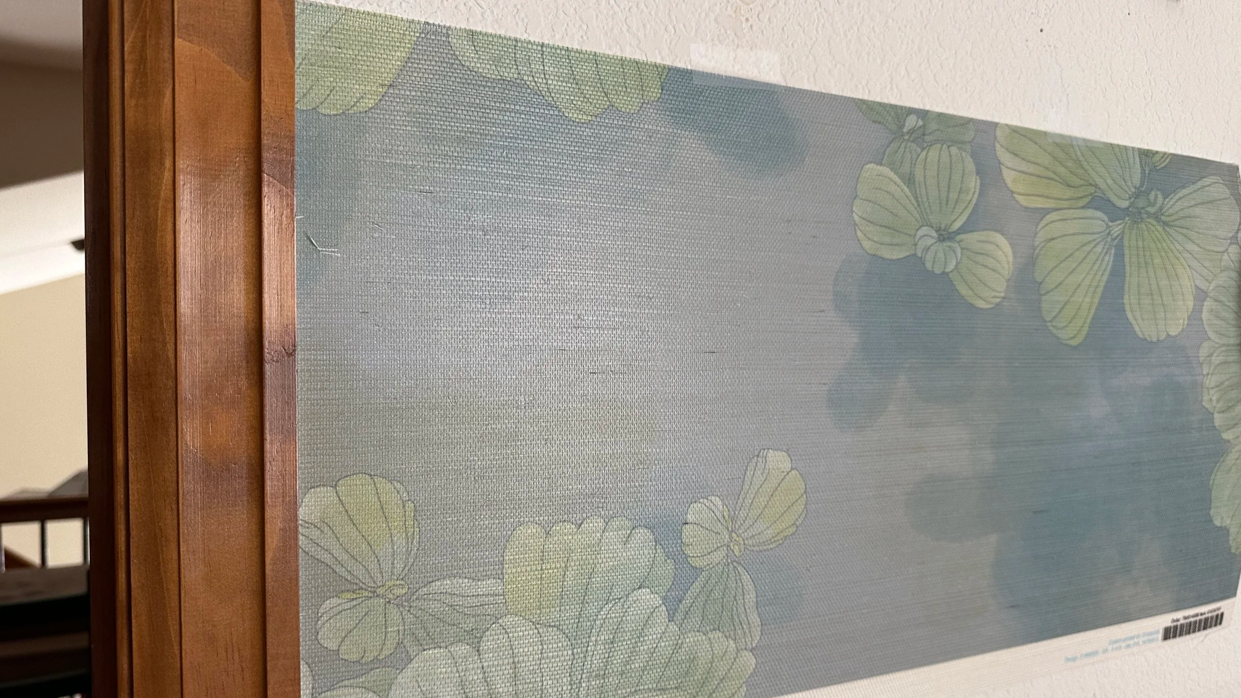
Wallpaper can look magical on a screen—and completely different once it’s on four walls. Sampling is where you find out what a pattern actually does in your light, at your ceiling height, and alongside the finishes already in the room. In this post, I’m sharing how I use wallpaper samples to check scale, color, and repeat in real life, and why that simple step saves so much guesswork for those using the space.
Why wallpaper sampling is non-negotiable
Wallpaper is one of the most powerful tools we have as decorators and designers. It can:
Shift the perceived size and shape of a room
Set the emotional tone in a single step
Tie together colors, finishes, and furnishings quietly and beautifully
But it’s also high-impact and relatively permanent. Once it’s up, it’s not coming down on a whim.
Because wallpaper is printed material, I also think it’s wise to sample within a reasonably close window to your final order whenever possible. Small variations can happen from one print run to another, so waiting too long after approving a sample may increase the chance of subtle shifts in color, finish, or overall feel. And, sampling is available to answer three key questions before you invest in full rolls and installation:
How does this pattern look in this room’s real light?
How does the scale and repeat feel at this ceiling height and wall size?
How does it interact with everything else that’s already here (or on the way)?
Step 1: Let the sample meet the architecture
When a wallpaper sample arrives, the first thing I do is get it onto a wall—even if it’s just with painter’s tape.
Hang it where it would actually live
If possible, place the sample:
At eye level on the wall you’re most likely to paper
Near a corner or transition (e.g., where two walls meet, or wall to trim)
Close to fixed elements: a window, door casing, cabinetry, or a key piece of furniture
Ask:
Does the pattern feel too large, too small, or pleasantly proportioned?
Does the overall energy feel calm, lively, dramatic, or something in-between?
Does it respect the architecture—or fight it?
A small, delicate pattern can feel beautifully textural in a compact powder room but get lost in a two-story entry. A bolder, more generous motif might come alive in a dining room but feel overwhelming in a narrow hallway. The sample will quietly tell you which it wants.
Look at it in different kinds of light
Check the sample in:
Morning light – cooler, clearer
Afternoon light – warmer, sometimes stronger shadows
Evening light – lamps, sconces, pendants, and whatever mix of bulbs you’re actually using
Pay attention to:
Whether the background reads lighter or darker than expected
Whether any color suddenly jumps forward (too green, too blue, too yellow, too “neon”)
How the pattern feels under artificial light, especially if the room is used more at night
This is especially important for patterns with subtle mid-tones or any metallic/pearlescent detail; those can shift dramatically between day and night.
Step 2: Check the repeat and rhythm, not just the motif
Wallpaper is pattern at room scale. The repeat—how the design travels and returns—is just as important as the individual elements.
Understand what you’re seeing on the sample
Depending on the manufacturer, your sample might show:
A full vertical repeat
Only a portion of the repeat
Several repeats across the width
If the repeat is large and your sample is small, you may only be seeing a hint of the full movement. In that case, I’ll often:
Reference the pattern’s repeat dimensions (listed on the spec sheet).
Look at how far the elements seem to travel before they return.
Imagine how that would read across a full wall or around a corner.
You’re looking for rhythm:
Does your eye move gently across the pattern, or get stuck on one element?
Are there any “hot spots” that might land at eye level over and over (e.g., a bold motif that could repeat right over a headboard or sofa)?
Does the repeat feel steady, or jittery and busy?
Tape multiple samples together when possible
If you can order more than one sample, try taping them together edge to edge:
This lets you see how the seams will read.
You’ll get a better sense of how the pattern flows, especially horizontally.
It can reveal whether the pattern feels more like a texture or a statement once it’s repeating.
Even two or three samples stuck together on the wall can be amazingly clarifying.
Step 3: See how wallpaper color behaves with your finishes
Color on a printed swatch is one thing; color next to your actual materials is another.
Lay or tape the wallpaper sample next to:
Your trim and door color
Flooring (wood, tile, stone)
Any existing or planned cabinetry finishes
A fabric memo or two you’re considering for upholstery or drapery
Ask:
Does the background color support or clash with the trim?
Do the pattern colors sit well with the warmth or coolness of your wood tones?
Could you imagine this wallpaper as a backdrop for your favorite art, or would it compete?
I like to think of wallpaper as the room’s visual atmosphere. Sampling lets you check whether that atmosphere is actually one you want to live and work in every day.
Step 4: Consider where and how it will be used
Wallpaper isn’t just for full rooms. Sampling helps you decide if a pattern is better suited to:
All four walls – for a fully enveloping, cocooning effect
A feature wall – behind a headboard, sofa, or dining table
A ceiling – where pattern becomes a canopy or sky
Small but mighty spaces – niches, backs of bookcases, the interior of a built-in
When I’m sampling, I’m quietly asking:
Does this pattern have enough presence to hold a whole room, or is it happier as an accent?
Would it feel soothing or overstimulating if used on multiple surfaces?
Is the scale right for the specific role it’s going to play?
Sometimes a pattern that feels too bold for every wall makes a perfect statement on a ceiling. Sampling is where you discover that.
Step 5: Think about those using the space
Wallpaper doesn’t exist in a vacuum; it’s always in conversation with those who spend time there.
Consider:
Is this a space for focus, rest, gathering, or energy?
How sensitive are those using the space to visual movement or contrast?
Will this pattern still feel like “them” in five years?
As you look at the sample, you might ask:
“Could I read a book in this room without feeling distracted?”
“Would this make mornings feel brighter or more overwhelming?”
“Does this pattern echo something meaningful—nature, travel, memories, cultural references—without feeling like costume?”
Wallpaper is where visual story and emotional comfort meet. Sampling gives you a safe, low-stakes way to test that story.
For decorators & designers: how to bring those hiring you into the sampling process
If you work with wallpaper regularly, you already know how transformative it is. Sampling is a beautiful way to educate gently without overwhelming.
You might:
Bring a small, focused set of samples rather than a huge stack, and walk those hiring you through why each was chosen.
Tape samples in place during meetings so they can see them “in context,” not just on the table.
Invite them to live with the samples for a few days and jot down how the pattern feels at different times of day.
Framing it as: “Let’s see how this behaves in your real light and with your real finishes before we ask it to live on your walls.” helps everyone feel you’re on the same side of the decision.
For homeowners & small business owners: a simple way to sample wallpaper
If you’re not a professional, you don’t have to decode every technical detail. Try this:
Order samples of any pattern you’re truly considering.
Tape them where you’ll actually see them in day-to-day life.
Check them a few times a day, for several days.
Ask yourself:
“Do I exhale when I look at this, or tense up?”
“Would I be happy seeing photos of gatherings or workdays with this in the background?”
If you’re working with an interior decorator or designer, sharing your reactions—“this feels too busy,” “this feels like a hug,” “this feels a little flat”—gives them what they need to steer you well.
Where this connects with fabric, performance, and planning
Wallpaper sampling doesn’t stand alone. It’s part of a larger conversation that includes:
Fabric sampling – making sure upholstery and soft goods feel and behave well in the same light.
Substrate choices – how different wallpaper materials affect maintenance and mood.
Long-term thinking – choosing patterns that feel timeless for you, not just for the current trend cycle.
In other posts and PDF guides, I go deeper into performance fabrics, abrasion ratings, and substrate comparisons; wallpaper samples are the visual heart that everything else orbits
If you’re an interior decorator or designer and would like to collaborate with a wallpaper and fabric pattern designer who thinks from the sample stage all the way through installation, I’d love to work together—whether you’re sourcing from my existing collections or exploring a custom design for a specific project.
If you’re reading this as someone considering wallpaper for your home or business and you’d like help narrowing options, choosing patterns, and planning where they should go, you can contact me to engage my interior decorating services.
And if these kinds of calm, practical conversations about pattern are useful, you can:
Subscribe to Surface & Space to have new posts land in your inbox on Fridays.
Access a growing library of subscriber-only PDF guides that support decisions about wallpaper, fabrics, and performance materials—so you can revisit this information whenever you’re ready to take the next step.
© 2025-2026 Gabrielle Hewson. All rights reserved. You’re welcome to share links to this article, but please don’t copy or republish the text or images without my written permission. For licensing, permissions, or any other use beyond linking, please contact me directly.