
How to Read a Wallpaper Memo: What That Sample Is Telling You Before You Order
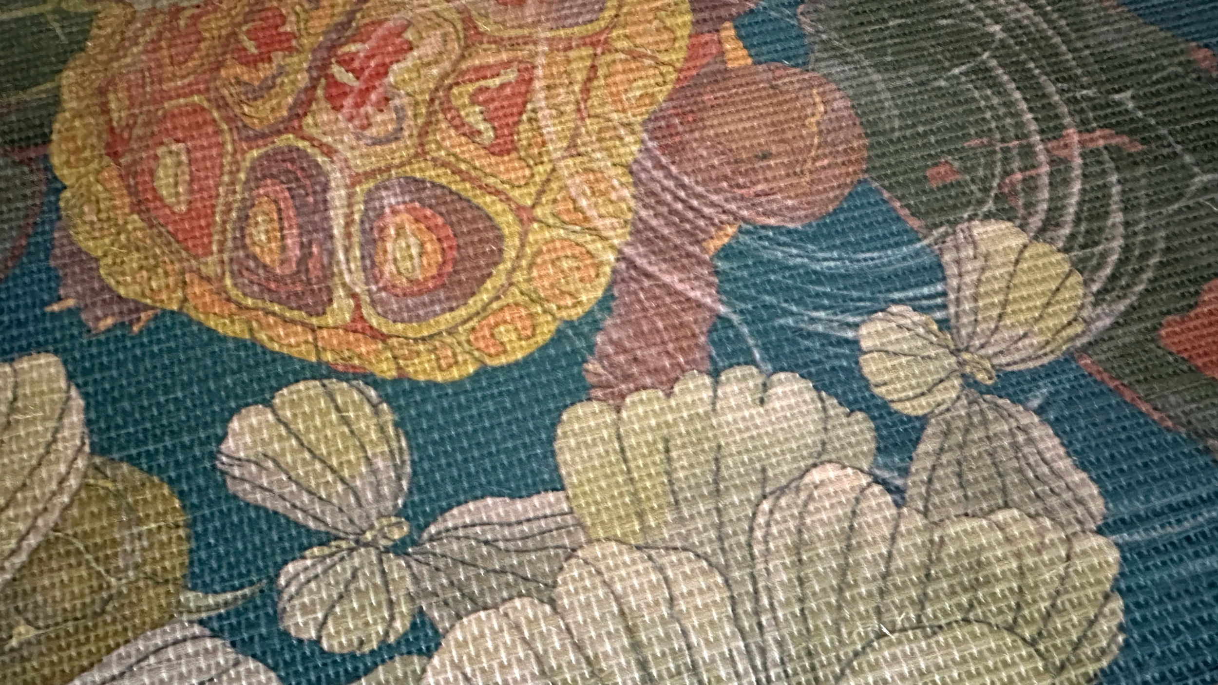
A wallpaper memo is not just there to show you a pretty pattern. It’s there to tell you how that wallcovering is made, how it repeats, how it installs, how it cleans, and whether it truly suits the room you have in mind. The above image is a photograph of a pattern on natural grasscloth. While a sample enables you to touch and feel the material, the memo helps you determine the best wallpaper substrate for each of your projects.
Why a wallpaper memo matters
A wallpaper memo is the sample itself along with the card or label that tells you what it is, how it behaves, and whether it truly suits the room you have in mind.
That little sample card can help answer some very practical questions before you order: What exactly is this pattern and colorway? What is it printed on? How large is the repeat? How does it install? How durable or cleanable is it? And is it actually right for the room you’re considering?
Not every wallpaper memo is labeled exactly the same way, but most include some version of the same core information: pattern name, colorway, substrate, width, repeat, match, installation type, cleaning notes, and sometimes fire-rating or commercial-use information.
What follows is information to help you better understand what a wallpaper memo is actually telling you.
Pattern/design name and colorway: identifying the exact wallpaper
While the pattern or design name tells you exactly which wallpaper sample you’re holding, the colorway tells you which color version of that pattern you’re holding.
This matters when you:
are comparing multiple versions of the same pattern.
need to refer back to it later for ordering.
want to pair a wallpaper with coordinating fabrics, trims, or paint.
Colorways can completely shift the emotional tone of a pattern. The memo helps make sure the one you fell in love with is the one that actually gets ordered.
Substrate or material: what the wallpaper is printed on
Substrate is one of the most important lines on a wallpaper memo because it tells you what the wallpaper is printed on—and that affects how it looks, feels, installs, cleans, and performs over time.
You might see things like:
Non-pasted paper — A traditional wallpaper substrate that does not have adhesive already applied, so paste is added during installation; it’s a common and good choice for long-term, professionally installed wallpaper applications. Many non-pasted papers are non-woven, meaning they’re made from a blend of natural and synthetic fibers pressed together rather than woven. They’re often valued for stability, easier installation, and, in some cases, cleaner removal, with a subtle pebble texture and a strong alternative to vinyl.
Grasscloth — A wallcovering made with natural fibers, such as sisal, woven onto a backing, prized for its rich texture and organic variation; because of its natural character, color and seam variation are part of the look rather than flaws.
PVC-free Type II — A commercial-grade wallcovering designed for durability and ease of cleaning like traditional contract wallcoverings, but made without PVC. PVC stands for polyvinyl chloride, a type of plastic commonly used in many building and finish materials, including some vinyl wallcoverings. In wallpaper, it’s often used because it helps create a surface that is durable, scrubbable, and well suited to higher-traffic or more demanding spaces. The PVC-free option is a more environmentally conscious option for harder-working spaces.
Metallic — A wallpaper substrate or finish that includes a reflective metallic surface or sheen, used to bounce light, add dimension, and create a more elevated, light-responsive effect on the wall. Metallic wallpaper comes in a variety of versions. The one I use is a non-woven substrate with a specialty metallic finish in either silver or gold.
Vinyl — A wallpaper substrate with a vinyl surface that is generally more scrubbable, durable, and forgiving in higher-traffic or more moisture-prone spaces like halls, baths, or commercial settings. PVC/vinyl itself is often chosen for durability and scrubbability, which is why it shows up so often in high-traffic wallcoverings. While vinyl wallcoverings are valued for durability and ease of cleaning , some people prefer PVC-free options because they want to reduce exposure to plastic-based materials and certain additives commonly associated with PVC products, or because they are especially sensitive to chemical odors and indoor-air concerns.
Peel-and-stick — A self-adhesive wallpaper designed to be applied without separate paste, often used for renters, temporary installs, staging, or lower-commitment projects on smooth, properly prepared walls.
The substrate affects:
How the wallpaper looks and feels
How it installs
How it removes, if it removes
How cleanable it is
Whether it suits residential or more demanding commercial use
For example, a grasscloth may offer beautiful texture and natural variation, but it will behave differently than a vinyl. A peel-and-stick may be useful for temporary or renter-friendly situations, but not ideal for every wall or every climate. A PVC-free Type II may be especially useful in harder-working settings where durability matters more.
Width: how wide the wallpaper is
Wallpaper width tells you how wide each roll is, which affects how many strips will be needed across the wall, how often seams will appear, and how installers calculate coverage and waste. Wider goods may reduce the number of seams, while narrower widths may behave differently in smaller or more detailed rooms.
Vertical repeat: how often the pattern begins again
The vertical repeat tells you how far along the wall the design travels before it starts over. Most commonly this is 12 vertical inches, though it depends on the manufacturer and printer. Understanding the intended vertical repeat helps because:
Larger repeats usually mean more waste during installation
The scale of the pattern affects how it feels in the room
The installer will need enough material to line up the design properly from strip to strip
A pattern with a generous vertical repeat may feel more expansive and dramatic on the wall. A tighter repeat may read more like texture. Neither is better; they simply behave differently.
The memo helps you understand whether the wallpaper will feel bold, quiet, spacious, busy, or atmospheric once repeated across an actual room.
Match type: how the pattern aligns from strip to strip
Match type refers to how the wallpaper pattern is meant to line up from one strip to the next during installation. This matters because it affects how much wallpaper needs to be ordered, how complex the installation may be, and how visually continuous the pattern will feel across the wall.
A wallpaper memo may list the match as something like:
Straight match — the pattern lines up at the same height on each strip, so every new strip starts in the same place vertically.
Drop match — the pattern is intentionally offset from one strip to the next, so the design drops down before repeating; this often requires more planning and sometimes more material.
Random match — the pattern does not need to line up in a specific way from strip to strip, making installation more flexible and often more efficient.
In general, a drop match tends to require more planning and often more paper, while a random match is more forgiving. A straight match is usually the most predictable.
Installation type: how the wallpaper goes on the wall
Most wallcoverings are best installed by a professional installer. Some are marketed as easier to handle. Some are more approachable than others, and some are far less forgiving of textured or poorly prepared walls. This line on the memo helps set expectations before the rolls arrive.
Why installation type matters so much
Wallpaper can be expensive to purchase, but improper installation can be even more costly. A beautiful wallcovering can be undermined by bubbling, poor seam alignment, visible gaps, curling edges, paste stains, tearing, or damage to the wall beneath if the wrong installation method or poor prep is used. That’s why the memo’s installation information matters: it gives you an early signal about whether the wallcovering is beginner-friendly, best left to a professional, or especially dependent on proper wall prep and adhesive technique.
The memo may tell you whether the wallpaper is:
Non-pasted — The wallpaper does not come with adhesive already applied, so paste must be added during installation, either to the wall or to the back of the wallpaper depending on the substrate and installer’s preferred method. Some non-pasted wallpapers may require booking, which is the short resting period after paste is applied, when the strip is gently folded pasted-side to pasted-side so the adhesive can absorb evenly and the material can relax before it goes on the wall. Non-pasted wallpapers are often used for longer-term, more traditional installations and are usually best installed on smooth, properly primed walls.
Unpasted commercial wallcovering — This is a heavier-duty wallcovering intended for professional installation in higher-traffic or more demanding spaces. It does not come with adhesive already applied, so paste must be selected and applied during installation, and because of its weight, backing, seam handling, and performance requirements, it is usually installed by a professional. Commercial wallcoverings also depend heavily on proper wall preparation, correct primer, and installer experience, because mistakes can be more visible and more difficult to correct once installation begins. II like to work with PVC-free Type II because its linen finish feels more elegant to me in how it looks, feels, and carries my designs than standard vinyl. Where vinyl is necessary, I can also recommend a nice durable vinyl.
Peel-and-stick — generally a more temporary solution. This wallpaper has a self-adhesive backing that is peeled away as the material is applied directly to the wall. It is often seen as the easiest option, but it is also one of the least forgiving when walls are textured, dusty, under-primed, or not fully cured. It can be useful for renters, temporary installs, or lower-commitment projects, but it still requires careful alignment, smooth surfaces, and patience to avoid bubbles, lifting, or stretching.
Pre-pasted — meaning the adhesive is already on the back of the wallpaper and is activated with water before installation. Depending on the product, the strip may still need a brief booking period so the moisture can activate the paste evenly before hanging. Pre-pasted wallpapers can be more approachable, but they still depend heavily on good wall prep, careful alignment, and proper smoothing during install. While pre-pasted wallpaper can sound approachable, I personally don’t recommend it because I’ve found the quality to be subpar in look, feel, and durability.
Wall prep matters more than many people realize
Even the right wallpaper can fail if the wall underneath is not ready for it. Depending on the substrate and condition of the wall, proper prep may include cleaning, patching, sanding, smoothing texture, priming, and making sure the surface is dry, sound, and fully cured. Some wallcoverings are more forgiving than others, but in general, the more refined and permanent the installation, the more important proper wall prep becomes.
Washability and cleaning: how the wallcovering lives with daily life
Wallpaper memos may include notes like:
Washable - This usually means the wallpaper can tolerate gentle cleaning with care, with a damp cloth or mild soap.
Scrubbable — This indicates a more durable surface that can generally tolerate more active cleaning than a merely washable wallcovering.
Wipe clean — often with a damp cloth
Spot clean only — only seek to clean the dirt spot with a damp cloth or mild soap
These notes tell you how the surface may respond to: fingerprints, splashes, hallway traffic, kids, commercial use, and general wear over time.
A powder room, hallway, banquette wall, or client-facing business may need more ease of cleaning than a low-traffic guest room. The memo helps you decide whether the wallpaper’s beauty aligns with the reality of how that wall will be used.
Fire rating and commercial notes: what the wallpaper is qualified to do
If the wallpaper is intended for commercial or hospitality use, the memo may include fire-rating or performance information. You may see references to:
Class A fire rating - This indicates that the wallcovering has met a high standard for flame spread and smoke development, making it suitable for many interiors where fire performance matters.
Type II wallcovering - Type II refers to a heavier-duty commercial wallcovering standard associated with greater durability and ease of cleaning , often used in hospitality, healthcare, office, and other higher-traffic settings.
Commercial use - This means the wallpaper is considered suitable for business, hospitality, healthcare, or other public-facing interiors where walls may need to withstand more wear, cleaning, or code-related requirements.
Contract-grade notes - These notes indicate that the product is intended for professional specification in commercial or hospitality projects and may meet certain performance, safety, or durability requirements expected in that market.
For homeowners, business owners, and the designers guiding those projects, this can be a very important line.
What a wallpaper memo cannot tell you by itself
Even the most informative wallpaper memo cannot fully tell you how:
the pattern will feel across an entire wall
the color will shift in your morning, afternoon, and evening light
it will relate to your millwork, flooring, art, or furnishings
how much emotional presence the pattern will carry once repeated at scale
That’s why a memo is the beginning of the conversation, not the end. It gives you the facts so you can make a better decision in context.
How I like to evaluate a wallpaper memo
When I’m studying a wallpaper memo, I’m usually asking:
What is this pattern actually doing at this scale?
What is the substrate asking from the room and the installer?
Does the ease of cleaning and durability suit the intended use?
Will the repeat feel supportive, immersive, or too active in the space?
Does this wallpaper fit the emotional story of the room?
These questions help move the memo from “pretty sample” into “informed design choice.”
If you’re choosing wallpaper for your own project
If you’re a homeowner or business owner, you do not need to memorize every technical term. But it is very helpful to know enough to ask:
What substrate is this?
How does it install?
How does it clean?
What is the repeat?
Is it truly suitable for this room?
That alone can save you from choosing wallpaper purely with your eyes and ending up with something that doesn’t suit the actual life of the space.
If you’re an interiors professional
For decorators and designers, the wallpaper memo is where beauty meets logistics. It’s the point where the design idea starts showing its technical truth: how it will repeat, how it will install, how it will wear, and what kind of wall it belongs on.
And if you’d like a pattern-focused partner to help think through wallpaper choices, scale, substrate, and how all of that supports the bigger emotional story of the room, I’d love to collaborate.
If you’re reading this and you’d like help building a wallpaper and fabric story that balances texture, pattern, and practicality for those using your spaces, you can Contact Me to engage my interior decorating services.
And, if this kind of discussion is helpful, you can:
Subscribe to Surface & Space to have new posts land in your inbox on Fridays.
Get access to a growing library of subscriber-only PDF guides—covering wallpapers, fabrics, performance substrates, and other quietly useful tools for interiors projects. I add to this collection regularly, so it becomes a little toolbox you can return to whenever you’re ready.
© 2025-2026 Gabrielle Hewson. All rights reserved. You’re welcome to share links to this article, but please don’t copy or republish the text or images without my written permission. For licensing, permissions, or any other use beyond linking, please contact me directly.