Working With Pattern on Multiple Surfaces in the Same Space: When to Coordinate and When to Contrast
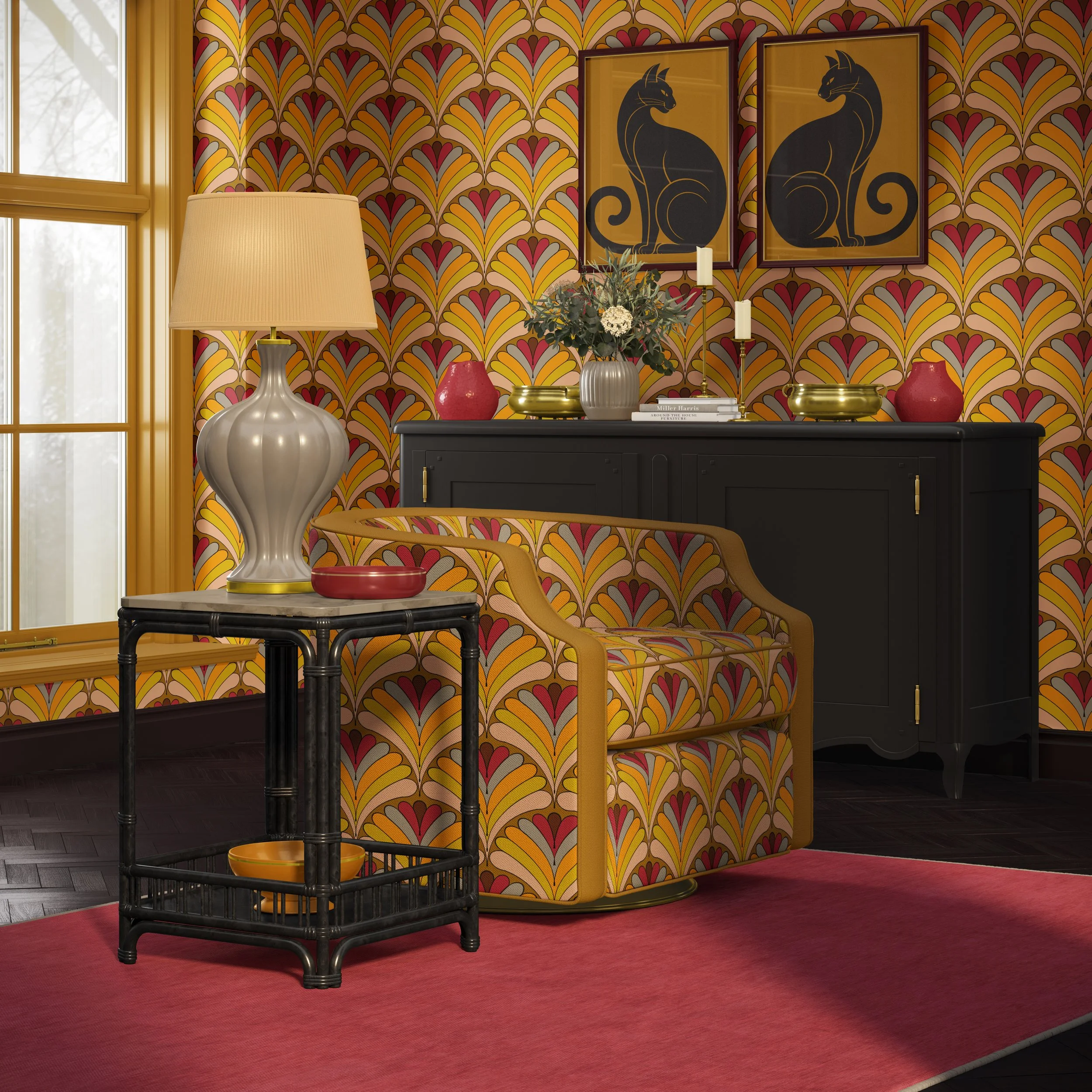
When more than one surface in a room wears pattern—walls, upholstery, drapery, rugs—the question isn’t “Is this too much?” It’s “What relationship do I want these patterns to have?” In this post, I’m sharing how I think through coordinating vs. contrasting pattern across multiple surfaces so a space feels layered and intentional instead of chaotic.
Why multiple patterns feel tricky—and why they’re worth it
Most people are comfortable with one obvious pattern, whether that’s wallpaper, drapery, a patterned sofa, or a bold rug. But the moment a second or third patterned surface enters the picture, concern tends to follow. Is this competing? Is it going to feel busy? Is this too much for those using the space day to day?
And yet, some of the most memorable, comforting, and quietly luxurious rooms are built from multiple patterns that speak to each other beautifully. The difference between too much and just right usually comes down to three things: how the patterns relate, how they’re scaled, and how much breathing room they’re given through solids and texture.
That’s the real conversation.
How I define success
A successful room feels comfortable, held, and inviting to those living or working within it. It lacks visual conflict and unnecessary tension. The patterns feel like they belong to the same story, even when one is clearly leading and another is supporting. Perhaps there’s a conversation starter like an accent wall that sets the tone and colors for the rest of the space. The room feels at ease, and those using it do too.
Coordinate vs. contrast: what we’re really deciding
When I’m planning a pattern-rich space, I’m not asking whether I should use pattern or not. I’m asking which surface wants to lead, and how the others should support it.
Coordinating patterns share a common element—color, motif, line quality, or mood. They sit in similar emotional territory and feel like variations on a theme.
Contrasting patterns intentionally bring a different energy, scale, or structure into the mix. They can create focus and freshness, but they need more thoughtful handling so the room still feels cohesive.
Most successful spaces use both. Maybe the wallpaper and drapery coordinate, while the rug adds contrast. Maybe the headboard coordinates with the bedding, and the pillows provide the surprise.
Step 1: Choose your lead surface
Before choosing specific patterns, I like to decide which surface is telling the main visual story.
Often that’s one of these:
A full-height wallcovering
A strong feature wall or even a ceiling
A sofa or pair of chairs that dominate the sightline
A rug or runner anchoring an open-plan space
A large expanse of drapery framing a view
Once the lead surface is clear, the rest of the decisions get simpler.
If wallpaper is the lead, upholstery and drapery usually do best when they coordinate or soften. Accents like pillows, ottomans, and smaller upholstered pieces can contrast a little more boldly.
If a sofa is patterned and central, the walls often do best in a subtler pattern or a quieter finish, and the rug or drapery can echo color and rhythm rather than compete.
If a rug is the star, walls and larger upholstery often work best in supporting roles, while smaller-scale patterns can still appear in cushions, benches, or chairs.
Step 2: Use scale to keep patterns in conversation, not competition
You can absolutely have multiple patterns in a room if their scale and density are doing different jobs.
I tend to think in three scales:
Large scale — broad movement, bigger shapes, sweeping motifs. Often useful for wallpaper, rugs, or larger upholstered pieces. Emotional feel: expansive, immersive, enveloping.
Medium scale — a clear pattern that doesn’t dominate the whole field. Often useful for chairs, headboards, drapery, or supporting wall applications. Emotional feel: lively but manageable.
Small scale — tighter repeats, finer geometrics, quieter texture-like patterns. Often useful for pillows, smaller ottomans, secondary chairs, or details. Emotional feel: grounding, cohesive, quietly connective.
Anything can work if the balance is right. I look for a pattern relationship that allows the lead pattern to interact well with echoing elements and supporting color throughout the room.
If the wall is patterned in a large, flowing repeat, I might reflect that colorway or gesture in upholstery on a less prominent piece and on select throw pillows among solids or quieter supporting patterns. If the sofa is holding the bolder statement, the rug or wall pattern is often stepped back in scale or density.
The goal is flow. I don’t want every element in the room asking for equal attention. A lead element can absolutely be the clear alpha, but its real strength comes in how well it holds the room together and supports the people using it.
When to coordinate patterns
Coordinating patterns are especially helpful when the room is small and you want it to feel calm and cohesive, when those using the space are curious about pattern but a little shy of it, or when the architecture is already busy with a lot of doors, windows, trim, or angles.
A few approaches that work especially well:
Same palette, different pattern
Wallpaper in a soft botanical with drapery in a subtle stripe using the same colors. A patterned sofa with pillows in a small check or quiet geometric that picks up two of the same hues. This keeps the eye feeling held rather than startled.
Same pattern, different scale or substrate
Wallpaper in a larger scale of the pattern, with a chair or bench in a smaller-scale version of that same motif.
Drapery and pillows in the same design but in different scale or colorway.
This can be especially effective when working with a wallpaper and fabric pattern designer who can adjust scale intentionally for each surface.
Shared gesture
Patterns do not have to match exactly to coordinate. They can share a similar curve or line quality, a common visual rhythm, or the same emotional tone.
Sometimes that kind of coordination is more elegant than a more obvious match.
When to contrast patterns
Contrast can be thrilling—and very sophisticated—when it’s handled with care. I tend to lean into contrast when the architecture is simple and can handle more visual energy, when the room is meant to feel more alive or conversation-starting, or when those using the space genuinely love pattern and want to feel surrounded by it.
A few contrast strategies that still feel grounded:
Structured vs. organic
An organic, flowing wallpaper paired with a more structured rug, chair fabric, or stripe.
This keeps the room from feeling too loose or too rigid.
High vs. low contrast
A bold, high-contrast pattern on one surface and a softer, lower-contrast pattern elsewhere.
The eye reads one as statement and the other as texture, even though both are technically patterns.
Pattern plus pattern plus textured solid
Whenever I introduce stronger contrast between two patterns, I want a textured solid nearby to absorb and connect both.
That might be a:
textured ottoman
softly textured linen on a chair
textured solid pillow that pulls color from both patterns
These quieter surfaces give the eye somewhere to rest and help the patterns feel like part of the same conversation.
Soft starts: pattern on multiple surfaces, gently
If those using the space are new to pattern, multiple patterned surfaces can still be introduced softly.
A patterned wall with a solid sofa and patterned cushions can feel incredibly balanced when the cushions echo one color from the wall and one from the rug.
Patterned drapery with a subtle, tone-on-tone rug can create a gentle relationship between eye level and floor.
A patterned headboard or bolster with solid bedding can allow the bed to feel tailored, while the pattern carries both softness and personality.
Do I use these exact solutions every time? Absolutely not. It always comes back to emotion, use, and interaction. Some spaces want more daring. Some spaces want bold color and deep calm at the same time. It’s all about those using the space, how they want to feel there, what they want to do there, and how the room needs to support that.
Light, time of day, and how pattern reads
Patterns do not look the same at all times of day. In strong daylight, large-scale patterns can feel more graphic and obvious. In lamplight or evening, smaller-scale patterns and textures often come forward and lend coziness.
When you’re using pattern on multiple surfaces, consider how the room will be used in the morning vs. at night, whether patterns that look distinct in bright light might blend more softly after dark, and whether the overall composition still feels balanced in both scenarios.
This is where sampling—and living with those samples at different times of day—is invaluable.
For decorators and designers: explaining this to those hiring you
Most decorators and designers make these pattern decisions instinctively, but it can be very helpful to make that thinking visible.
That may sound like:
“This pattern will lead. These others will echo it quietly so the room feels layered, not loud.”
“We’re using contrast here to wake the room up, but these solids and textures will keep it from feeling chaotic.”
“Both of these patterns share a similar curve or structure, so they’ll sit together more comfortably than you might expect.”
A simple sketch, elevation, or two or three physical mock-ups can also be incredibly clarifying—one more coordinated, one more contrast-forward, and one in the middle.
For homeowners and small business owners: what to notice
If you’re reading this as someone shaping your own space, here are a few things to look for when you’re evaluating pattern on multiple surfaces:
Does one pattern clearly lead?
Do at least some colors repeat across patterns and solids?
Is there at least one textured solid nearby to give your eye a rest?
Does the room feel like a place you’d want to spend time in—not just photograph?
If the answer is yes, you’re likely on the right track.
If you’re an interior decorator or interior designer and want a pattern-focused partner to help you place wallpaper and fabrics across multiple surfaces—walls, upholstery, drapery, and more—I’d love to collaborate.
If you’re reading this as someone shaping your own home or business and you’d like help building a pattern story that feels rich but livable, you can contact me to engage my interior decorating services.
And if this kind of breakdown is useful, you can:
Subscribe to Surface & Space to have new posts land in your inbox on Fridays.
Access a growing library of subscriber-only resources—gentle guides to pattern, fabrics, and substrates you can return to whenever you’re making decisions.
© 2025-2026 Gabrielle Hewson. All rights reserved. You’re welcome to share links to this article, but please don’t copy or republish the text or images without my written permission. For licensing, permissions, or any other use beyond linking, please contact me directly.