
Looking Back to Look Ahead: What 2025 Wallpaper & Fabric Projects Taught Me About Pattern and What Stayed Timeless Going into 2026
2025 was a year of pattern in motion—showroom installs and residential rooms, that put my wallpapers and fabrics to work in real spaces. Looking back at those projects now, I can see clear through-lines: what inspired homeowners, what quietly echoed larger industry trends, and which choices still feel timeless as we step into 2026. In this post, I’m unpacking what 2025 taught me about pattern—and why certain motifs, scales, and stories still feel fresh going into the new year.
The year pattern moved from theory to “how it lives”
If 2024 was about building foundations—collections, color stories, and pattern structures—2025 was the year those ideas really started living on the walls and upholstery of real spaces.
On my side of the studio:
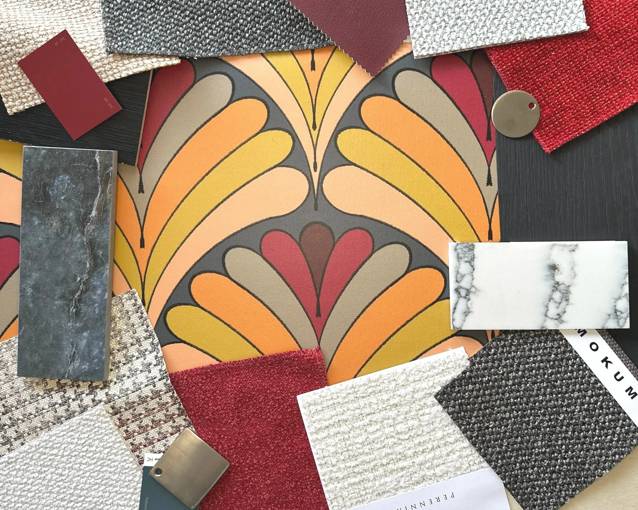
I continued growing a curated library of wallpaper and fabric collections designed through a decorator’s lens—patterns engineered to sit comfortably with millwork, stone, and existing furnishings.
Those designs started showing up in more visible ways, including multiple showroom vignettes at Concept 32, where three of my patterns—one each from my Art Deco Fans, Feeling Africa, and Watercolor Florals collections—were installed around custom cabinetry and storage.
I launched my blog, Surface & Space, writing directly about pattern trends recently identified by Pinterest in their 2026 trend forecasts, including Afrohemian influences in my Feeling Africa collection, Neo Deco influences in my Art Deco Fans collection, and how color stories shape mood.
At the same time, the wider design world was shifting:
2025 leaned heavily into biophilic and nature-inspired prints—which live in the sweet spot of all that I do—along with moody botanicals and softly scenic, nature-evoking designs.
Heritage patterns—chintz, toile, damask—began a refined comeback, often under labels like “modern heritage” or “grandma florals,” pairing nostalgia with updated color palettes.
Looking toward 2026, editors, forecasters, and even Pinterest’s own trend reports started talking about storytelling wallpapers, Afrohemian-influenced pattern, Neo Deco geometry, hand-drawn lines, and refined layering as key directions.
The designs I created early in January 2025—collections like Feeling Africa and Art Deco Fans—weren’t built to follow those trend calls. They came from instinct and the way I like rooms to feel. Only later did it become clear that those designs sit comfortably inside what’s now being named as 2026’s “Afrohemian” and “Neo Deco” directions. In other words: the patterns were conceived to be evergreen and livable first—and happened to land right where the broader conversation eventually went.
So this post is a bit of a bridge: part yearbook, part field notes, and part love letter to the patterns that still feel right as we step into 2026.
If you’re an interior designer or interiors professional, my hope is that this helps you see how these collections sit against the trend curve.
If you’re a homeowner or business owner reading along, think of this as a peek behind the curtain into how pattern decisions evolve over time.
What 2025 projects revealed about how pattern actually behaves
1. Story-first pattern work aged the best
Some of the strongest-performing designs in 2025—both in installs and in conversations—were the ones anchored to a clear story:
Neo Deco–aligned work like Art Deco Fans lived beautifully in the Concept 32 showroom. Its geometry echoed cabinet lines and hardware, connecting to the broader Art Deco–revival trend without feeling like costume or being theme-based.
Feeling Africa / Afrohemian-informed motifs resonated with those who wanted pattern to feel rooted in place, memory, and culture—not just “pretty.”
Florals stayed strong with Watercolor Florals and softly scenic nature prints were firmly anchored with both my Serengeti: Wildlife Animals and The Beauty of India: Life Among the Arches collections.
Across projects, the patterns that held up best were the ones that:
Tied back to a narrative—place, culture, or a particular emotional tone—could be explained in a sentence or two: “This one pulls in the architecture of the building or culture,” or “This reflects the landscape just outside the windows.”
Continued to make sense when the inevitable next layer—art, textiles, seasonal decorations—came into the room.
2. Nature-inspired doesn’t have to mean loud
Industry-wide, biophilic and nature-inspired wallpapers stayed at the forefront in 2025: botanicals, leaves, watery textures, and landscape-inspired murals.
In my own work, nature showed up more as a rhythm and a touch quality with:
Hand-drawn florals where line work and spacing do as much as the actual flower shapes.
Organic geometrics that feel like ripples, swirls, or waves rather than strict stripes.
Palettes that borrow from soil, sky, stone, and foliage.
What 2025 taught me here:
Humans respond warmly to patterns that suggest nature in scenic vignettes and layered pattern.
Soft, layered palettes feel more compatible with the “refined layering” and calm, sanctuary-focused direction we’re seeing for 2026.
3. Scale discipline matters more than novelty
One of the biggest practical lessons from 2025 installs—especially in the Concept 32 showroom—was how much scale can make or break a pattern:
Bolder geometrics held up beautifully in entry drop-ins and focused vignettes, where architecture naturally framed the repeat.
More fluid florals and painterly motifs shone in cabinet nooks and accent walls, where those using the space interact with the pattern at close range throughout the day.
The takeaway:
It’s less about whether a pattern is “big” or “small” and more about whether the repeat is scaled to the way eyes and bodies move through a space. In 2025, the spaces that felt most resolved were the ones where the pattern scale was in conversation with:
The size of the room.
The distance from which the pattern is usually seen.
The lines of cabinetry, paneling, or upholstery.
That principle isn’t going anywhere in 2026.
How my collections quietly intersected 2025–2026 trends
I never want to chase trends for their own sake—but it’s useful to notice where existing work happens to be in step with the broader conversation.
Here’s where I see alignment:
Modern Heritage & “grandma florals,” through a fresh lens
Editors are calling “Modern Heritage” one of 2026’s breakout styles—think rich color, historical references, and vintage pieces balanced with modern function.
In 2025:
My more heritage-leaning florals and structured motifs naturally slotted into that lane, especially in rooms with original millwork, plaster details, or classic cabinetry.
Designers used those patterns not to re-create a past era, but to ground otherwise modern spaces with a sense of continuity.
This is where collections that feel a bit “too classic” at first glance can become powerful tools when paired with clean-lined furniture and updated finishes.
Storytelling wallpaper, before the label became trendy
Forecasts for 2026 highlight storytelling wallpaper—prints that read almost like illustrated scenes.
Many of my 2025 pieces were already built around that idea:
Patterns structured like visual poems: repeating, but with enough variation and detail that the eye can wander.
Collections that share a common narrative thread—place, mood, or cultural reference—enabling mixing multiple patterns in one project without it feeling chaotic.
As more people look for rooms that feel personal rather than generic, that story-forward approach feels even more relevant going into 2026.
Refined layering instead of maximalist overload
We’re seeing a shift away from loud, dopamine decor toward refined layering—thoughtful combinations of color, texture, and pattern that feel collected rather than chaotic.
My 2025 work leaned in that direction by:
Pairing bolder wallpapers with quieter, textured solids in upholstery and drapery.
Using pattern in targeted doses—a ceiling, a back-of-shelving moment, a single upholstered piece—so those using the space don’t tire of it.
Designing patterns that can layer together in one room without competing for attention.
That’s something I plan to keep leaning into in 2026: patterns that want to be layered, but don’t demand a loud room to feel alive.
What stayed truly timeless in 2025 (and why I trust it for 2026)
Looking across installs and studio experiments, a few things clearly stayed timeless:
1. Grounded, flexible color palettes
The palettes that still feel right going into 2026:
Earthy neutrals with a bit of personality—warm grays, mushroom, tobacco, inky navy rather than straight black.
Nature-derived accent colors: deep greens, softened terracottas, blue-greens that can swing cool or warm depending on what they sit near.
Off-whites that feel like paper, stone, or plaster—not stark printer white.
These colors support “refined layering” and “modern heritage” directions while still playing nicely with existing floors, cabinets, and furnishings.
2. Hand-drawn line and human imperfection
No matter how digital the world gets, hand-drawn line still reads as human, soft, and calm:
Slight wobble in a stripe.
Organic edges.
Brushy tetured fills rather than perfectly flat colors.
These details helped patterns feel less like “product” and more like art on the wall—something that will continue to matter as people invest in fewer, better changes to their spaces.
3. Motifs that invite long-term living
Patterns that stood the test of 2025 had a few things in common:
They look good on both good days and messy days.
They soften visual noise—cords, toys, everyday life—rather than exaggerating it.
They allow those using the space to see something new when the light shifts or their mood changes.
That’s the kind of pattern that doesn’t burn out in a year. It settles in.
Tools of the trade moving into 2026
Leaning on story-first collections. When a pattern is tied to a narrative, it’s easier to present and easier for those using the space to embrace.
Matching scale to architecture. Think about where eyes land—from a kitchen entry, from a sofa, from a stair landing—and choose repeats that align with those sightlines.
Using pattern to support modern heritage and refined layering, not fight it. Heritage-leaning motifs in updated palettes can ground rooms that otherwise skew very contemporary.
Letting one pattern lead and others support. A stronger wallpaper plus textured upholstery and quieter coordinates will read more timeless than five competing showstoppers.
If you’re looking for a thought partner on which of my patterns to pull where, that’s the part I love—helping you translate your concept into a pattern map that feels coherent rather than chaotic.
What to notice when a pattern sticks with you
Wallpaper and fabric samples save time and money, so when you see a pattern you like, order a sample and live with it for a beat. then ask yourself:
Do I still like this pattern on a Tuesday afternoon when the room is messy?
Does it make the room feel calmer, more alive, or more “me”—even when nothing else is styled?
Do I feel slightly more at ease, more myself, or more inspired in this room than in a plain one?
If the answer is yes, that pattern is doing its job—and it’s likely to feel timeless for you, regardless of trend reports. Pick the pattern or patterns that speak to you, help you create a desired emotion, and/or simply make you smile when you enter the room or pass that nook.
Carrying these lessons into new work for 2026
All of this reflection is shaping how I design and curate for the year ahead. In 2026, my focus is on:
Deepening story-driven collections and exploring new narratives that connect to nature, place, and everyday rituals.
Creating more patterns designed explicitly for refined layering—pieces that play well with each other in one room without feeling like a theme park.
Continuing to test patterns in real contexts so the work stays grounded in furniture lines, flooring, and real-world lighting.
Embracing evergreen pattern that isn’t quiet; it’s intentional. It knows what it’s there to do.
My hope is that, when we look back at 2026 from the vantage point of 2027, we’ll see these same threads: story, scale, texture, and care.
If you’re an interior designer or decorator planning 2026 projects and you’d like a pattern partner and decorator, I’d love to collaborate. You can reach out to me to talk about upcoming rooms, showrooms, or product lines and how wallpaper and fabric can support your concepts.
If you’re a homeowner or business owner reading along, you can:
Explore my current Wallpaper & Fabric Collections on my site to see which patterns you’re drawn to first.
Visit my Surface & Space blog for deeper dives into pattern myths, design stories, and practical applications.
Subscribe to Surface & Space for new articles in your inbox and instant access to two free printable substrate guides (wallpaper & fabric), plus a bonus PDF on Conscious Creators of Gentle Textiles.
Here’s to patterns that tell real stories, feel good in everyday life, and still make sense when we look back a year—or ten—from now.
© 2025-2026 Gabrielle Hewson. All rights reserved. You’re welcome to share links to this article, but please don’t copy or republish the text or images without my written permission. For licensing, permissions, or any other use beyond linking, please contact me directly.