Color-drenched Rooms: Using Pattern and Palette to Shape How a Space Feels
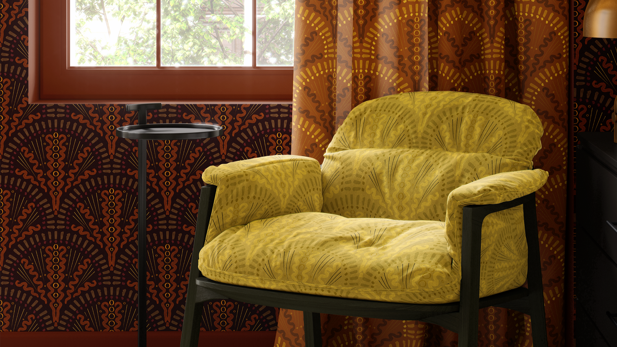
Color is never just a “finish.” The palette you choose quietly shapes how a space feels, how those using it move through their day, and even how they remember the room later. In this post, I’m using one imagined sitting room—wrapped in a deep brown scalloped wallpaper, terracotta drapery, and a mustard-yellow patterned chair—to explore how layered color and repeat can create rooms that feel rich, enveloping, and surprisingly livable
Why color drenching feels so emotionally powerful
“Color drenching” is often described as painting the walls, trim, and sometimes the ceiling in similar tones. For me, it’s more than that. It’s about letting a single, well-considered palette hold an entire room—across walls, soft furnishings, and pattern—so that nothing feels tacked on.
In the hero room:
The deep dark brown walls act almost like a night sky or rich soil—still, steady, grounding.
The terracotta drapery brings warmth and movement, like sunlight hitting clay or brick.
The mustard-yellow chair adds a quiet note of optimism and energy, like a lantern or a wildflower in shade.
Because all three surfaces share the same scalloped, brushy pattern, just interpreted in different colorways, the room feels cohesive, not busy. Color is doing the emotional work; pattern is carrying it.
One pattern, three colorways: a living example
Let’s look more closely at how each piece in the hero image contributes to the mood.
1. Deep dark brown walls – grounding, steady, embracing
The wall pattern sits on a deep, dark brown ground—not black, but a rich chocolate tone. Each scallop is built from layered browns with tiny dashes of orange and yellow that move through the repeat like little pulses of light.
Emotionally, this does a few things:
It grounds the room, like good soil beneath your feet.
The darker ground makes the rest of the elements—art, furniture, textiles—feel intentional, almost curated.
Those tiny touches of orange and yellow keep the brown from feeling flat or heavy; they add warmth and life without shouting.
This is a good example of how a darker color on the wall doesn’t have to feel oppressive. When the repeat is thoughtful and the accent notes are warm, the effect is cocooning, not caving in.
2. Terracotta drapery – warmth, movement, and gentle drama
At the window, the curtains shift the story. Here, the same scalloped pattern lives on a terracotta background, with the scallops painted in dark brown and varying yellows that echo the wall but lean warmer.
The result:
The drapery connects to the brown walls through the repeat and the dark scallops, but it introduces a softer, sun-baked warmth.
Terracotta feels like warmth you can stand next to—glow, not glare.
The vertical falls of fabric add movement, so the pattern doesn’t feel static; it breathes with the light and the day.
At the window itself, this terracotta pattern acts as a visual anchor. It draws the eye toward the opening in the wall—the place where light comes in, where tasks happen, where someone might sit to read or pause. The curtains bridge the practical function (shade, privacy, softness) with the emotional tone (comfort, warmth, welcome).
3. Mustard-yellow chair – a quiet focal point, not a shout
The chair in this room carries a “dirty mustard” yellow background—a muted, lived-in gold. The scallops on this surface are made from brighter yellows and soft grays, which keep the pattern lively but not loud.
This does a delicate bit of emotional work:
The mustard reads as optimistic but grounded—not neon, not sugary.
The brighter yellow scallops pick up the tiny yellow notes from the walls and the curtains, pulling them forward and making them feel intentional.
The gray within the scallops adds a soft, shadowy note that keeps the chair from feeling too sharp or too sweet.
Because the chair’s colorway is lighter and more luminous than the walls or drapery, it naturally becomes a focal point—an invitation to sit—without needing a contrast that breaks the story.
What ties it all together (and keeps it from feeling overwhelming)
In a room like this, it’s very easy to go too far. What keeps this space from feeling chaotic?
Shared pattern language
Even though the wall, drapery, and chair are in different colorways, they all share:
the same scalloped, brushy repeat
the same hand-drawn line quality
the same rhythm and scale
That means two things:
The eye recognises the pattern even as the colors change, which creates comfort and coherence.
The variety happens within a known structure, which is much easier to live with day to day than three unrelated patterns competing for attention.
A palette that moves, but stays in one family
The palette moves through browns, terracotta, and mustard, with:
deep chocolate at the walls
clay-like warmth at the curtains
muted golden yellow at the chair
There’s a quiet story here: soil, fired earth, late-afternoon light. You don’t have to name it, but those associations are what make the room feel earthy, collected, and human rather than like a “theme.”
All three colorways carry warmth and depth; there’s no icy note cutting through. That’s why the room feels held together, even as the values (light vs. dark) shift.
Supporting pieces that know when to stay out of the way
In a color-drenched, pattern-layered room, the supporting cast matters.
You might also see:
A wood side table or console in a natural or slightly deeper finish—something that harmonizes with the browns but doesn’t try to steal attention.
A rug in a soft neutral or a low-contrast pattern that echoes one of the lighter tones from the chair or the drapery.
A few textured solids—a woven throw, a nubby cushion, a ceramic piece on the side table—that pick up individual colors from the wallpaper without adding more pattern.
The goal is not to avoid interest, but to place it. The pattern carries the story; the solids and textures let that story be readable.
How to translate this approach into your own projects
You don’t need this exact pattern for this idea to be useful. You can borrow the structure.
Step 1: Choose one pattern to lead
Pick one nature-informed pattern that feels right for the room:
something with movement you like (soft arcs, leaves, branches, abstract waves)
a scale that will hold up on the surface you have in mind (walls, drapery, upholstery)
a hand or line quality that feels like you
Let that pattern be the lead voice in the room, rather than trying to juggle three unrelated prints.
Step 2: Build two or three related colorways
Instead of using one colorway everywhere, explore a small family of versions:
a deeper, moodier interpretation for walls or a large anchor
a warmer or slightly lighter version for drapery or secondary surfaces
a more luminous, optimistic version for a key piece of seating or a focal cushion
You’re not trying to be matchy-matchy; you’re letting the pattern travel through the room at different volumes.
Step 3: Decide how you want the room to feel
Ask:
Should this room feel more grounded and restful, like the deep brown walls?
More warm and embracing, like the terracotta drapery?
More uplifted and gently energized, like the mustard chair?
Let one of those emotional notes lead, and use the others as supporting tones.
For example:
In a bedroom, you might lean more heavily into the deeper, grounding colorway, using the warmer and brighter versions as small accents.
In a sitting room that’s meant to feel social and alive, you might give the mid-tone or warmer colorway (like the terracotta) more surface area.
Step 4: Soften the edges with textured solids
Once your pattern and its colorways are chosen, bring in textured solids that:
echo one or two key colors from the pattern
add tactile richness—bouclé, chenille, slubbed linen, soft velvets
give the eye gentle places to rest
A woolly throw in a slightly deeper brown, a linen cushion in a terracotta-adjacent neutral, or a nubby mustard pillow can all support the story without diluting it.
If you’re an interior decorator or interior designer and want a textile-focused partner to support your pattern-rich projects, I’d love to collaborate.
If your interested in exploring Feeling Africa or my other collections: Collections.
If you’re a novice or professional and you would like help building a fabric and wallpaper story that balances texture and pattern for those using your spaces, you can Contact Me to engage my interior decorating services.
And, if this kind of discussion is helpful, you can:
Subscribe to Surface & Space to have new posts land in your inbox on Fridays.
Get access to a growing library of subscriber-only resources—guides to help you think through pattern, color, and materials in your own time. I add to this collection regularly, so it becomes a little toolbox you can return to whenever you’re ready. your own time. I add to this collection regularly, so it becomes a little toolbox you can return to whenever you’re ready.
© 2025-2026 Gabrielle Hewson. All rights reserved. You’re welcome to share links to this article, but please don’t copy or republish the text or images without my written permission. For licensing, permissions, or any other use beyond linking, please contact me directly.