
Designing for Real Life: How Pattern Hides Wear, Tear, and Imperfection
Pattern is one of the most practical tools we have for disguising everyday wear, softening imperfections, and extending the life of the pieces invested in. In this post, I’m sharing how wallpaper and fabric choices can quietly hide scuffs, soften signs of age, and make beautifully designed rooms easier to live in.
Why “perfect” isn’t the point
In a room, real success looks like cushions have moved, the coffee table has seen drinks and books, there might be a nick on a baseboard—and yet the room still feels cohesive, welcoming, and well cared for.
That’s not an accident. It usually means:
Surfaces were chosen that age gracefully.
Pattern and texture were used in strategic places.
The room’s design is able to absorb small imperfections without feeling “ruined.”
There’s staging and there’s actually designing to be truly lived in for the next three, five, ten years.
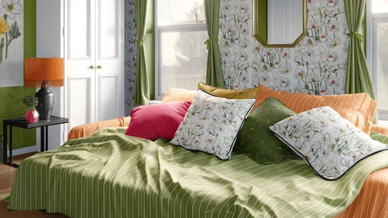
How pattern naturally disguises wear and tear
Our eyes are wired to look for contrast and interruption. A blank surface gives the brain very few places to look—so a single scuff or stain becomes the star of the show. Pattern flips that.
Pattern:
Breaks up solid fields — On a solid sofa, every crease and mark is obvious. On a subtly patterned fabric, folds and daily rumples blend with the motif.
Diffuses small stains — Especially with mid- and small-scale prints, tiny marks don’t scream. They visually merge into the pattern’s rhythm, buying your client time between cleanings or reupholstery.
Softens structural imperfections — Slightly uneven walls, patched areas, or small dents in millwork can feel less harsh when a pattern gives the eye something else to focus on.
Adds texture where reality will show — Heavily used surfaces—like dining chair seats and ottomans—benefit from pattern because it hides the first wave of patina that would be glaring on a flat, solid field.
This isn’t about being careless. It’s about accepting how spaces are actually used and designing so that wear looks “loved” instead of “damaged.”
Strategic places to use pattern for real-life durability
Not every surface needs to be patterned. Part of practical design is deciding where pattern will do the most work.
Some high-impact placements:
1. Seating that works hard
Dining chairs and banquettes — Patterned fabric here can hide crumbs, minor stains, and denim transfer far better than a flat pale solid. A small- to mid-scale repeat often looks clean while quietly forgiving.
Ottomans and coffee table alternatives — Feet, trays, and snack plates all land here. A patterned textile is more forgiving of impressions, marks, and slight pilling over time.
Everyday sofas in family rooms — Even if the sofa itself is solid, introducing patterned cushions in durable fabrics helps absorb the visual chaos of everyday life. For especially busy households, a subtly patterned base cloth can be a lifesaver.
2. Floors and “splash zones”
Rugs in circulation paths — Runners and area rugs with pattern will handle dirt and traffic much more gracefully than flat, solid options—especially in entries and hallways.
Under dining tables — A patterned rug beneath a table softens the impact of spills and chair movement. It also visually organizes the entire dining zone, which matters in open-plan spaces.
3. Walls that take a beating
Hallways and stairwells — These are high-touch areas that often show scuffs, fingerprints, and bag marks. Wallpaper with a forgiving repeat can make those marks less obvious between touch-ups.
Children’s rooms and play areas — Pattern on walls can handle the wear better than flat paint alone, especially when combined with a scrubbable finish or practical wallcovering base.
Behind benches and banquettes — Back-of-head and hands contact is real. Pattern creates a visual buffer that keeps minor marks from dominating.
The right kind of pattern hides imperfections
Not all pattern is equally forgiving. Small decisions about scale, contrast, and color can make a big difference.
Scale
Small-to-mid scale repeats are the most camouflaging for everyday wear. They create a gentle visual “noise” that distracts from isolated marks.
Very large scale patterns can be dramatic, but a stain that falls in a light, open area of the repeat will still show. Large scaling works well in lower-contact places (like drapery or feature walls) if concealment is a priority.
Contrast
Medium contrast is often ideal. Enough variation to disguise marks, but not so high that the pattern feels busy.
Extremely high-contrast prints are bold and beautiful, but they’ll emphasize creases and wear lines more clearly.
Color & value
Multi-tonal palettes (within the same color family) help wear disappear into the overall effect.
Extremely light patterns on pale grounds will show dark stains; very dark patterns will show lint and light dust. The sweet spot is often in the mid-range, or a thoughtfully mixed palette that includes both.
Thinking of these factors in the same breath as aesthetics. “How will this look after 200 sits, 50 dinners, and three winters?” is a very practical question.
Pattern + performance: a powerful combination
For truly hardworking spaces, pairing pattern with performance textiles or well-chosen wallcovering bases is where the magic happens:
Pattern distracts the eye.
Performance fibers and finishes make cleaning easier.
That means a patterned:
performance fabric on dining chairs that still looks crisp after countless gatherings.
wipeable wallcovering in a breakfast nook that hides the minor evidence of everyday meals.
runner in a hallway woven from fibers designed to resist staining and crush.
Designing for “good-looking wear” instead of perfection
Some materials look better with patina. Pattern can support that natural aging so it reads as character, not deterioration.
Ways to design for “good-looking wear”:
Using pattern to mask the first layer of patina. — As pieces age, the pattern keeps the overall impression intact even as small signs of life accumulate.
Pairing newer pattern with older elements. — A fresh patterned fabric on a vintage chair frame lets the inevitable dings and marks on the wood feel intentional and charming rather than shabby.
Thinking about touch points. — Places where hands rest, feet land, and items are frequently placed are ideal candidates for patterned solutions. That way, wear emerges where it can blend, not where it stands alone.
This is especially helpful in second homes, rentals, and busy family houses, where “no shoes, no food, no pets” simply isn’t realistic.
Considering the value of pattern
Cost per use: “Will putting this patterned fabric on the sofa keep it looking fresh much longer than a flat solid, thus stretch the life of the piece and protect your investment?”
Maintenance peace of mind: “Will less time be spent worrying about every mark when the fabric or wallpaper is already doing some of the work?”
Realistic lifestyle match: “Because you entertain often / have young kids / have a dog, will pattern here help the space stay feeling polished in between cleanings?”
Future resale: Patterned, well-maintained pieces look more forgiving in photos for short-term rental listings or future resale.
Pattern is a practical ally, and opens up the opportunity to be bolder or more expressive while also being smart and, on the right material, durable. Learn more about some of the different substrates for wallpaper and fabric that I recommend.
If you’re ready to design for real life, pattern can be one of your best tools. Whether you’re interested in full decorating services, rethinking a few hardworking rooms, or specifying wallpaper and fabrics that will actually support lifestyle, I’d love to talk. You can reach out to me to start the conversation.
Curious how my patterns might help hide wear and soften imperfections in your own spaces? You can request samples directly from any collection page by clicking “Request A Sample” on my website. Visit my curated wallpaper and fabric collections.
Subscribe to Surface & Space for new articles in your inbox and instant access to two free printable substrate guides (wallpaper & fabric), plus a bonus PDF on Conscious Creators of Gentle Textiles.
© 2025-2026 Gabrielle Hewson. All rights reserved. You’re welcome to share links to this article, but please don’t copy or republish the text or images without my written permission. For licensing, permissions, or any other use beyond linking, please contact me directly.