
Non-pasted, Grasscloth, Metallic, Vinyl – Choosing the Right Wallcovering for the Job
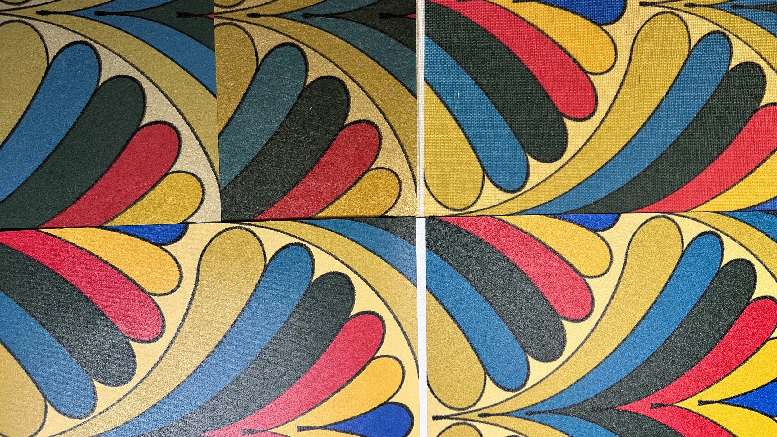
Top to bottom, left to right: silver metallic, gold metallic, grasscloth, non-pasted, and vinyl wallpaper substrates featuring Art Deco Fans 04—note the textural differences and subtle color variants. For a richly colored pattern like this one, the unique nuances enable you to create a story that supports your vision for any space. In this post, I’m breaking down what each material does best.
Why material choice matters as much as the pattern
Most clients fall in love with the artwork first—the flowers, the geometrics, the color story. But as designers, we know the substrate underneath is just as important. It affects:
How easy the paper is to hang and remove.
How well it stands up to moisture, fingerprints, and everyday life.
How the pattern reads in real light (matte vs. reflective vs. textured).
The good news: you don’t need to become a wallcovering engineer. You just need a working understanding of the main categories—vinyl, non-pasted (traditional), grasscloth, and metallic—so you can align pattern + performance + placement.
Non-pasted traditional paper (and non-wovens): the classic all-rounder
When we say “non-pasted,” we’re usually talking about traditional wallpapers—paper or non-woven substrates that require paste (either paste-the-wall or paste-the-paper) at install. This category is where much of the most beautiful, nuanced artwork lives.
Best for:
Living rooms, dining rooms, bedrooms
Home offices, libraries, and studies
Powder rooms with low direct splash exposure
Any space where the client prioritizes a rich, matte look
Pros:
Often the most beautiful, print-friendly surface for detailed artwork.
Matte, sophisticated finish that plays well with plaster, stone, and natural light.
Non-wovens can be more forgiving to install and remove than older wallpapers.
Watch-outs:
Less wipeable than vinyl; think “gently cleanable” rather than “scrub it hard.”
Not ideal for zones with constant splashes or steam sitting directly on the surface.
As with all wallcoverings, proper prep and a good installer make or break the result.
When you want a room to feel truly “decorated” rather than just painted, a non-pasted is often where the magic happens. It’s also a wonderful choice when you’re working with custom patterns—the line quality and color depth really show.
Grasscloth and natural textures: atmosphere first, perfection second
Grasscloth and other natural-fiber wallcoverings (sisal, jute, hemp, etc.) are beloved for a reason: they instantly add warmth, texture, and a tailored, collected feeling to a room. But they come with quirks—and they are absolutely not for clients who want flawless, uniform walls.
Best for:
Dining rooms, studies, libraries
Adult bedrooms and quiet sitting rooms
Elevators, vestibules, and “jewel box” entries
Those who appreciate natural variation and patina
Pros:
Rich texture and depth you simply can’t get with flat paint.
Beautiful backdrop for art, millwork, and more minimal upholstery.
Feels luxurious and layered, even in very simple rooms.
Watch-outs (and mindset shifts):
Seams and panel variation are visible—that’s part of the charm.
Natural fibers can show sun fading, snags, or marks more easily than vinyl or paper.
Not ideal for high-splash zones, kids’ playrooms, or homes with pets who claw walls.
Grasscloth is for those of us who are comfortable with the phrase “perfectly imperfect.” Grasscloth is a textile on the wall rather than a flat, uniform finish. It is one of the most beautiful visual and aesthetic tools for elevating special spaces.
Metallic, foil, and specialty finishes: light as a design tool
Metallics shape not only the pattern but the light in a room. They can subtly bounce light, deepen shadows, and add a quiet sense of luxury. Currently, I’m experimenting with a woven metallic substrate that comes in a metallic silver or gold base color with a woven texture. It creates a very soft shine that catches ambient light without being distracting. I like the uniqueness it brings to walls, its durability, ease-of-install, and with the right pattern and colorway, the “wow” power it has. Coupled with a dynamic pattern like my Art Deco Fans collection, the metallic substrate serves to elevate both the wall and the space in the Concept 32 Cabinetry Studio showroom’s entry drop-in.
Best for:
Powder rooms and evening spaces (bars, dining rooms, lounges)
Small, dark rooms that need a little sparkle
Ceilings where you want a glow more than a solid color
Spaces meant to feel a bit “couture” or atmospheric
Pros:
Adds depth and movement as light shifts throughout the day.
A little goes a long way—fantastic for feature walls and ceilings.
Pairs beautifully with simple, solid fabrics and clean-lined furniture.
Watch-outs: not all metallics are alike
Be careful what type of metallics you choose; for example, high-shine foils will show substrate imperfections more readily; wall prep is critical.
Strong metallics may be too stimulating for calm bedrooms or offices.
Reflectivity can shift color perception; always test a sample in the actual space it will live before committing.
When you’re looking for a “special moment,” but not a loud color story, a softer metallic, like the metallic substrate I work with in either gold or silver base. Patterns that work best are black/white/gray monochromes or patterns with a tonal pattern with high contrast may be the perfect solution. A soft woven metallic wallpaper reads sophisticated in daylight and quietly dramatic at night.
Vinyl wallcovering: the hardworking chameleon
Vinyl has come a long way from the shiny, plasticky versions many of us remember. Today’s better-quality vinyls can be printed with beautifully nuanced artwork.
Best for:
High-traffic corridors and mudrooms
Kids’ spaces and playrooms
Powder rooms and bathrooms with good ventilation
Commercial or semi-commercial areas (offices, studios, hospitality)
Pros:
Wipeable and often scrubbable—great for fingerprints and splashes.
Durable in the face of bumps, bags, and daily wear.
Many options in Type II / contract-grade for serious performance.
Watch-outs:
Avoid cheaper vinyls that can still look overly shiny or flat; they won’t do your walls any favors.
Base substrate and sheen will slightly change how pattern colors read (usually brighter on this bright white base)—always view a physical sample in the actual light.
Vinyl is excellent for “elevated but practical.” It protects high traffic walls and keeps the room feeling finished, not fussy.
How I match material to room
Think of each room in terms of use, abuse, and mood:
Entry / mudroom
Use: high traffic, bags, coats
Good bets: Vinyl, durable non-woven; grasscloth only for low-contact wall areas
Powder room
Use: occasional hand splashes, close-up views
Good bets: Vinyl (for serious splash zones), non-pasted, metallic for drama; grasscloth if ventilation is good and expectations are realistic
Kitchen dining nook / breakfast area
Use: daily meals, kids, coffee
Good bets: Vinyl or wipeable non-pasted; grasscloth usually only away from direct food contact — a stone or tile backsplash is highly recommended if wallpapering a wall directly behind a sink that butts up against it
Formal dining / library / office
Use: occasional, mood-driven
Good bets: Non-pasted, grasscloth, metallics, or a mix (e.g., grasscloth on walls, metallic on ceiling for a carefully-crafted look)
Bedrooms
Use: with lots of soft furnishings
Good bets: Non-pasted, select metallics, or grasscloth for those who love texture and want elevated luxury
Understanding these substrates helps with choosing materials that match how a room is actually lived in —before there’s a problem.
Questions to ask before you choose a wallcovering
To make the right call between non-pasted, grasscloth, metallic, or vinyl—a few targeted questions go a long way:
How is this room actually used? — Everyday, guests only, kids, pets, food, makeup, steam, etc.
How much natural light does it get? — This affects both mood and how reflective or textured surfaces will read.
How tidy is the household—honestly? — A meticulous couple with no kids is very different from a busy family of five.
Are patina and visible seams okay? — This is the true grasscloth test.
What’s the maintenance comfort level? — Happy to gently wipe walls as needed, or want to “install and forget”?
Wallcovering is only one part of how a room has to live; the furniture and soft surfaces carry just as much of the daily wear. If you’re curious how I think about that side of the equation, you can also read “Performance Fabric Isn’t Just for Kids and Pets: Choosing Upholstery That Stands Up to Real Life,” where I break down how I choose upholstery fabrics that feel elevated and still stand up to real life, and “Designing for Real Life: How Pattern Hides Wear, Tear, and Imperfection,” which explores how thoughtful pattern placement can quietly extend the life of the pieces you live with every day.
Once you know those answers, you can decide on the right material and focus your energy on the fun part: choosing the pattern and color that carry the story.
If you’re weighing different wallcovering options and not sure which material is right for your project, I’d be happy to help you sort through the choices. Whether you’re a homeowner planning one special room or a designer specifying across a whole home, you can reach out to me to start the conversation.
Curious how my patterns translate across different substrates? You can purchase samples directly from any collection page by clicking “Request A Sample” on my website, and take it for a spin in your space. Check out my collections.
Subscribe to Surface & Space for new articles in your inbox and instant access to two free printable substrate guides (wallpaper & fabric), plus a bonus PDF on Conscious Creators of Gentle Textiles.
© 2025-2026 Gabrielle Hewson. All rights reserved. You’re welcome to share links to this article, but please don’t copy or republish the text or images without my written permission. For licensing, permissions, or any other use beyond linking, please contact me directly.